The Mythmaking Apparatus of the US National Parks
In quiet yet scrupulous detail, Designing Experience asks how the US National Park Service shapes the narratives it tells about this country and the lands it claims.

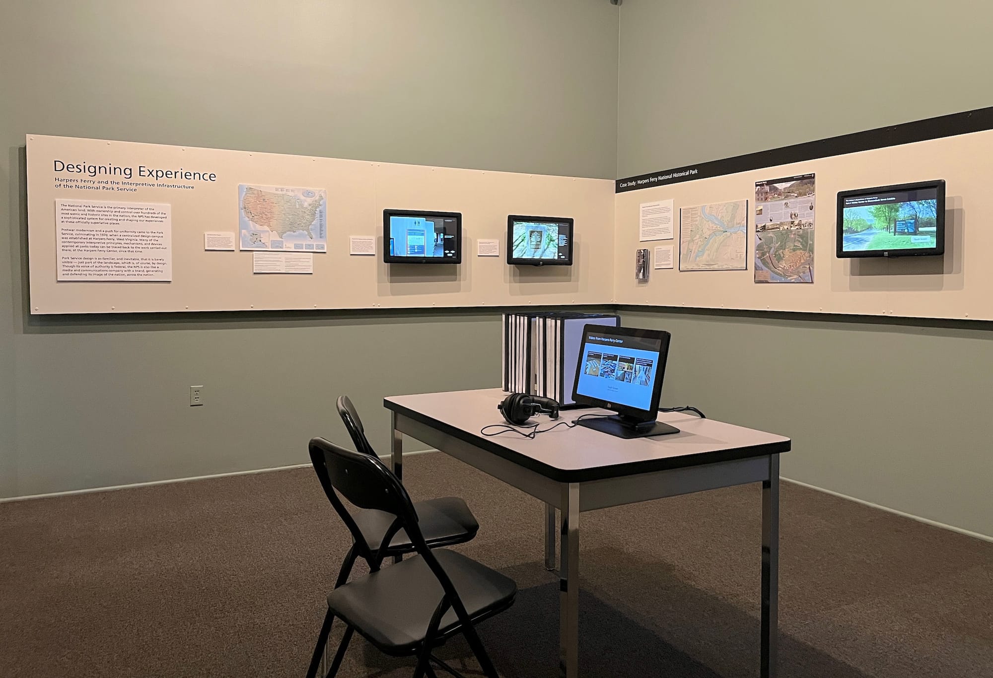
LOS ANGELES — “[T]he story of a nation attempting to explain itself, to itself.” That phrase feels so resonant at this moment in the United States, seeming to tap its finger on the piles of newly banned books and forbidden curricula, and circle a subtext of inevitable failure to contain the whole of this place in any single narrative. Those words make up the last bit of text in the first wall label for Designing Experience: Harpers Ferry and the Interpretive Infrastructure of the National Park Service at the Los Angeles headquarters of the Center for Land Use Interpretation (CLUI). In quiet yet scrupulous detail, the exhibition asks how the US National Park Service (NPS) shapes the narratives it tells about this country and the lands it claims.
The CLUI specializes in drawing attention to what is easily overlooked and often poorly understood, specifically in relation to geography and place, from resource extraction to land art projects to puzzling out which government agencies control the use of giant swaths of federal land, and so much more. In 2015, I wrote about the organization's Wendover Complex in Utah, but this was my first time visiting the LA center, located inside a nondescript former medical facility in Culver City that also houses the better-known Museum of Jurassic Technology.
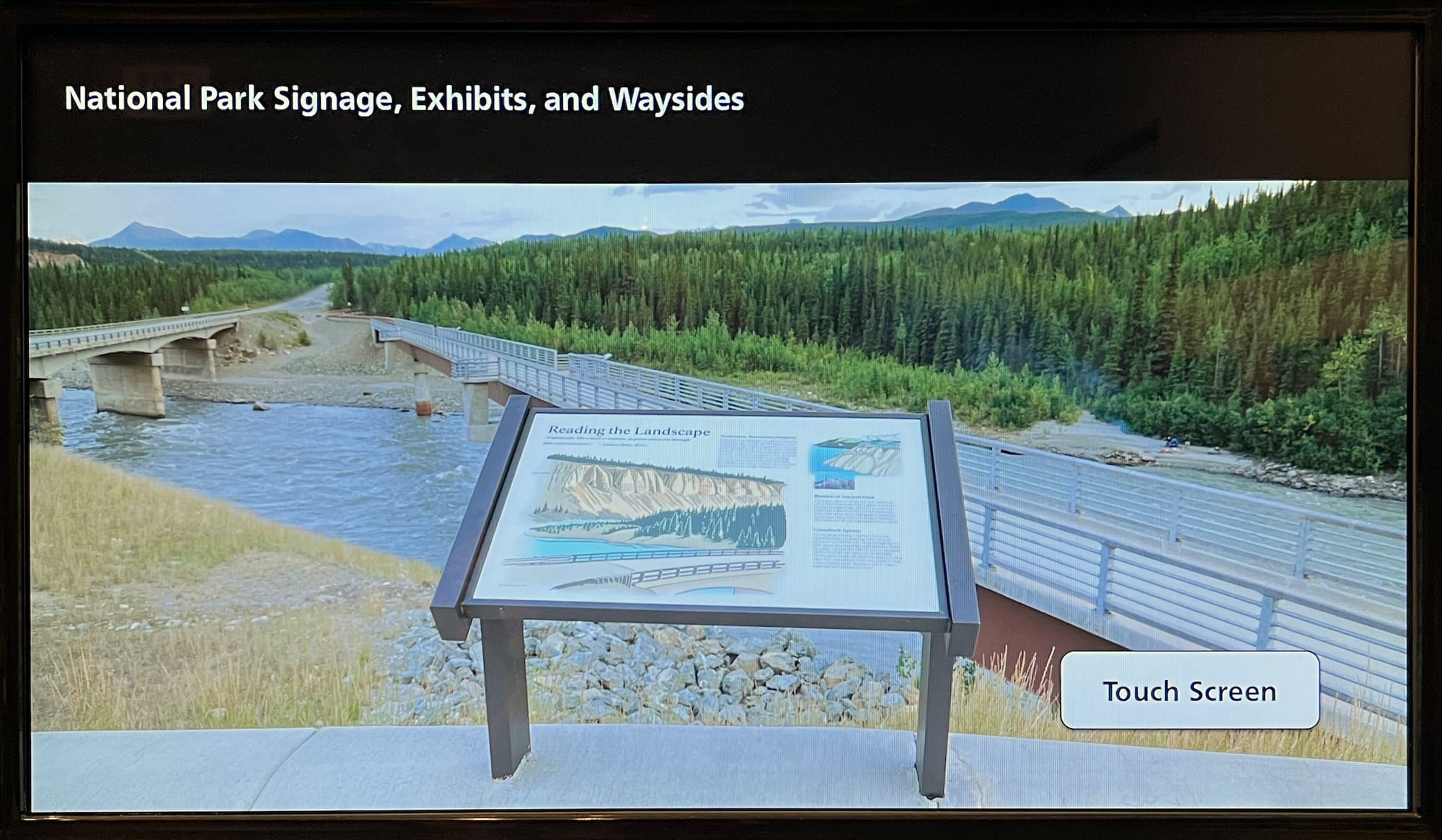
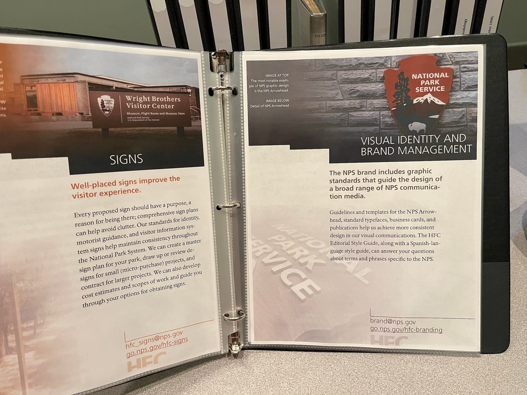
From learning that the ubiquitous “Unigrid” design template of NPS brochures was created in 1977 by none other than Massimo Vignelli, who famously helped unify the design of the NYC subway system and maps, to viewing humorously monotonous videos about how the NPS’s Harpers Ferry Center for Media Services has influenced the ways we navigate and understand the parks, the exhibit could be taken superficially as an earnest collection of miscellany for parks enthusiasts. But given the prominence of the National Parks in US mythology, along with the fact that they received over 310 million visits in 2022, and how often they are the sites of contested American history, as well as sacred places to Indigenous people, the question of how the NPS expresses and packages those layered realities is a provocative one.
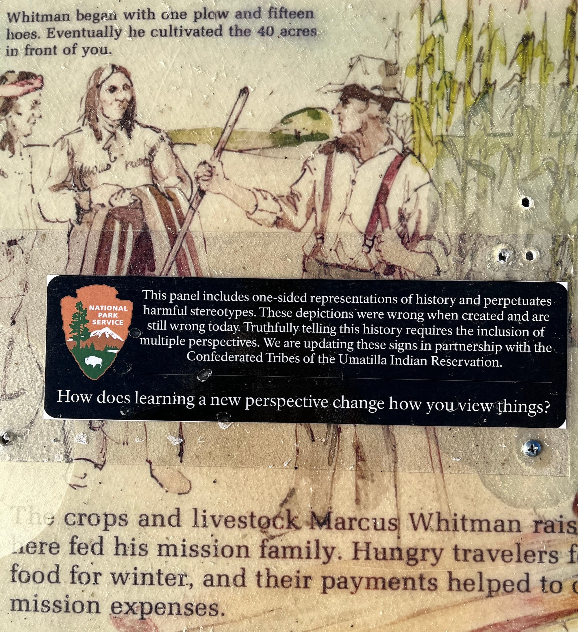
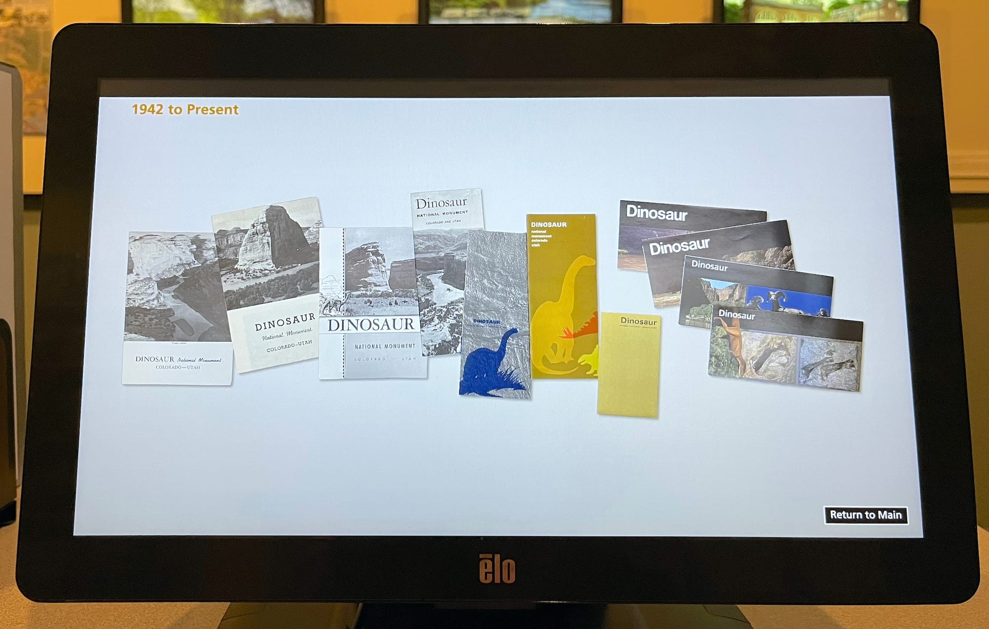
Ideas surrounding change over time stand out as one of the show's richest themes. The stories we tell are rarely stable for long. One of the videos that most directly addresses this point is “The Story of the Unigrid Brochure” (which can be streamed). The video illustrates the evolution of the Dinosaur National Park brochure from 1942 to 2020. Though video narrator Betsy Ehrlich, publications production manager for the NPS, primarily emphasizes design, she also offers gentle and consistent reminders about stories both left out and altered.
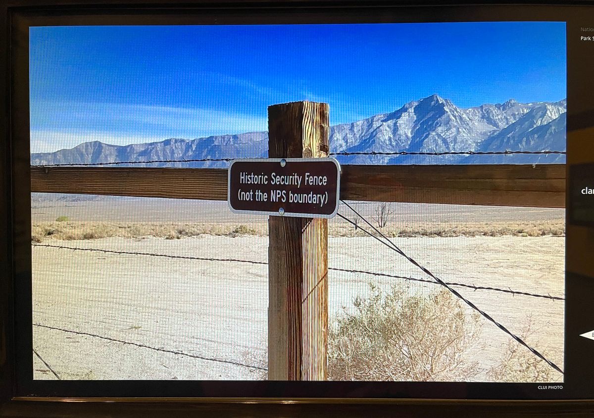
As someone who regularly visits National Parks and Historic Sites myself, the questions the show asks about shaping and shifting narratives come across as immediate and present, rather than hypothetical or abstract. While sifting through the videos and binders, I felt I was also sifting through my experiences of the places I've visited and how their stories have resonated with me. Being given a glimpse into the highly controlled apparatus of the NPS's media production brought some of my experiences into sharp focus, particularly my visit to the Whitman Mission National Historic Site in December 2021.
While I don't have the space to get into the full significance of the Whitman Mission and how the US government used what happened there to further justify the genocide of Indigenous people within the territories it sought to control, it represents one of many sites within the NPS system where the story is being reframed at this very moment. As you can see in the photo below, a terse but heavily freighted addendum was crudely affixed to every sign I passed. That small marker not only alludes to contemporary conversations about providing a more complete accounting of history, but also evokes the hundreds of years of history that preceded its creation, including the continued presence on that land of the very peoples the US government attempted to exterminate and their growing influence on the narratives constructed by those who tried to colonize them. It was a tiny moment of witnessing the slow but tectonic shifts in national storytelling that, as the CLUI exhibit reveals, are diligently being produced in the approved typography and layouts by a little-known team of government workers toiling away in their Harpers Ferry offices.
Designing Experience: Harpers Ferry and the Interpretive Infrastructure of the National Park Service continues at the Center for Land Use Interpretation (9331 Venice Boulevard,
Culver City, California) through December 3. The exhibition was organized by the Center.


