Seeing Green for the First Time
Billy Sullivan is doing something magical with green. The number his recent paintings pull off with a grassy, mossy, lush hue make for a required trip to the Nicole Klagsbrun gallery.

Billy Sullivan is doing something magical with green. The number his recent paintings pull off with a grassy, mossy, lush hue make for a required trip to the Nicole Klagsbrun gallery.
Calling a painter like Sullivan a good colorist, and throwing in a reference to Matisse for good measure, has been done. These tired bromides don’t capture the excitement of feeling like you’re experiencing a color for the first time in Sullivan’s work. It is that intense. Bitter art viewers will claim they’ve seen it all, but they keep looking at art because they hope they haven’t. Sullivan answers that hope by finding a way to make color, which we see everyday, somehow feel fresh, new and unexpected again. That’s what a “good colorist” does.
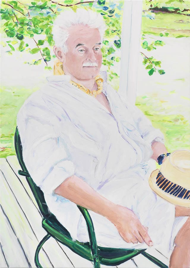
For example, in 2010’s “Keith,” various shades of green dance with each other on the picture plane. There is the dark green in Keith’s chair, the lighter, yellow-tinted spring green in the grass and then a range of mid-tones in the tree’s foliage. The mostly white clothing, white hair and light peach skin do little to compete, instead allowing the greens to take center stage. And the subtle lavender highlights in Keith’s clothes further pump up the green; purple is the hue’s chromatic foil. By allowing the shades of green to be the work’s main focus, the viewer starts to pick up on the intense differences between the darks and the lights. They barely feel like the same color anymore.
All these effects culminate when you look into Keith’s eyes and feel a burning intensity that could only result from such a thoughtful composition. That piercing sensation is lost in online reproduction, because some magic can only be experienced in person.
Sullivan grasps that the secret to making colors pop is comparison. The summery, light-color spectrum in his current work aides these juxtapositions. No color is so deep that it becomes a black hole sucking in all of the attention. Instead, all of the bright, thinly saturated colors allow the eye to jump around with ease and draw comparisons. The eye’s journey is further aided by the choice to leave out heavy black outlines, which can fence in the eye by making it focus on the designated shapes rather than allowing it to roam free among Sullivan’s unbounded swaths of color.
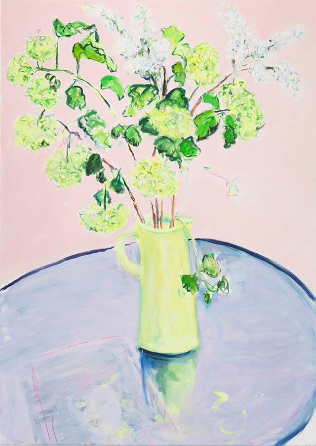
“Hydrangeas and Lilacs” (2012) plays such unfenced purples and greens off each other more intensely than “Keith.” A bouquet with several shades of green stands upon a bluish table against a plummy, reddish, lavender background. The dark green leaves and the lighter green blossoms both pop against the lavender. It’s such a lovely picture despite the fact that it blatantly excludes most of the color wheel.
Pairing a few colors and then letting them interact with one another is a theme in Sullivan’s recent body of work. Using familiar subjects like a man on a chair or a vase of flowers, he is making color feel special and unfamiliar again.
Billy Sullivan continues at Nicole Klagsbrun (532 West 24th Street, Chelsea, Manhattan) through June 16.