How Graphic Designers Around the World Interpret Shakespeare
When the Globe Theatre along London's River Thames opened in 1599, a flag depicting Hercules hoisting a globe announced the opening of William Shakespeare's Julius Caesar.


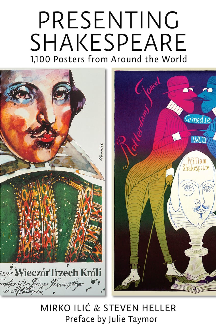
When the Globe Theatre along London’s River Thames opened in 1599, a flag depicting Hercules hoisting a globe announced the opening of William Shakespeare’s Julius Caesar. In the four centuries since Shakespeare’s death, a diverse visual language has developed around the presentation of his plays. Mirko Ilić and Steven Heller’s Presenting Shakespeare: 1,100 Posters from Around the World, recently released by Princeton Architectural Press, explores international approaches to selling Shakespeare through advertising and graphic design.
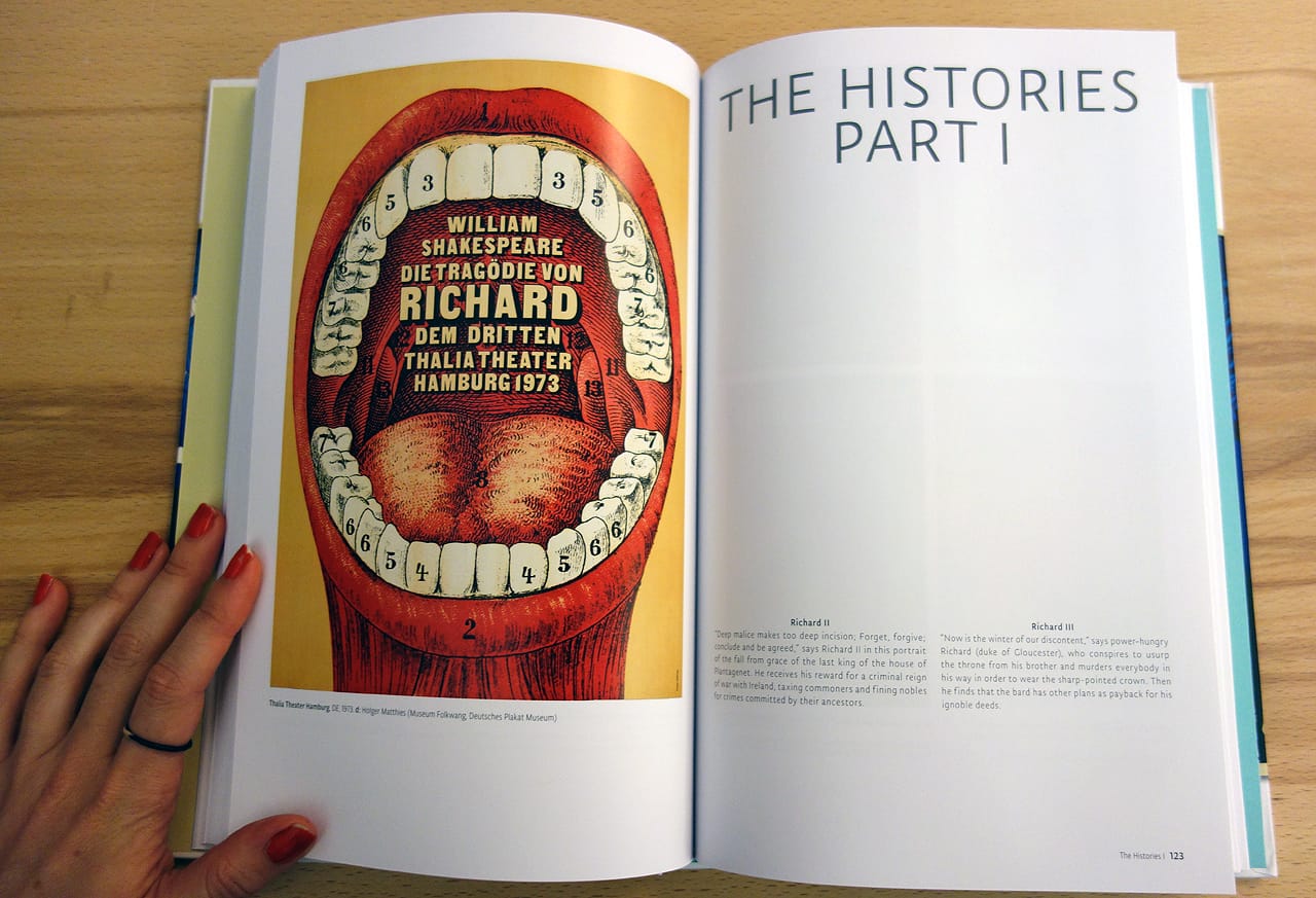
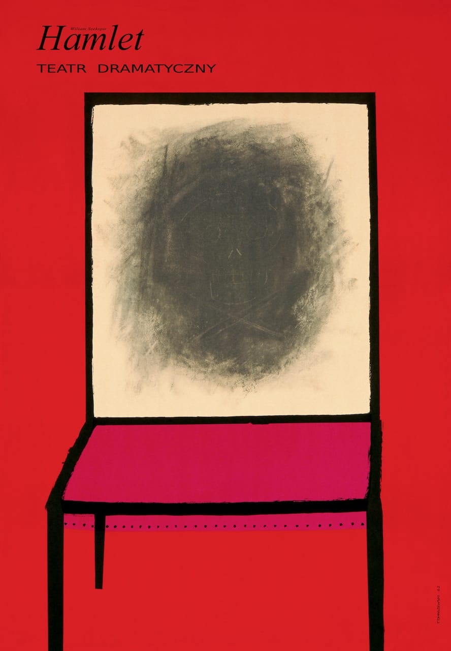
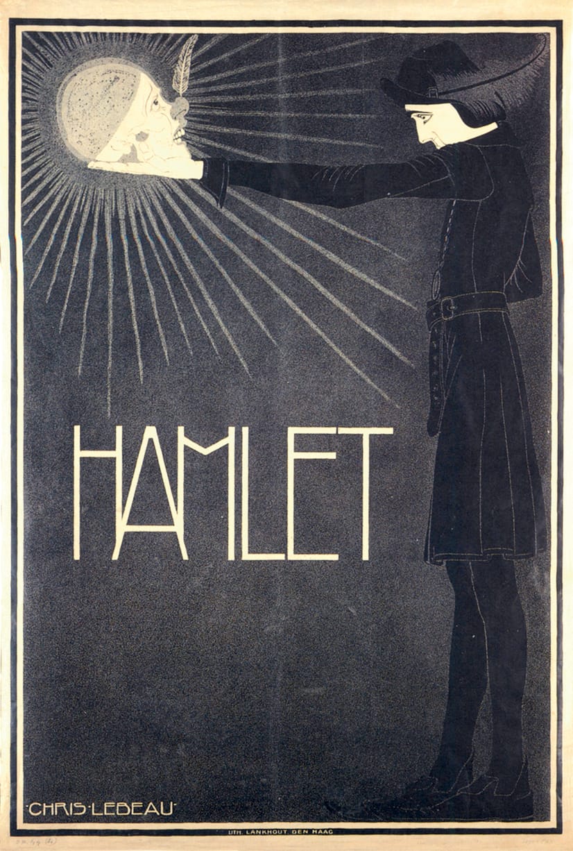
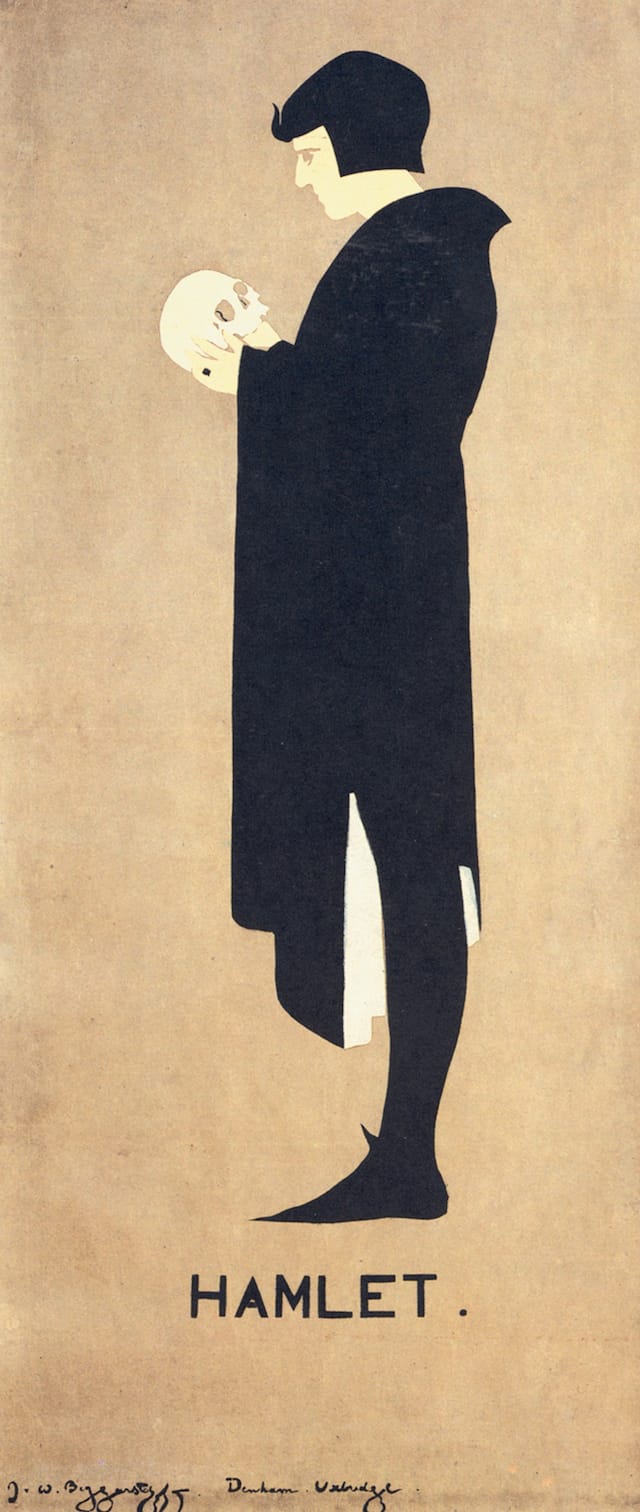
Posters only took hold as a quick and immediate medium in the 20th century, with the advent of new technology and cheap printing. Since then, graphic designers have harnessed and built upon the existing shorthand for each play, like Hamlet contemplating the skull of Yorick — an image made iconic in part by an influential minimalist poster from 1894 by the Beggarstaffs (William Nicholson and James Pryde in England).
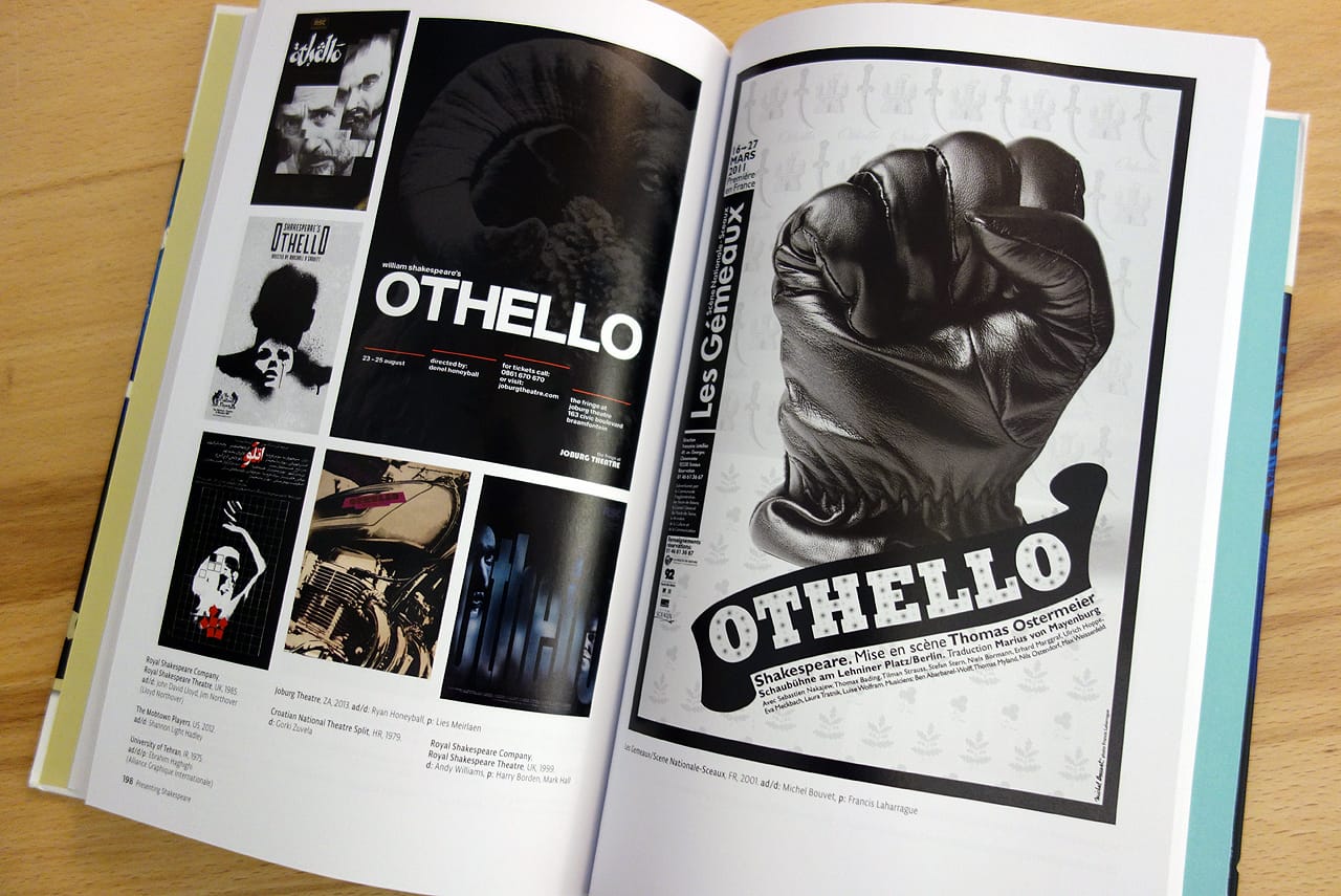
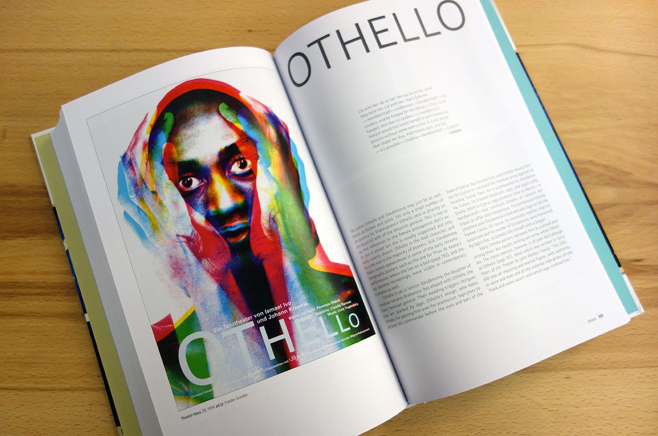
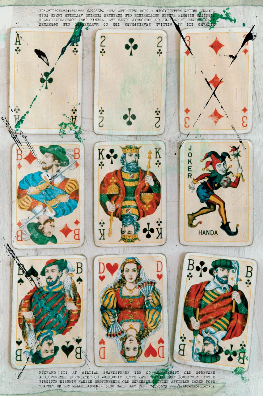
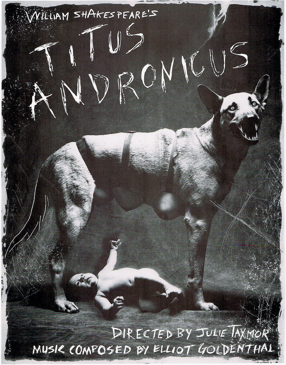
Presenting Shakespeare includes posters with heaps of roses and daggers for Romeo and Juliet, and red pigments as bright as the blood Lady Macbeth couldn’t scour from her soiled hands for the “Scottish Play.” King Lear is often defined by his useless crown, which some designers depict as a rock or piece of wood bolted to his wrinkled forehead. Titus Andronicus posters are mostly frenzies of violence, although one is just a photograph of raw meat; another from 2013 by Annette Bowery for the Royal Shakespeare Company tallies the body counts associated with various fates (characters baked in a pie = 2; limbs cut off = 7). Othello, in a 2001 poster by Michel Bouvet for a French production, is represented by a single, clenched black leather glove.
The interpretive nature of the posters has sometimes been a way for artists to evade censorship during times of political restriction. Ilić and Heller write:
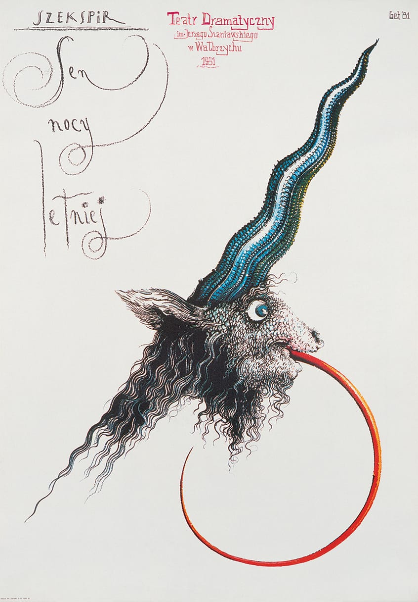
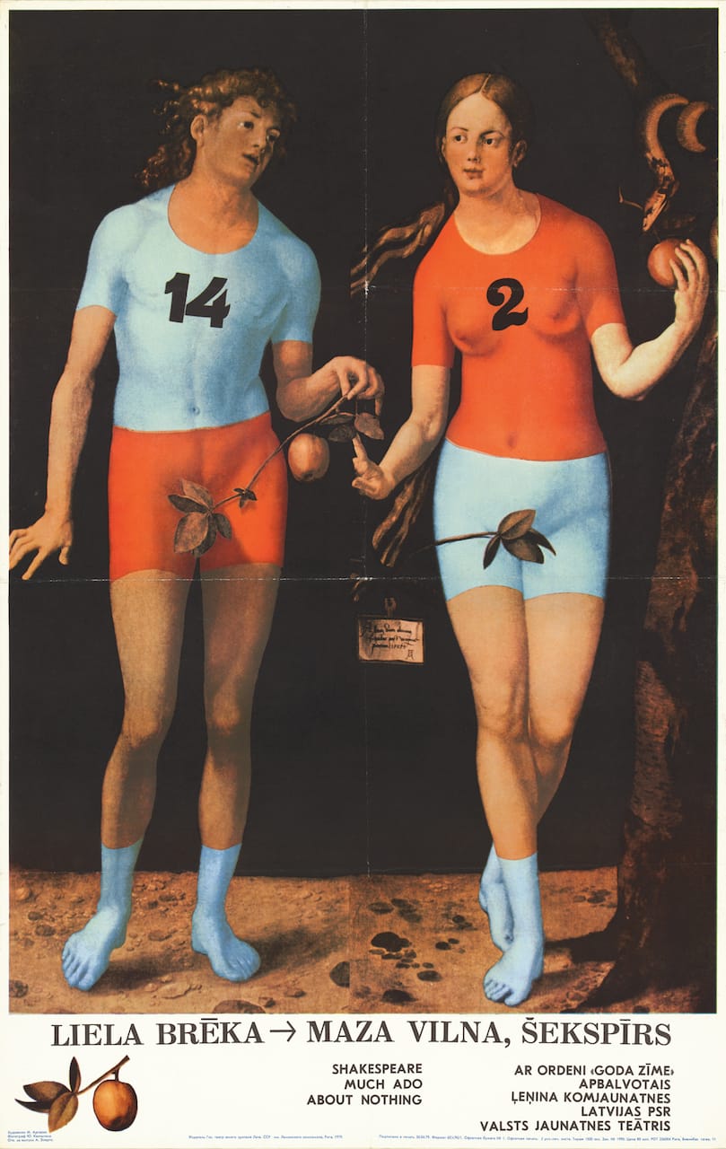
Rather than solely representational, Shakespeare’s imagery can be metaphorical. … Just as some of his plays, including Hamlet, Othello, Richard II, Merchant of Venice, and others, have been updated to reflect the social mores or politics of the moment, so too have posters first and foremost promoting the Bard’s genius provided opportunities to make statements or push the limits of contemporary prohibitions. During the 1950s through the fall of the Iron Curtain, many such posters were created by Eastern European artists; stymied by government decrees from making overt social or political commentary, they had to master the art of deception.
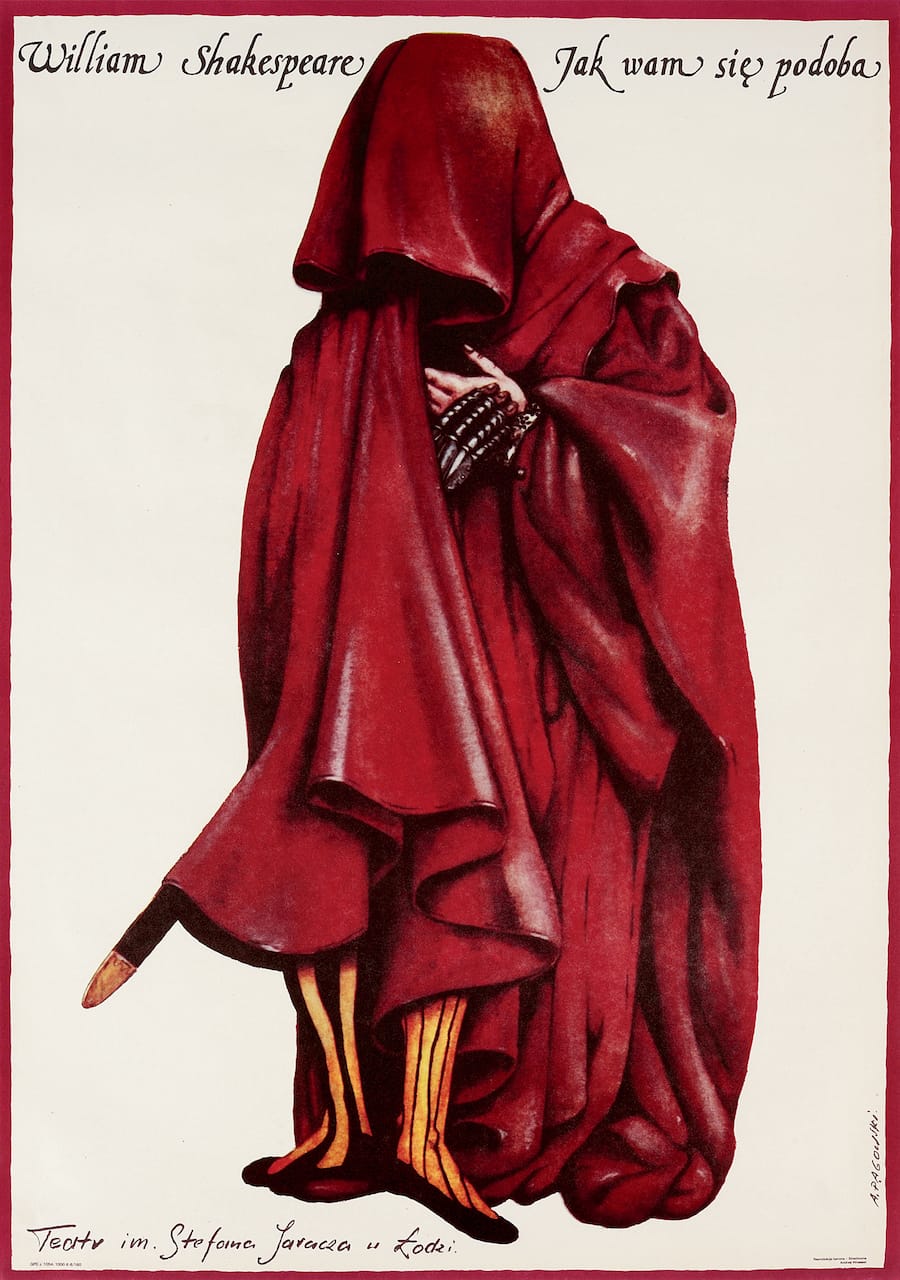
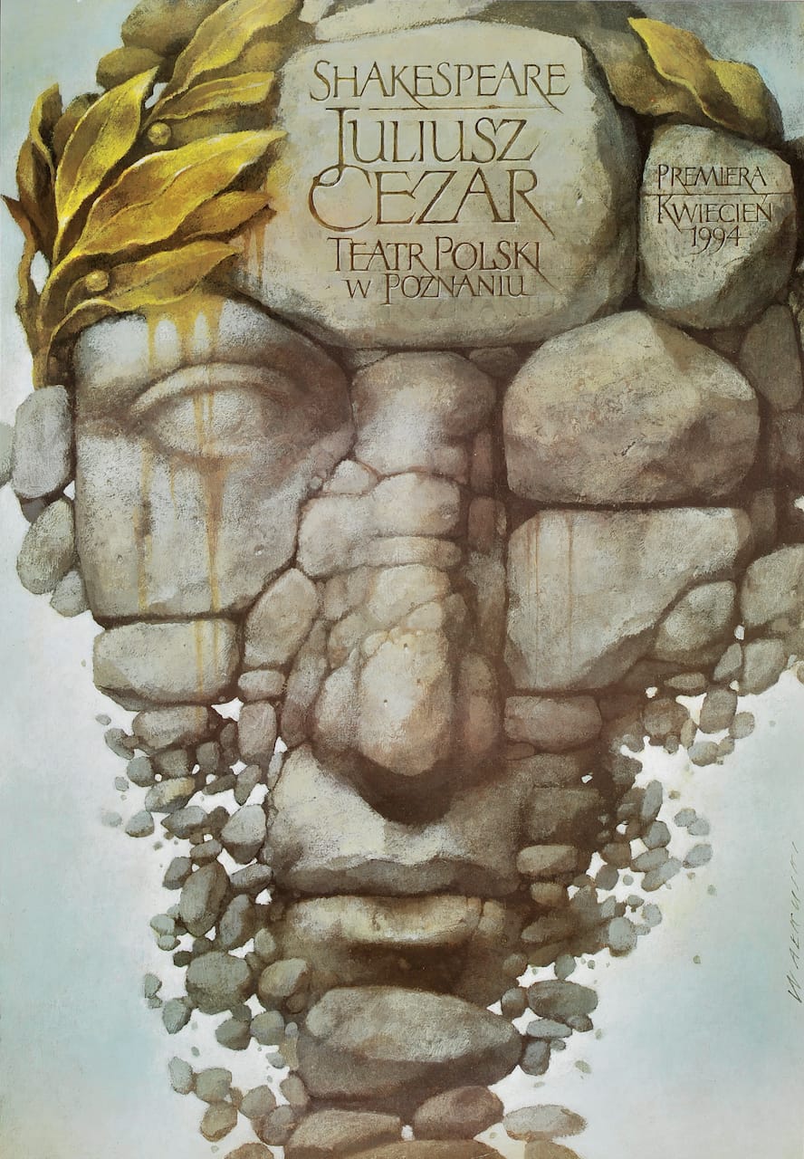
Presenting Shakespeare is mostly a visual compendium light on analysis, but with over a thousand posters from 55 countries it offers an opportunity to delve into how different cultures interpret Shakespeare’s classic stories of love, tragedy, and twisted identities. For example, Poland has particularly gripping graphics, like a crumbling pile of weathered stones by Weislaw Walkuski for a 1994 production of Julius Caesar and a 2008 poster for Romeo and Juliet by Leszek Zebrowski that gets beyond the usual daggers and roses with a simple image of an open bear trap in the shape of a heart.
As director Julie Taymor, who has staged her own Shakespeare productions, writes in a preface:
[The] greatness of a Shakespeare play is its allowance for multiple interpretations, as one can witness from the extreme diversity of posters within this book. A Midsummer Night’s Dream can be conveyed as a light, rollicking romp in the woods for one theater troupe or a dark dialectic on the perils of love, lust, and marriage for another.
Mirko Ilić and Steven Heller’s Presenting Shakespeare: 1,100 Posters from Around the World is published by Princeton Architectural Press.