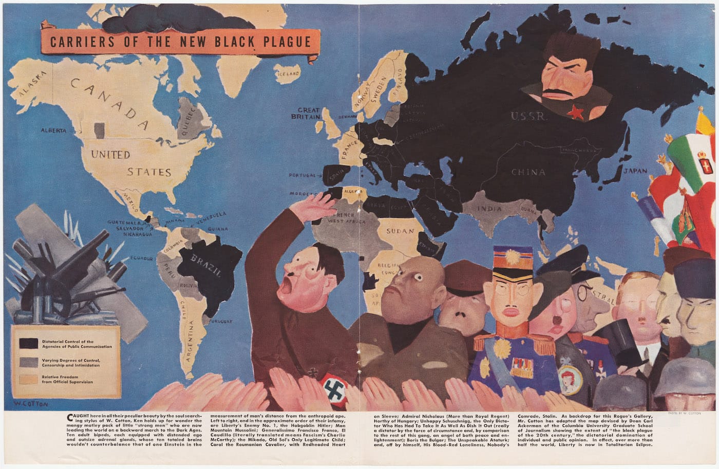
Maps Made to Influence and Deceive
Some maps are not designed to chart geography, but to express a particular belief.

Some maps are not designed to chart geography, but to express a particular belief. One of the best collections of this “persuasive cartography” is the PJ Mode Collection at Cornell University Library, with examples dating from the 15th century to the present.
PJ Mode donated his collection to Cornell in 2014, and last year over 300 digitized maps from the PJ Mode Collection were released online in high resolution. Cornell is continuing to add to these digital holdings, which only recently have been a focus of scholarship.
Sometimes called cartographic propaganda, these maps are often contrary to everything we think a map to be: a truthful representation of the world. Yet every map is in a way subjective, with the cartographer choosing text, colors, and perspectives. Consider our standard world maps, where a three dimensional planet is being depicted flat. Some of its size distortions date back to 16th-century projection work by Gerardus Mercator. For instance, Africa appears smaller than Greenland on Mercator maps, when it’s actually around 14 times larger than Greenland, a distortion that has long skewed the public perception of the country. Currently, maps of the United States colored in red and blue are influencing our understanding of the current presidential campaign. Even back in the Greco-Roman World, as explored in the 2013 exhibition Measuring and Mapping Space at the Institute for the Study of the Ancient World at New York University, maps were employed to plot a shape of the world that could be controlled, and emphasize the size of the Empire.
The PJ Mode Collection maps are much more overt with their bias. Mode, who began collecting in the 1980s, states on the Cornell site: “Every map has a Who, What, Where and When about it. But these maps had another element: Why? Since they were primarily ‘about’ something other than geography, understanding the map required finding the reasoning behind it.” Mode gave a lecture this May on the subject to the Grolier Club and the New York Map Society, which is available to watch online.
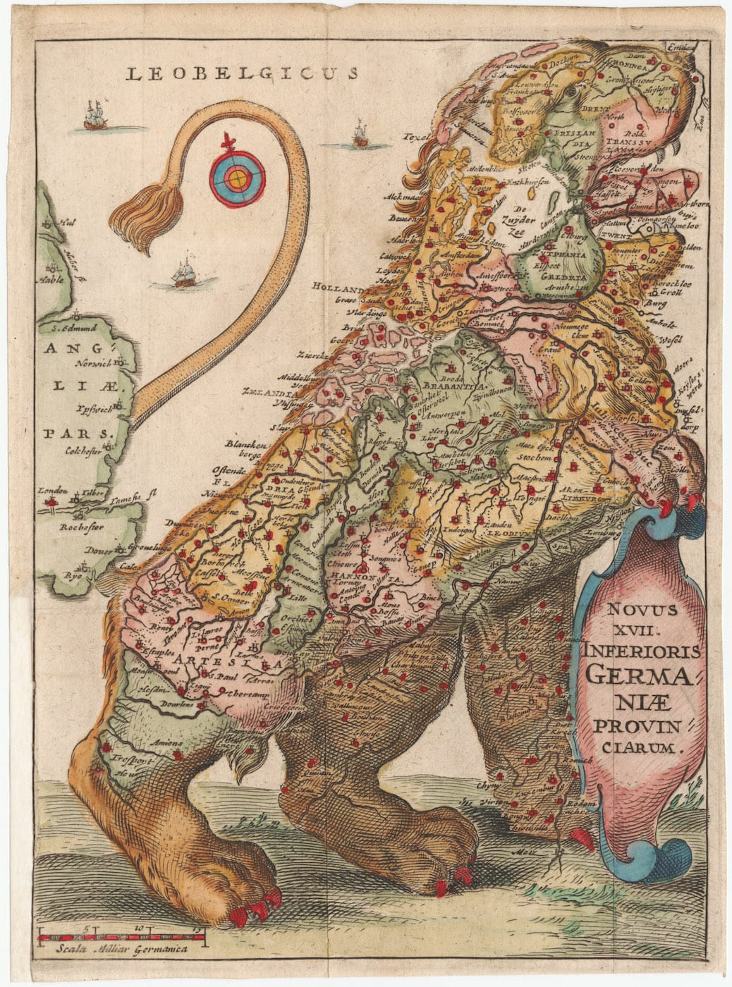
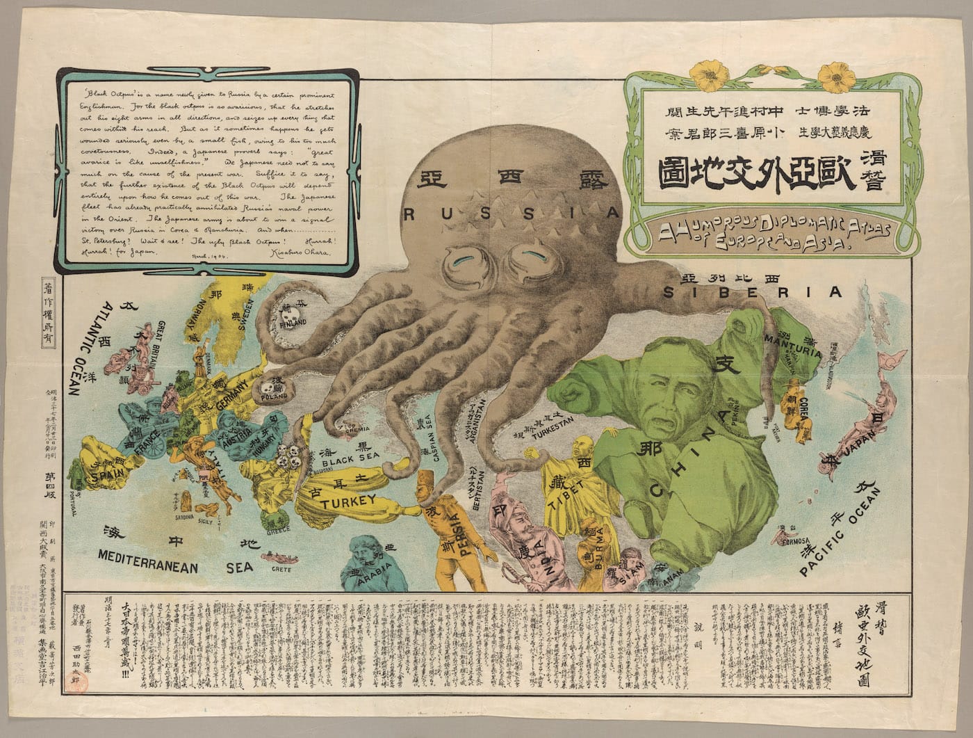
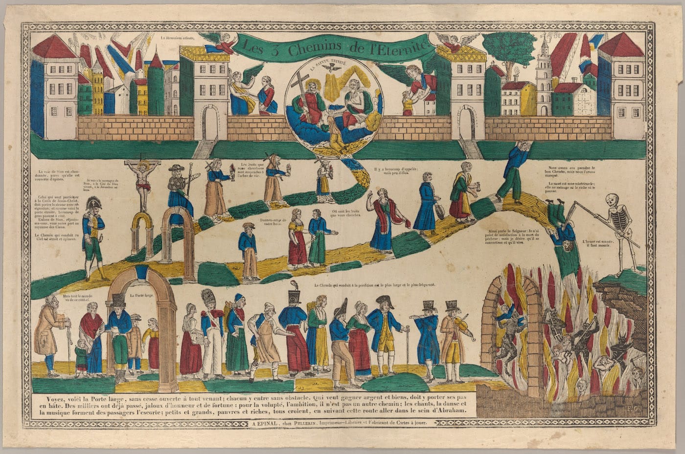
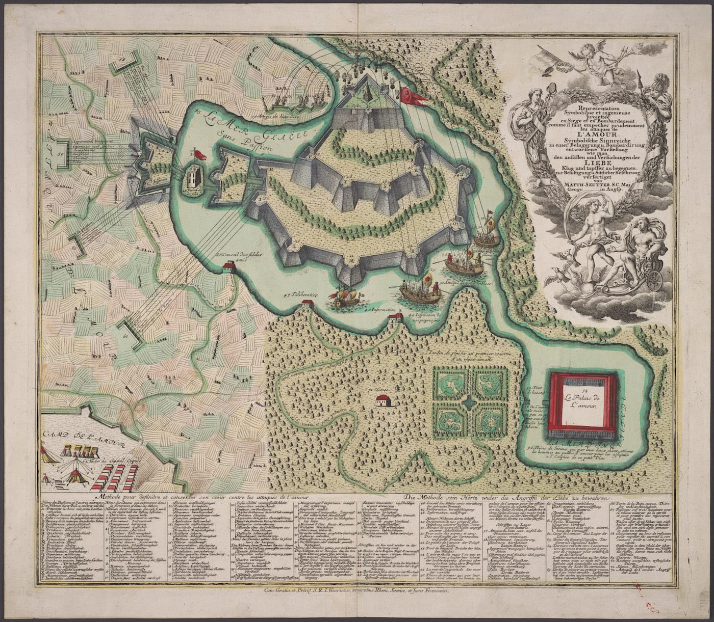
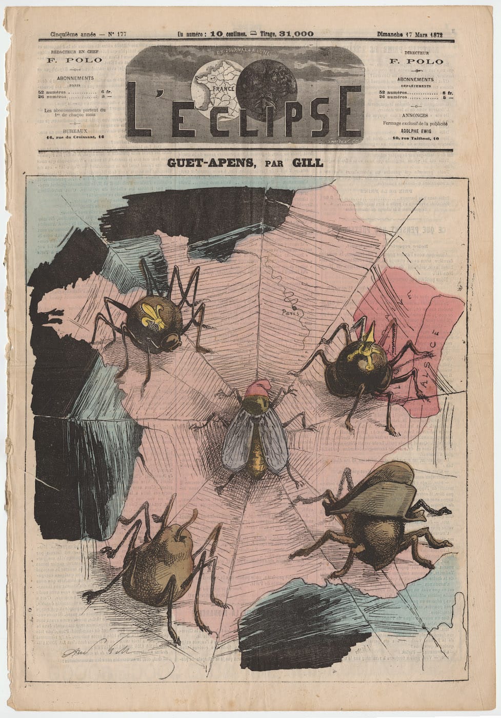
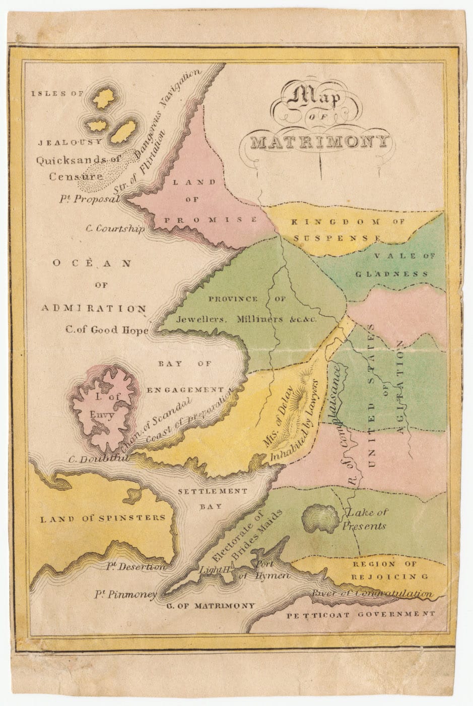
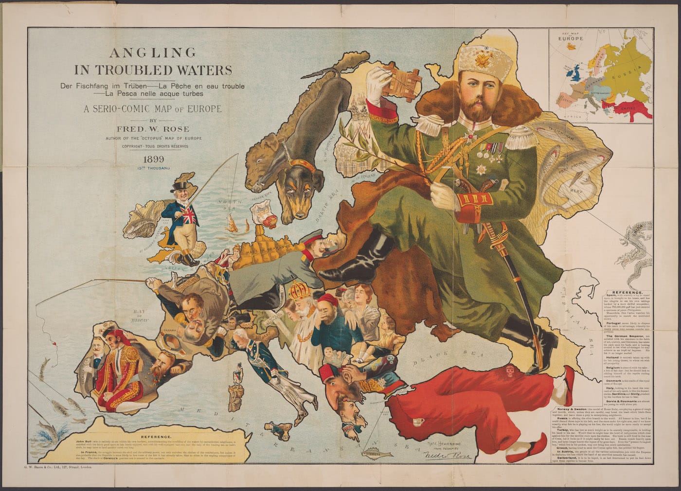
You can browse the collection by date and subjects, like ethnocentrism, religion, imperialism, and conduct of life. Many are political, like a 1904 map from Japan where Russia is depicted as an octopus grasping countries with its tentacles. Frequently, they are more pictorial than purely cartographic, such as an 1872 map from L’Eclipse magazine showing France as a web and its citizens as caught flies, circled by spiders representing the Napoleon III, the Third Republic, Bismarck, and the Royalists.
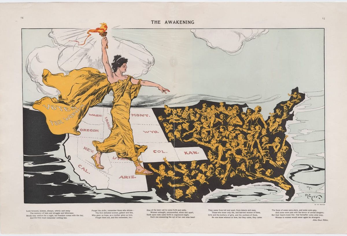
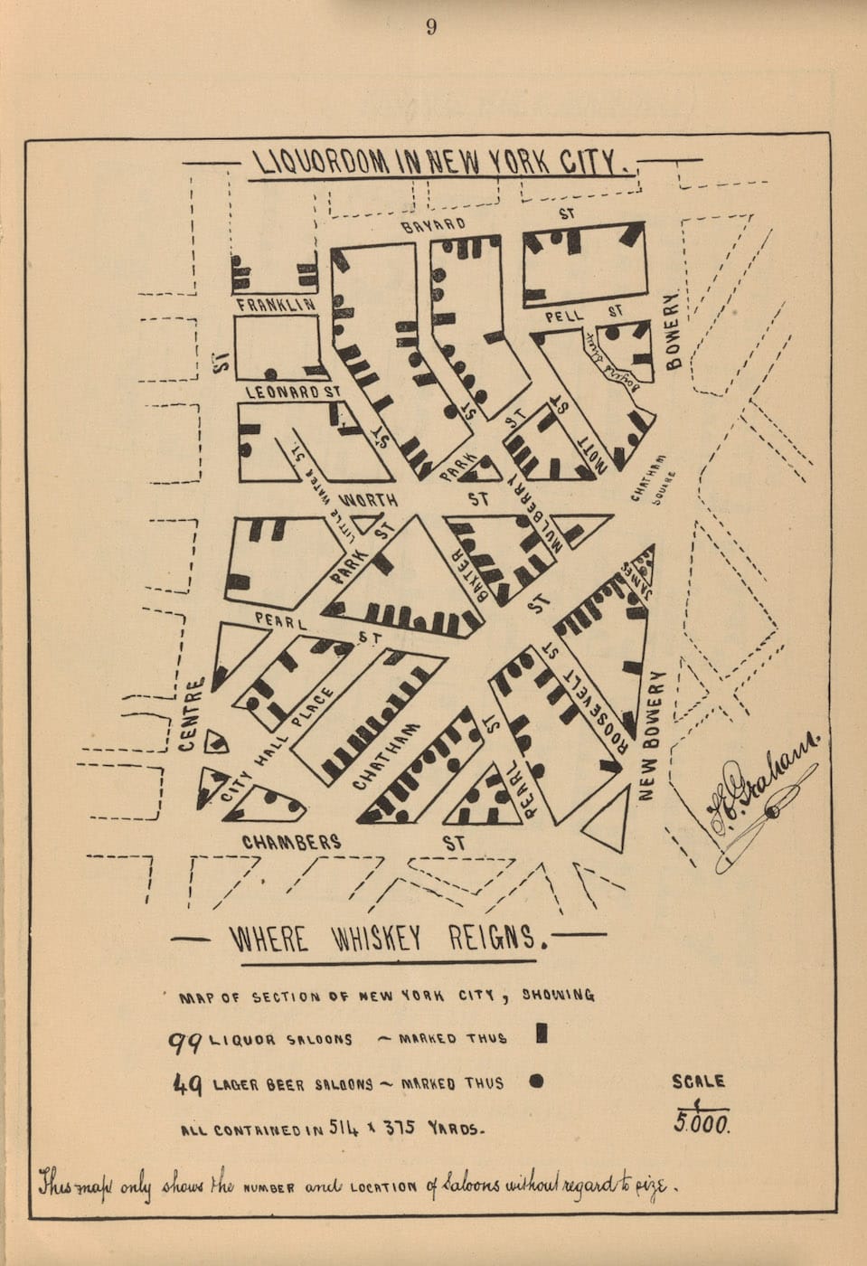
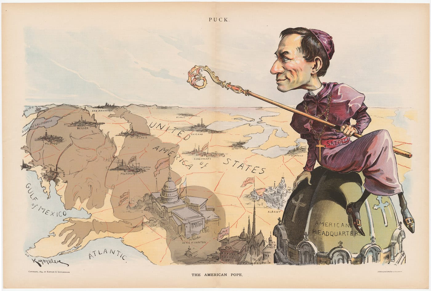
Social movements like temperance and women’s suffrage in the 19th and 20th centuries utilized maps to compel the public. An 1889 map by William T. Hornaday illustrated the extermination of the American bison and helped with his advocacy for their survival. W. T. Stead’s 1894 map of vice in Chicago packs the grid of the 19th Precinct with brothels, pawn brokers, saloons, and lodging houses, the induced anxiety similar to the use of color on an 1895 map of Manhattan with “concrete socialism” in bright red and private enterprises in white. Others are vividly reactionary, like a satirical 1894 “The American Pope” anti-Catholic cartoon where the shadow of a cardinal is cast over the country and its public schools.
Below are more examples from the PJ Mode Collection, among the over 300 you can find online.
The PJ Mode Collection from Cornell University Library is available to explore online.