The Wild World of the Hairy Who
The Chicago version of Pop Art, embodied in the work of the Hairy Who, is sweaty, nervous, sometimes giggly or goofy.

CHICAGO — No one, to my mind, embodied the spirit of 1960s Chicago like Penelope Rosemont. Rosemont, along with her husband and creative partner, Franklin Rosemont, was at the center of the scrappy Chicago Surrealist Group and worked with Students for a Democratic Society and other radical groups to help instigate the protests at the 1968 Democratic National Convention. I once had the pleasure of speaking with her about those momentous days, which she described as a heady mixture of outrage, terror, camaraderie, and high spirits — a combination that, during the convention, caught the imagination of the world. “Not bad,” she said, “for a bunch of kids.”
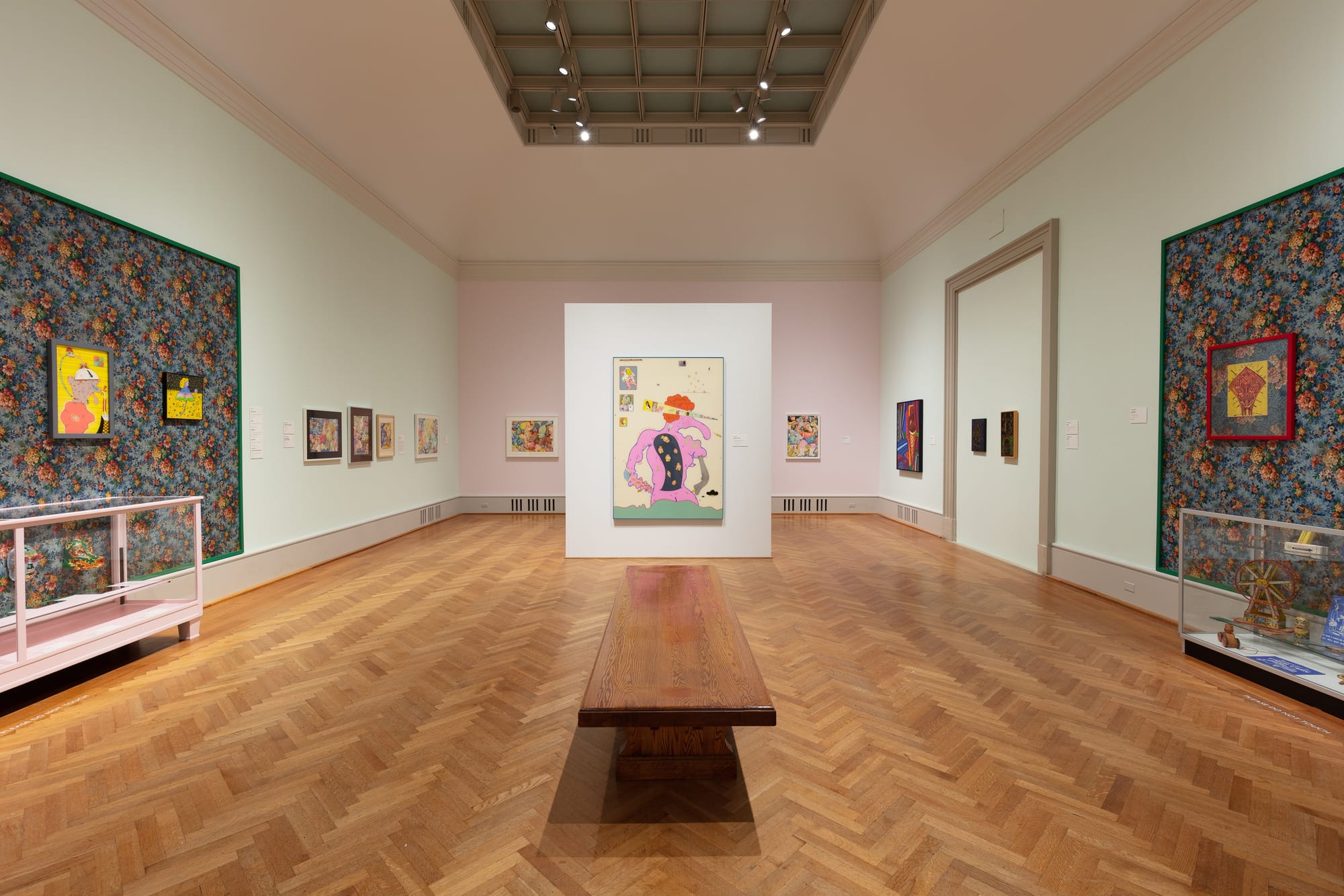
The Art Institute of Chicago has worked hard to bring us back to the late 1960s, with Hairy Who? 1966-1969. The exhibition, curated by Mark Pascale and Thea Liberty Nichols, seeks to recreate the six exhibitions that took place between 1966 to 1969, organized by and showcasing the group of Chicago artists calling themselves the Hairy Who. The remarkable thing is the degree to which the curators have succeeded in crafting not only a survey of the group, but also a feeling for how their work was a response to a particular time and place.
The critic Franz Schulze once referred to the period that gave rise to the Hairy Who as “the dark, forlorn mid-60s, when Chicago as an art town was little more than a way station between Mighty New York and the hopping new West Coast.” This feeling was shared by others: Chicago poet Michael Anania called his city “a very small town within a vast metropolitan area.” Under such conditions, young artists found it difficult to exhibit for lack of venues. When Jim Falconer and Jim Nutt, both products of the School of the Art Institute of Chicago, approached Don Baum, then-chairman of the community-based Hyde Park Art Center, with a plan to exhibit their work, along with their classmates Gladys Nilsson, Art Green, and Suellen Rocca, they weren’t concerned with the grossly inadequate HPAC facility, with its bad overhead lighting and oddly configured space. They were simply hoping to find walls on which to hang their work, and were delighted when Baum decided to take a chance on them, and their classmate, Karl Wirsum, whose work he was championing.
Wirsum inadvertently named the group when he walked into a meeting where the others were discussing the Chicago radio art critic Harry Bouras and said “Hairy who?” Their first show was a local hit, as were others at the HPAC in 1967 and 1968. Soon after, the group began exhibiting outside Chicago, showing at the San Francisco Institute of Art in 1968 and the School of Visual Arts in New York and the Corcoran Gallery of Art in Washington DC in 1969.
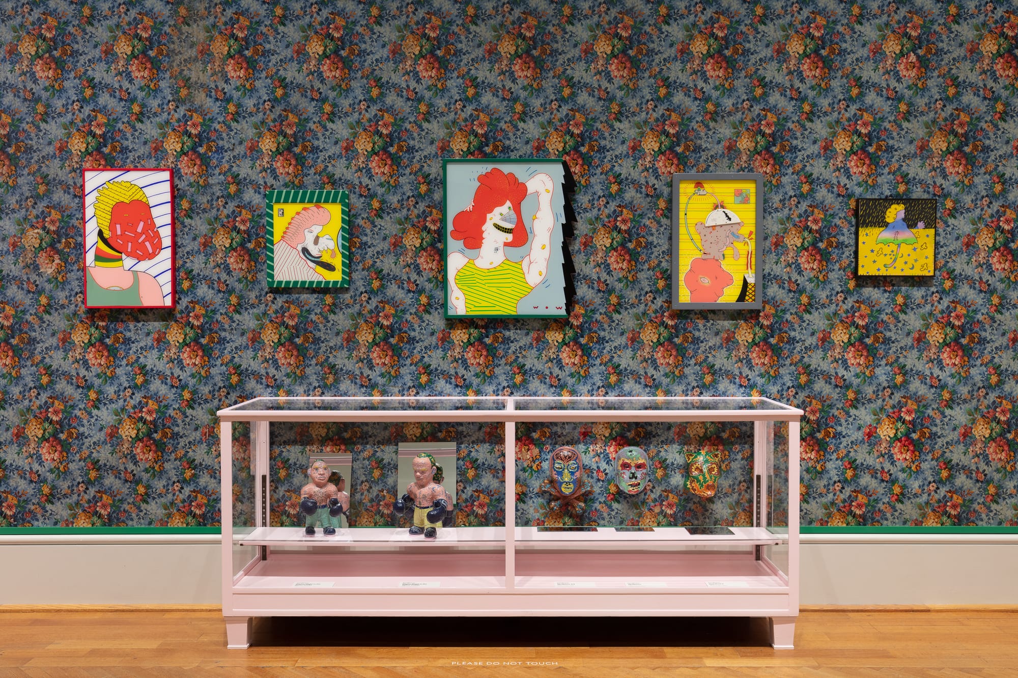
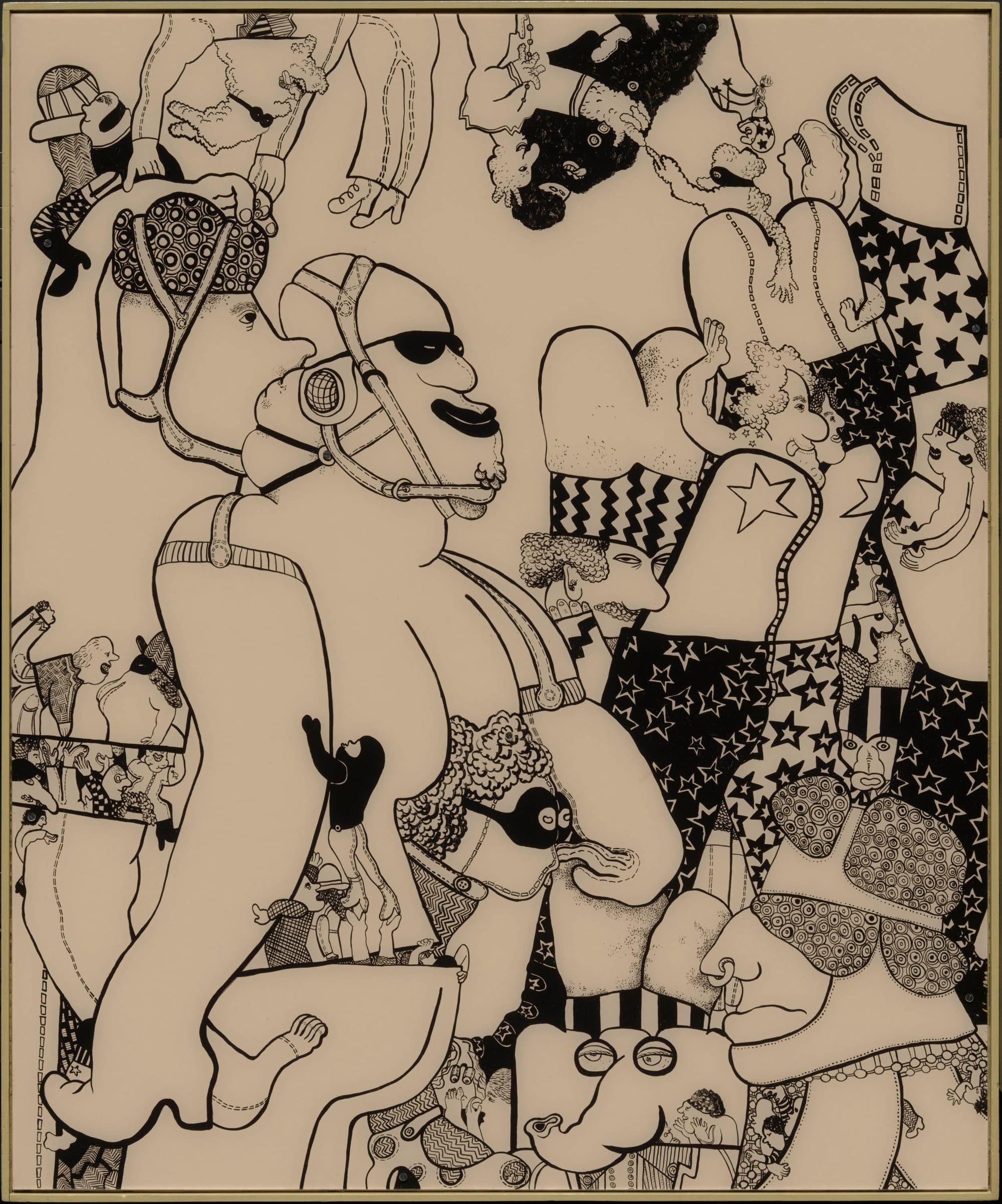
While the work is related to Pop Art, the Hairy Who drew primarily from a vast array of popular imagery, including music festival posters and comic books (Wirsum had dreamed of being an artist for DC Comics, specializing in horror), graffiti and tattoo parlor flash art, advertising and catalog illustrations, and the colorful graphics on pinball machines — the latter inspired Nutt, Wirsum, and Nilsson to paint on Plexiglass. Absent from the work is the deadpan canniness of Andy Warhol and Roy Lichtenstein’s cool irony. The Chicago version of Pop isn’t cool at all: it’s sweaty, nervous, sometimes giggly or goofy. At the third HPAC show, and again at the Corcoran, the Hairy Who embraced the tacky commerce of American popular culture, attaching large, cardboard price tags (“$199.99!”) to artworks and displaying them alongside vitrines of tin toys, cardboard advertising displays, and pulp publications, as well as painted lawn chairs, toys, and a mailbox on a post — the demotic printed and sculptural forms of American life assembled to conjure a joyful gesamkunstwerk reflecting Chicago’s Maxwell Street Market, a favorite hangout for several members of the group, and a place where blues musicians, street vendors, hustlers of all stripes, and members of the area’s diverse immigrant communities jostled shoulders in the shadow of the Loop.
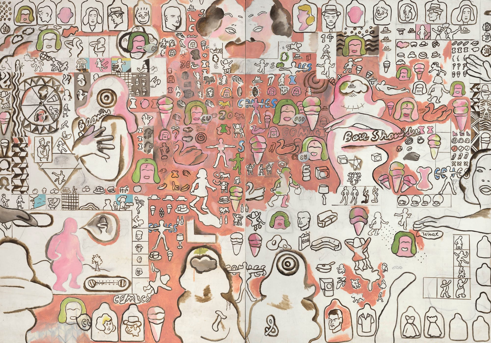
Suellen Rocca’s works, such as “Bare Shoulder Beauty” and “Curly Head” (both 1966), incorporate text that echoes advertising copy, while dividing the picture plane into strips and panels of near-narrative image sequences reminiscent of comics strips. In these works, as in the larger and more ambitious “Suellen’s Corness Painting” (1967), human figures, as well as stockings, rings, and palm trees, appear in outline, some framed in ragged squares, like postage stamps. In other works, such as “Game” (1966–67), human figures drawn in outline are brightly colored or surrounded by radiating lines, in a manner later made famous by Keith Haring.
Equally drawn to vernacular imagery, Jim Falconer’s canvasses are crowded with floppy, wriggly forms adapted from popular sources: “Morbid Sunshine by a Miner Artist” (1966), for example, features a central figure in bright yellow and a black top hat, looking like a wobbly version of the Planter’s company’s Mr. Peanut, surrounded by similarly cartoonish forms. The painting glows with saturated yellows and oranges. The vibrant, happy colors and the figures’ cute bendiness and smiling faces sit uncomfortably with the horribly violent acts they perpetrate on one another: bloody knives and severed limbs are jammed into the thronging space. The mood perfectly encapsulates the moment, as relentlessly upbeat and populist as the fantasy world conjured by American commercial culture, and as saturated with violence and menace as Vietnam-era American reality.
Gladys Nilsson’s canvases are crowded with rounded and inflated figures, reminiscent of Fernando Botero’s, that seem to push outward, demanding ever more space for themselves. Her exquisite skill as a colorist is evident even when she limits her palette to black, white, and one or two other colors, as in her Plexiglass works. Hers is by far the most joyful art of the group.
Nilsson’s pop culture influences can be as contemporary as those of her peers — “Mt. Vondervoman: During the Turest Rush” (1967), for example, portrays an enormous Wonder Woman in soft colors, surrounded by smaller figures — but her works are often tinged with nostalgia, invoking burlesque (“Starry Stage Ladies,” 1967) or the clothing of an earlier time (the monocles and hats of “The Scolding,” 1966). Like Falconer, she can inflect chipper, upbeat iconography with hints of danger: “Duck Patrol” (1966) depicts cute, puffy animals in pastel pink and blue wearing vaguely military hats in the foreground, with a banner recalling the Viet Cong’s flag in the background.
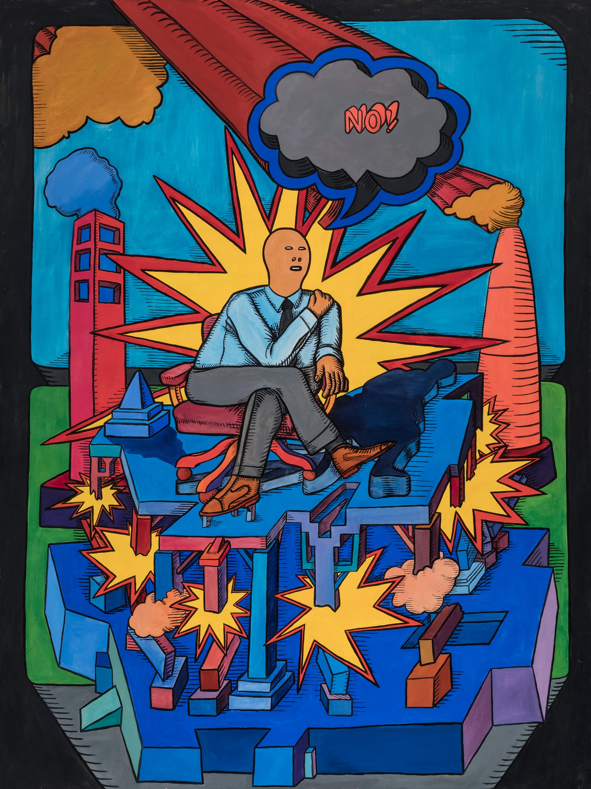
The works of Art Green and Karl Wirsum express the era’s growing sense of crisis more directly. Green’s magnificent “Consider the Options, Examine the Facts, Apply the Logic” (1965) is the first work to confront the viewer entering the exhibition, and it makes a powerful impression. Large by the standards of the Hairy Who, its central figure — a man in a blue Oxford shirt and tie — sits in an office chair atop a complicated structure that is being destroyed by bright yellow, cartoonish explosions. He is framed by a similar explosion, and flanked by what appear to be a smoking skyscraper and factory chimney. Above him is a speech bubble bearing the single, emphatic word, “No!”
The painting was inspired by a magazine image of Robert McNamara, that well-meaning, misguided architect of the Vietnam war. It shows a middle or upper class white man attempting to be decisive, even as the very framework supporting him is violently disintegrating. Similar men in crisis appear in other works by Green, notably “Occupational Hazards” (1966), in which a three-faced man in a suit walks obliviously off a structure, as if it’s a pirate ship’s plank. Green is the artist laureate of the decline of white male authority, the painter of the end-times of that phalanx of Kennedy and Johnson administration over-reachers, described by David Halberstam as “the best and the brightest.”
More minimal than Green’s compositions, Karl Wirsum’s paintings often consist of a single, central figure staring directly at us (as, for instance, in “Youdue,” “First Quarter of Moon Dog,” and “Spawning a Yawn with a Yellow Awning On,” all 1966). The effect is strongly confrontational: these are figures that force themselves on our attention. Wirsum’s sculptural works — which include small, brightly painted figures of boxers, masks of dogs, or skulls that evoke Dia de Los Muertos — similarly concentrate their energies into a single, confrontational gaze, looking out at us in a kind of challenge.
What really holds the Hairy Who together on a formal level is the members’ shared emphasis on line (likely a result of their education at SAIC, which emphasized drawing). No one draws a wiggly, wavering line better than Jim Nutt. Nutt’s flat figures in works such as “Lippy” (1967) and “Wowido” (1968) reveal the influence of underground comix, while their distorted features, accentuated by warts or dripping mucus, show a proclivity for the grotesque.
While their embrace of vernacular culture distinguished the Hairy Who artists from New York’s disaffected Pop artists, it wasn’t just popular culture that influenced the Hairy Who’s visual vocabulary. They studied the classics of painting, and we can see it in the work: German Expressionism in Jim Nutt’s aesthetic; El Greco in Jim Falconer’s elongated figures; and Piranesi in the complex, sometimes impossible architectures in Art Green’s paintings.
Curators Nichols and Pascale should be applauded for their efforts to recreate the look of the original Hairy Who exhibitions. They have installed works from the different shows in different rooms and, where appropriate, displayed their Maxwell Street finds and hung their paintings against gaudy, patterned linoleum. They have also assembled, in a separate space, a large collection of the posters, price tags, other graphic ephemera produced by the Hairy Who in conjunction with the original shows.
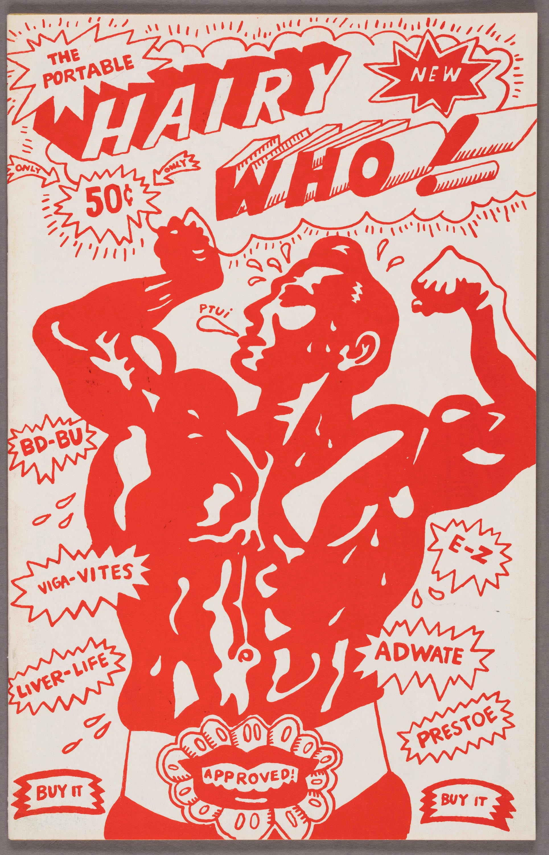
One highlight of this is a display of the comic books produced by the artists to accompany the original shows in lieu of catalogs. Another highlight is the effort taken to represent the Hairy Who’s New York show, which was virtually undocumented. One can only imagine the archival sleuthing that was involved.
But one thing the Art Institute cannot reproduce is the raffishness of the original shows, their provisionality and brashness. As Don Baum put it, the original shows created “a non-gallery situation for non-high art.” It is inevitable, when a museum as distinguished as the Art Institute mounts a commemorative exhibition like Hairy Who? 1966-1969 that a certain sense of consecration or veneration creeps in. So it is important, when looking at the work on display, to remember the youthfulness, the cheekiness, the going-on-one’s-nerve that was involved.
And it is important, when stepping out of the Art Institute and standing between the stone lions beneath the neoclassical façade, to think back on the exhibition and say, “not bad for a bunch of kids!”
Hairy Who? 1966–1969 continues at the Art Institute of Chicago (111 South Michigan Avenue, Chicago, Illinois) through January 6, 2019.


