In Defense of Jonathan Yeo’s King Charles Portrait
Just like Velázquez’s last portrait of King Philip IV of Spain, Yeo’s blood-red painting signifies the imminent downfall of a monarch.
In 1656, King Philip IV of Spain commissioned a portrait by Diego Velázquez, his longtime court artist. It’s a plain, dark portrait. The king is partly facing the observer and is only visible from the chest up. His face is long; his eyes solemn, tired. His skin is pale — the sole traces of color are in his bright pink lips, which emphasize an overbite, and a pale reddishness around his nose, suggesting illness. He wears a black cloak and a muted pendant of a chivalric order, far from the opulence one might expect from a royal portrait.
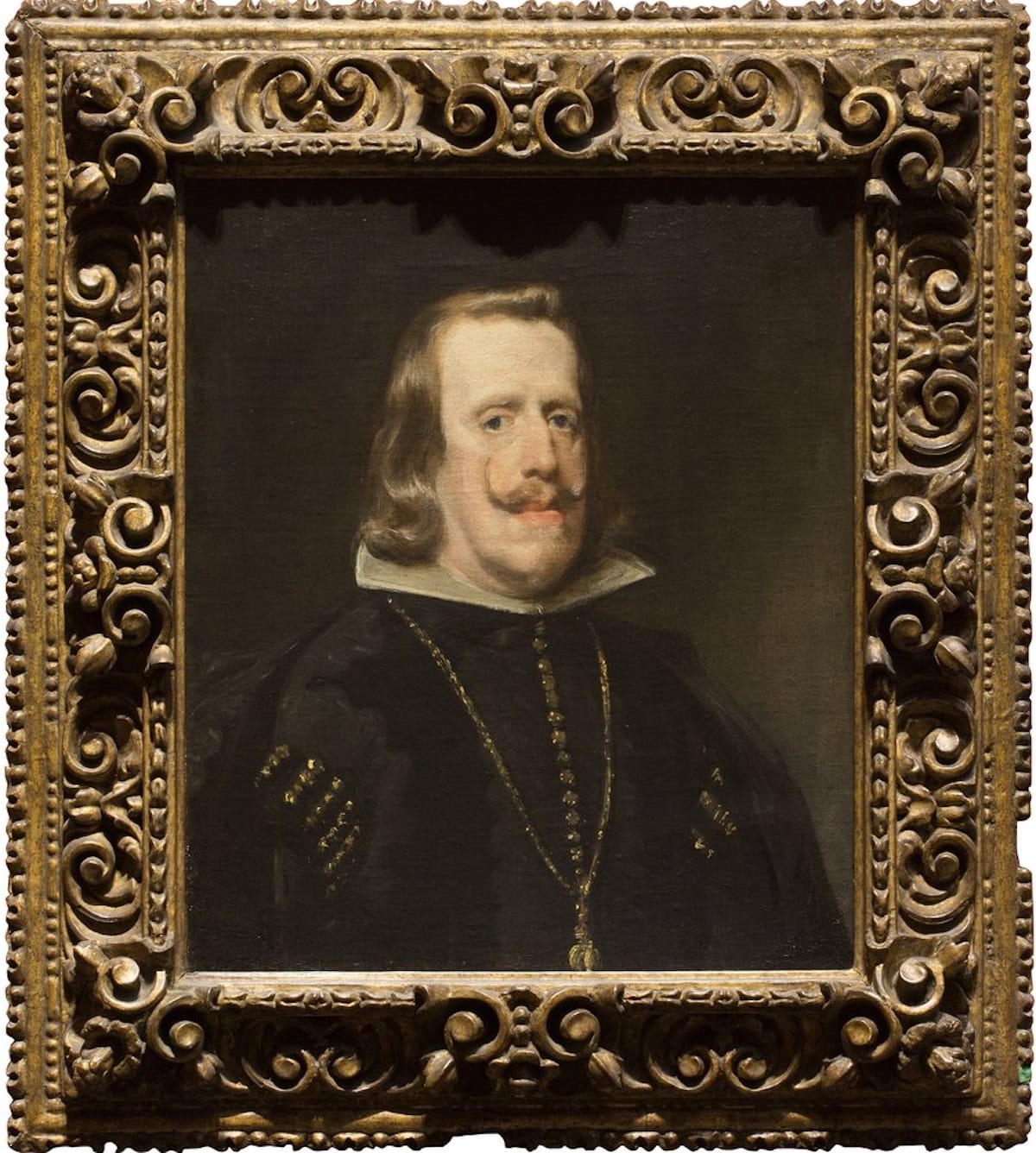
The painting, now held at London's National Gallery, was commissioned in the last decade of Phillip’s life and eight years after the end of the brutal Thirty Years’ War, which caused a bourgeoise rebellion that stripped him of his rights to Portugal.
When you consider, too, that Velázquez painted Philip’s portraits throughout his reign, we can gain deeper insight into the gravity of this particular work. His earlier portraits are brighter and more colorful, and the composition usually included his full body, standing upright, strong, holding the hilt of a sword, and confident in his position. The 1656 portrait, however, says just as much about Velázquez and the power of the court painter as it does about Philip himself.
I wonder, with the access Velázquez had, if he was trying to tell us something about the state of the king’s health or his mental well-being. I wonder, too, if the king approved of the portrait. And it’s by these same metrics that I’d like to look at the portrait of King Charles III by Jonathan Yeo, unveiled earlier this month by the subject himself.
I think the portrait is technically beautiful and, as far as portraits of royalty go, daring in its ethereal style, which departs from the typical bold, sculpted hyperrealism of official portraiture.
Charles’s face is reminiscent of Lucien Freud’s style, which has influenced Yeo’s previous collage work, namely of Freud himself and of former United States President George W. Bush made out of pornographic magazines. Additionally, it bears a shocking resemblance to Francis Bacon’s “Head VI” (1949) through the color fading around the figure.
Speaking of color, there’s so much red in this portrait that it’s almost a Rothko. Why did he portray the British monarch as if floating in a pool of blood? Why does said pool appear to be eating away at his military dress, overwhelming other tones in the garment?
Was this all on purpose?
With regard to the composition of the work, Yeo has only said that he wanted to portray Charles in his military wear and to include a monarch butterfly landing on his shoulder to suggest his transformation from prince to king.
Sure, sure. But what about the decision to wrap the figure in red? Yes, yes, the British Empire is usually associated with red through most of their ceremonial and national colors. But would not limiting the red to the uniform and opting for a different background have emphasized a sense of control, stature, and power better than diffusing red all over the composition? Yeo said the king “was initially mildly surprised by the strong color but otherwise he seemed to be smiling approvingly." But still, why is there no commentary on this from the artist? Why did Charles stumble back in shock at the painting?
Additionally, the butterfly is an age-old symbol of British “adventurism,” attributed back to Robert Baden-Powell, the founder of the Boy Scouts and leader of the UK’s colonial campaigns against the Boers in South Africa whose illustrations of butterflies hid military maps in their geometric wings. Maybe the king requested the symbol’s inclusion, but it receives the same flushed treatment as the uniform.
I choose to believe that Yeo, much like Velázquez, is seizing the moment. The British Empire, historically and presently, is responsible for oceans of blood. About 100 million South Asians killed or starved over 40 years at the turn of the 20th century; incalculable lives lost to the slave trade; death squads used against Irish people during The Troubles; an ongoing genocide of Palestinians originating back to the Balfour Declaration and the British hand waving to the United Nations to take care of the issue; a contemporary crisis of economic instability; heads of lettuce lasting longer than heads of state; and mass radical action taking place against the British state for their inaction on climate change. The list goes on.
I have no idea why Velázquez depicted King Philip IV the way he did in his 1656 portrait, and I can’t find any record of him explaining it. But the man looks unwell. The eyes do not lie. And it may be farfetched to assume Yeo’s strong compositional decisions were carefully designed to make it look like Charles, currently battling cancer, is rotting in a pool of blood caused by a family history of genocide whose fruits he continues to enjoy — but at this point, why not just make that leap?
And I respect it. He dared to offend and gave us an interesting piece of glorified corporate art. I’d like to see it in person the next chance I get. And to Yeo: My line is open. Tell me why you really did it.


