Interview
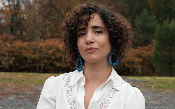
Tania El Khoury’s Soothing “Revenge Art”
The Lebanese artist and Bard College professor spoke with Hyperallergic about her recent projects and precarious life under bombardment in Beirut.
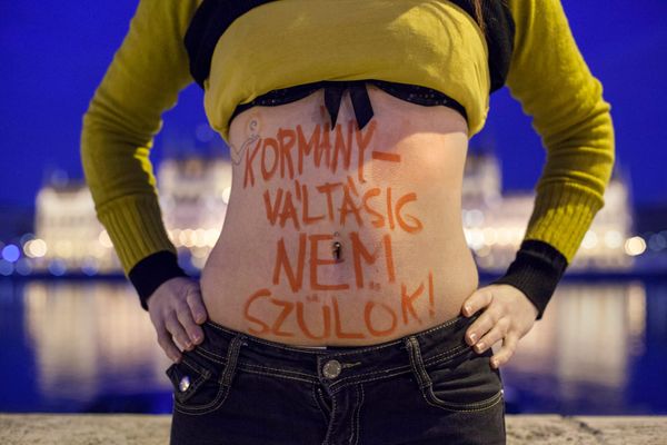
Opinion
As a Hungarian curator living in the United States, I cannot help but see my country as both a cautionary tale and a source of hope for artistic freedom.
Interview
“You say, ‘Fuck you. I'm good and you're wrong,’” she told Hyperallergic. “This is who I am, this is what I do, and this is what I care about.”
News
The museum and the artist’s foundation are collaborating on a surprising exhibition opening this June.
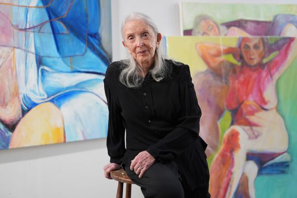
Surrounded by her drawings and ceramics, we discussed her evolving art practice and new life as NYC first lady.
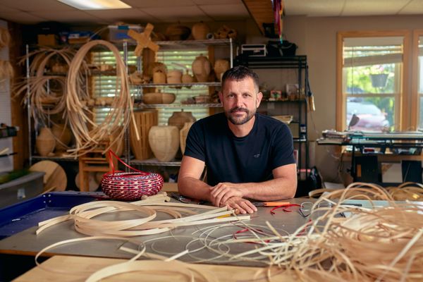
Join us on April 29 for a conversation with artist and recent MacArthur Fellowship winner Jeremy Frey and Hyperallergic Editor-at-Large Hrag Vartanian.
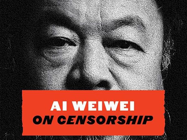
“On Censorship” offers timely reflections from the dissident artist, whose entire life and career have been marked by state persecution.
“The art world changed,” scholar Thierry de Duve told us on the occasion of MoMA’s new show. “Duchamp’s ‘Fountain’ is the message that brings us the news.”
Through research and collaboration, a feminist art collective reclaims the place of alternative spiritualities in art history.
Residencies, fellowships, grants, and open calls from Banff Centre, the Vilcek Foundation, and more in our monthly list of opportunities for artists, writers, and art workers.
Get the best of Hyperallergic sent straight to your inbox.
News
The museum and the artist’s foundation are collaborating on a surprising exhibition opening this June.
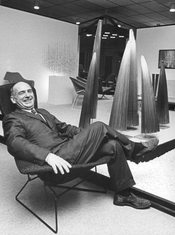
Feature
As a sculpture long thought lost resurfaces in Detroit, the artist and designer’s alma mater sets its sights on a major retrospective.
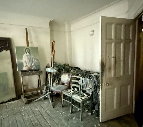
Community
“The main thing I love about my studio is that it is mine. No one can enter without permission.”
Sponsored
Announcement
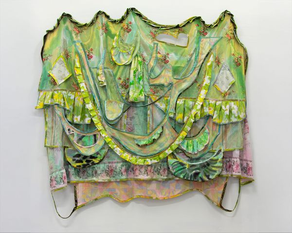
Discarded bedsheets shape portals of reflection, obscuring the past or inviting to imagine what lies beyond in this exhibition at the Halsey Institute of Contemporary Art at the College of Charleston.
Daily Newsletter
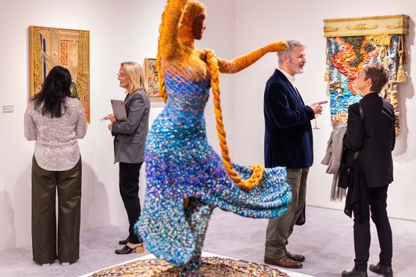
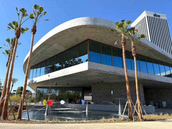
Photos from the revamped LA museum, impressions from MoMA PS1's “Greater New York,” Artnet and Artsy lay off dozens of workers, and a Lebanese artist’s balm for collective wounds.
Art Review
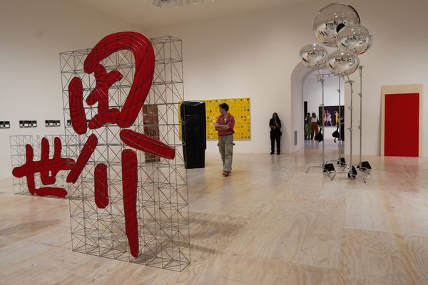
The survey, which happens every five years, rejects the out-of-towner’s glossy surfaces in favor of the view from inside.
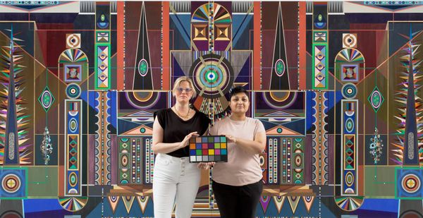
Community
Also, the Denver Art Museum's new associate curator of Native Arts, the Toronto Biennial of Art, and Marilyn Minter chats with Monica Lewinsky.
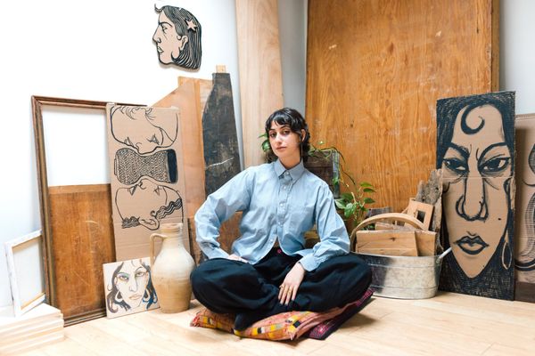
Feature
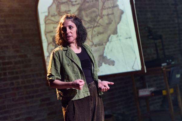
The latest segment of her performance series “Crossing the Water” chronicles life under military occupation after the 1982 Israeli invasion of Lebanon.
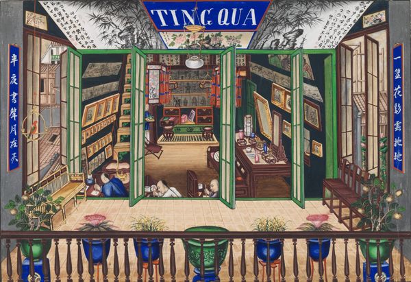
Book Review
In a book on Qing-era trade portraitists whose names are lost to history, Winnie Wong shows us how our restless pursuits of authenticity guide us into pitfalls of our own making.
News
The organization abruptly terminated its longstanding partnership with the Henry Street Settlement social services organization last year.
Sponsored
Announcement
An exhibition of works by Alighiero Boetti at Magazzino Italian Art.
Feature
Some visitors may feel unmoored by the museum’s open plan and free-floating associations, but others will welcome the unconventional approach.