Apple's Amazingly Artistic iOS6 Maps
You don't really want your maps to be "artistic" renderings of reality, we all prefer them accurate, but the recent release of Apple's iOS6 maps is proving more artistic fiction rather than fact.


You don’t really want your maps to be “artistic” renderings of reality, we all prefer them to be accurate, but the recent release of Apple’s iOS6 maps is demonstrating a more artistic flair to cartography that is frustrating to those who live based in fact.
Yet that’s not all bad. This capture of Toronto’s Pearson International Airport I spotted on theamazingios6maps.tumblr.com is quite beautiful. As photographer Jonathan Blaustein mentioned to me on Instagram, “Looks just like Burtynsky’s photos from Spain.”
My Facebook friend Ian Epstein pointed out another striking similar to a work by Andreas Gursky:

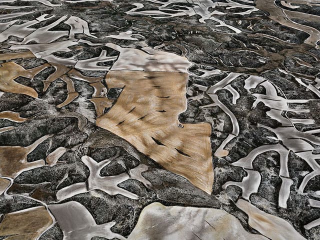
Here are some other stunning renderings from the blog:


And this joke is something Hyperallergic readers will certainly appreciate:


