Plastic Purses and Comic-Book Catalogues: American Postwar Art at the Margins
Life-size knit body suits mingle with painted metal lawn chairs, plastic purses, and rows of zines and ephemera in the summer show at Matthew Marks Gallery, What Nerve!, which gathers the work of four outlying postwar art groups in the United States.

Life-size knit body suits mingle with painted metal lawn chairs, plastic purses, and rows of zines and ephemera in the summer show at Matthew Marks Gallery, What Nerve!, which gathers the work of four outlying postwar art groups — the Hairy Who, the Funk artists, Destroy All Monsters, and Forcefield — in an attempt to tell an alternative narrative of figurative art from the 1960s onwards in the United States. (The exhibition debuted at the RISD Museum last fall.) What Nerve! sets out to demonstrate that these groups share more than just their geographic distance from New York and Los Angeles, where the canon of art history grounds this time period.
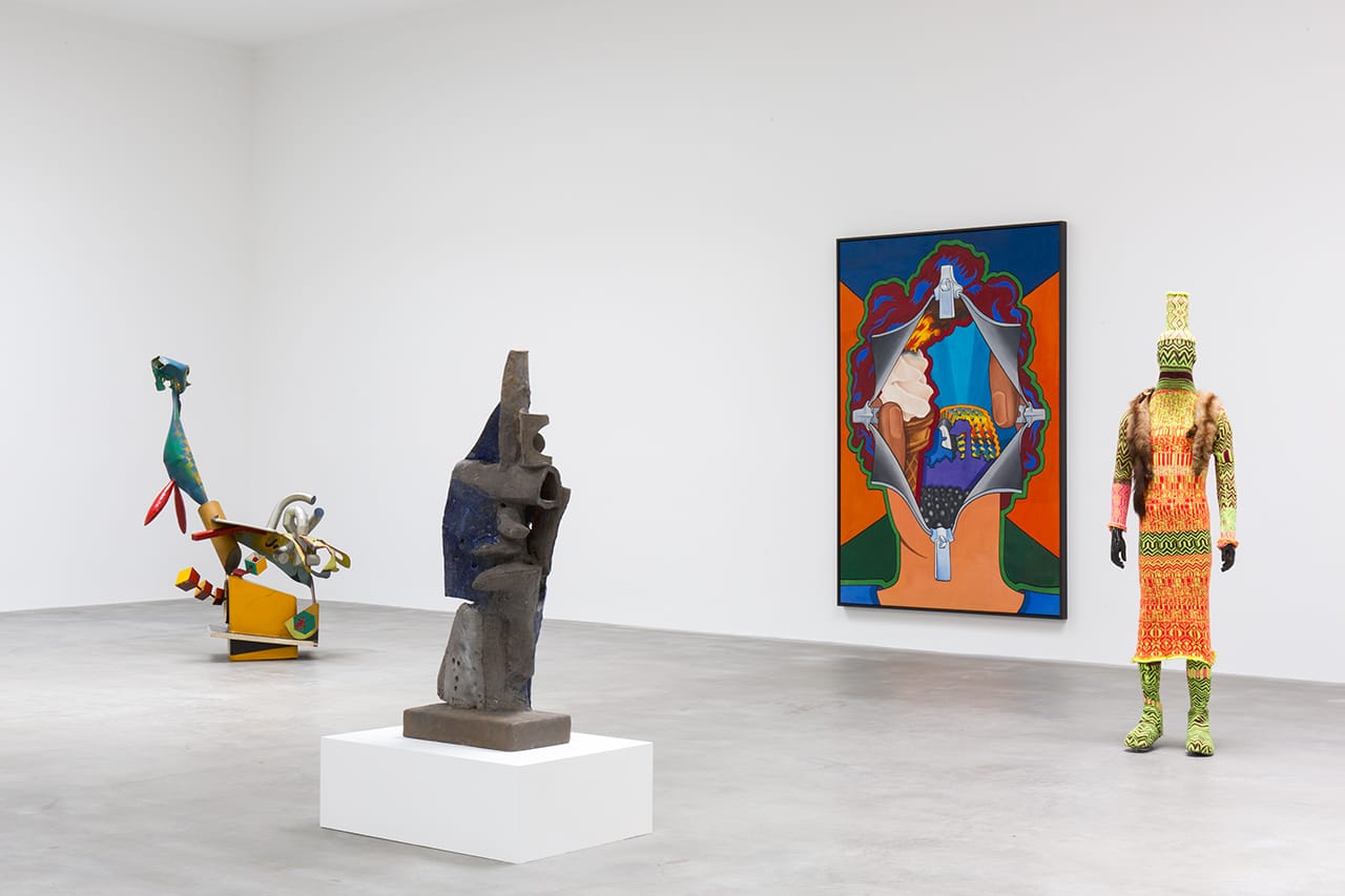
Spread across three galleries on 22nd Street, the show boasts over 68 works, including a series of Forcefield films and audio recordings screening on a loop at 502 West 22nd and four dense vitrines of zines and ephemera from the Hairy Who and Destroy All Monsters publications at 526 West 22nd. To help the viewer navigate this maze of bright colors and dark themes, the checklist includes floor plans that identify each work by number. While often I find the use of a numbered floor plan overwhelming, in this case it was one of best decisions made by guest curator Dan Nadel — the other being that, rather than segregating each group by section (which there’s certainly space for and is how the accompanying catalogue is structured), the exhibition intersperses the works, creating links across movements. The lack of identification beyond the guide offers visitors the chance to make these visual connections first, before knowing if the artists themselves shared any working affiliations.
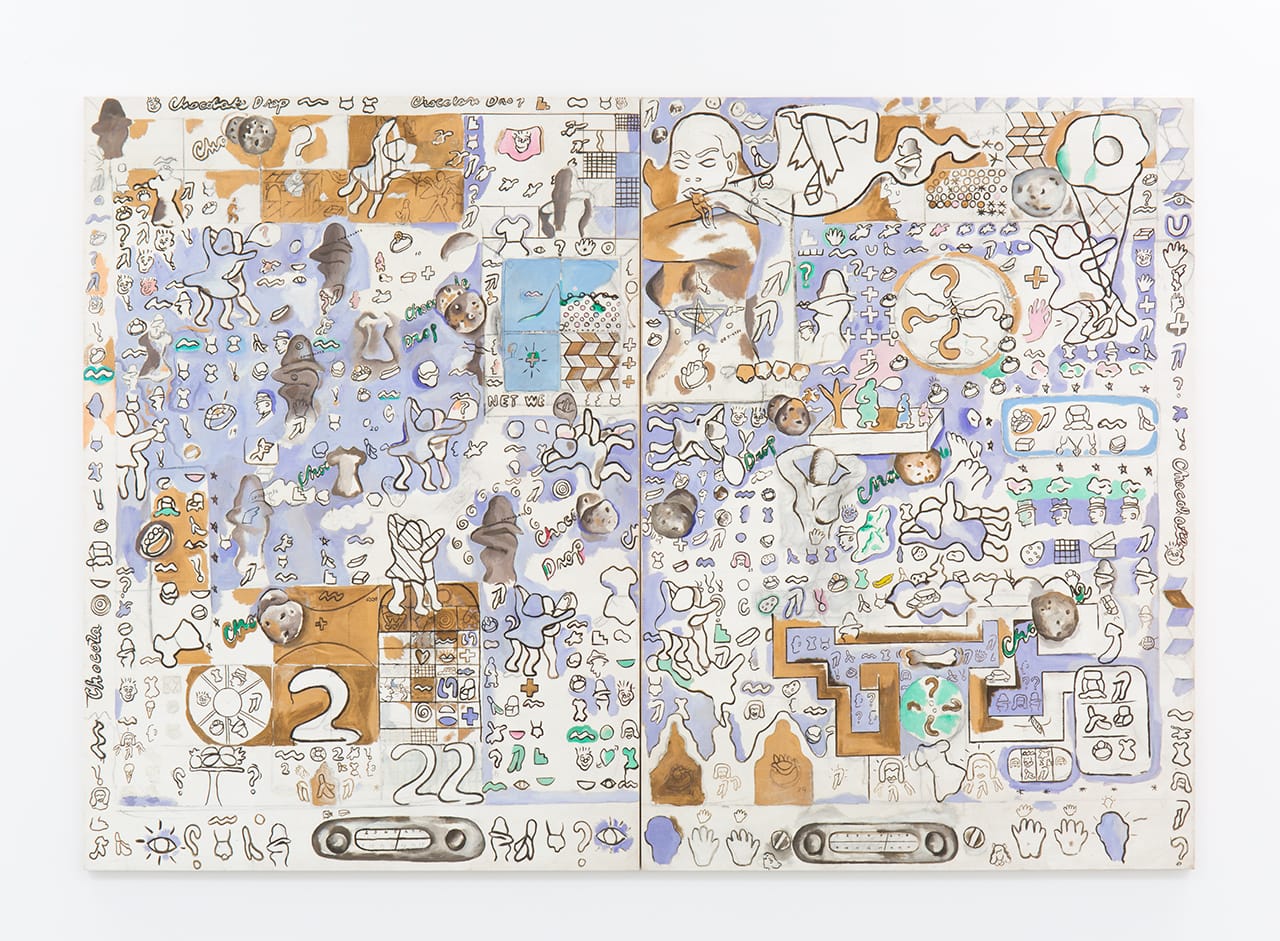
Nadel takes care to arrange pieces by their formal properties, emphasizing line quality, color, and figuration; they suggest, as the show’s subtitle — “Alternative Figures in American Art, 1960 to the Present” — claims, a kind of figuration akin to the more widely recognized Pop icons of time, yet distinctly different. The Hairy Who’s Suellen Rocca has a large two-panel painting, “Chocolate Chip Cookie” (1965), prominently displayed in one of the first gallery rooms. Outlined geometric and organic forms intermix with outlines of dancing women and baby-doll dresses. The arrangement of these icons in neat rows gives the piece a pictographic, linguistic quality. Several smaller sculptures sit on plinths in front of Rocca’s painting, including a Ken Price egg and a Robert Hudson steel sculpture. The latter two are both Funk artists, but Rocca’s piece echos the minimal form of Price’s egg and the assemblage quality of Hudson’s rough steel. The sketch marks, visible erasures, and thinly applied coats of paint make it appear unpolished and assembled.
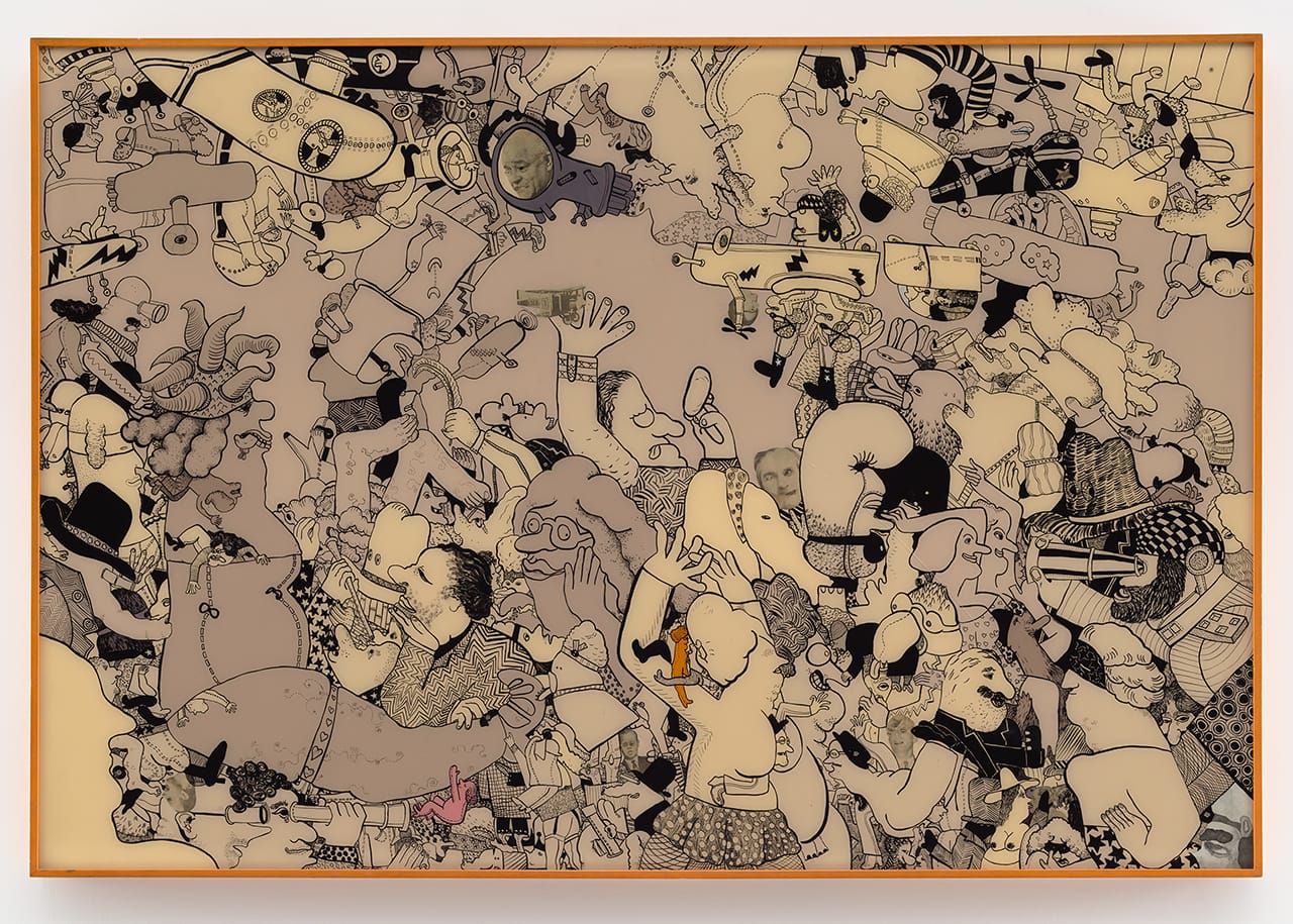
Picking up on this aesthetic, the opposite wall features another Hairy Who artist, Gladys Nilsson, whose acrylic and Plexiglas painting “Very Worldly” (1967) shows closely packed figures with writhing arms and legs. Black-and-white collage fragments of faces and heads are subtly stuck between the work’s thick black outlines and sepia colors (save two lone, miniature pink and yellow characters in the foreground). Rocca and Nilsson have similar compositional sensibilities of dense layering, yet the pairing of their work with pieces by Price and Hudson highlights a shared interest in minimal forms and clean lines, albite to different ends.
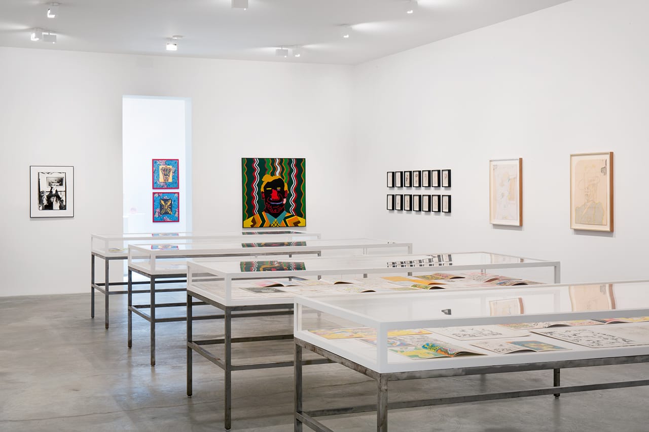
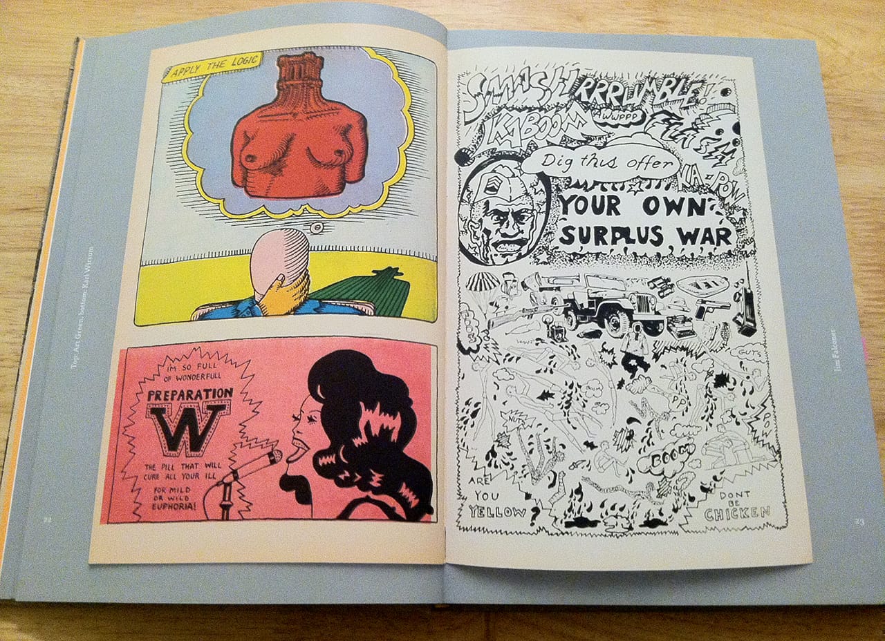
Whereas the space with Rocca and Nilsson focuses on larger paintings and sculptures, another building gives smaller works on paper — hanging around vitrines filled with sketches, posters, and zines — equal weight. A wall opposite the glass cases features Jim Shaw’s elegant monochrome blueprints from 1977. In these printing experiments, Shaw layered photographs of bound women, advertising signs, and architectural forms, concealing the original images to create abstract shapes and patterns; the content is over powered by the well-crafted graphic forms. Farther into the gallery, a section is devoted to Mike Kelley’s suite of 14 zany marker portraits, “Untitled (Allegorical Drawing)” (1976). Hung in two rows, each page measures 6 x 4 inches and contains what look like casual doodles; yet framed on the wall, rather than placed in the nearby vitrine, these pieces illustrate the value of such experiments with modes of figuration and printing. Shaw and Kelley, both Destroy All Monsters artists, share the long room with Hairy Who comic books and working materials as well as framed posters by both Hairy Who and Funk artists. Taken as a whole, the room demonstrates an overlapping engagement among the groups with printed matter and drawing, and gives credit to the important process and thinking that result in innovative final products.
Artists who work with ephemera and mass-distributed materials, such as zines, buttons, and posters, are often passed over by art history because their works are hard to preserve and categorize. This is certainly true of the Hairy Who artists, who collaborated on several self-published comic books as catalogues, and they are the group best served by this revisionist exhibition. To coincide with the opening of this show, Matthew Marks has published the first complete collection of their books, The Collected Hairy Who Publications 1966–1969, preserving them and making them available for close study and widespread readership beyond the gallery display. Central to understanding the imagery of these comics is their practical use as exhibition catalogues rather than serial narratives. As Nadel, the book’s editor, explains in his brief essay — which follows rather than proceeds the spreads — the idea of making cheap comics as catalogues came mostly out of necessity. Jim Nutt, one of the founders of the group, is quoted as explaining: “If we thought the had the money, let alone the will to print up a spiffy real catalogue, we would have asked for that.”
What they created instead is much more interesting and, with this publication, long lasting. Playing on the common practice of full-color reproductions in traditional catalogues, each artist drew images evocative of their style and included these works instead of photographic reproductions. The books don’t tell stories; they present a visual way of thinking. As Nadel says, despite making figurative work, the group was not focused on narrative: they were formalists interested primarily in “line, form, color, memory, words.” This partly explains the artists’ exquisite-corpse method of making the books. While some include full spreads by a single artist, such as Art Green’s “Come Poze” (1967), more commonly the spreads and individual pages are shared by two, sometimes three artists, such as “Clean up Hit her,” by Art Green, Gladys Nilsson, Jim Nutt, Suellen Rocca, and Karl Wirsum.
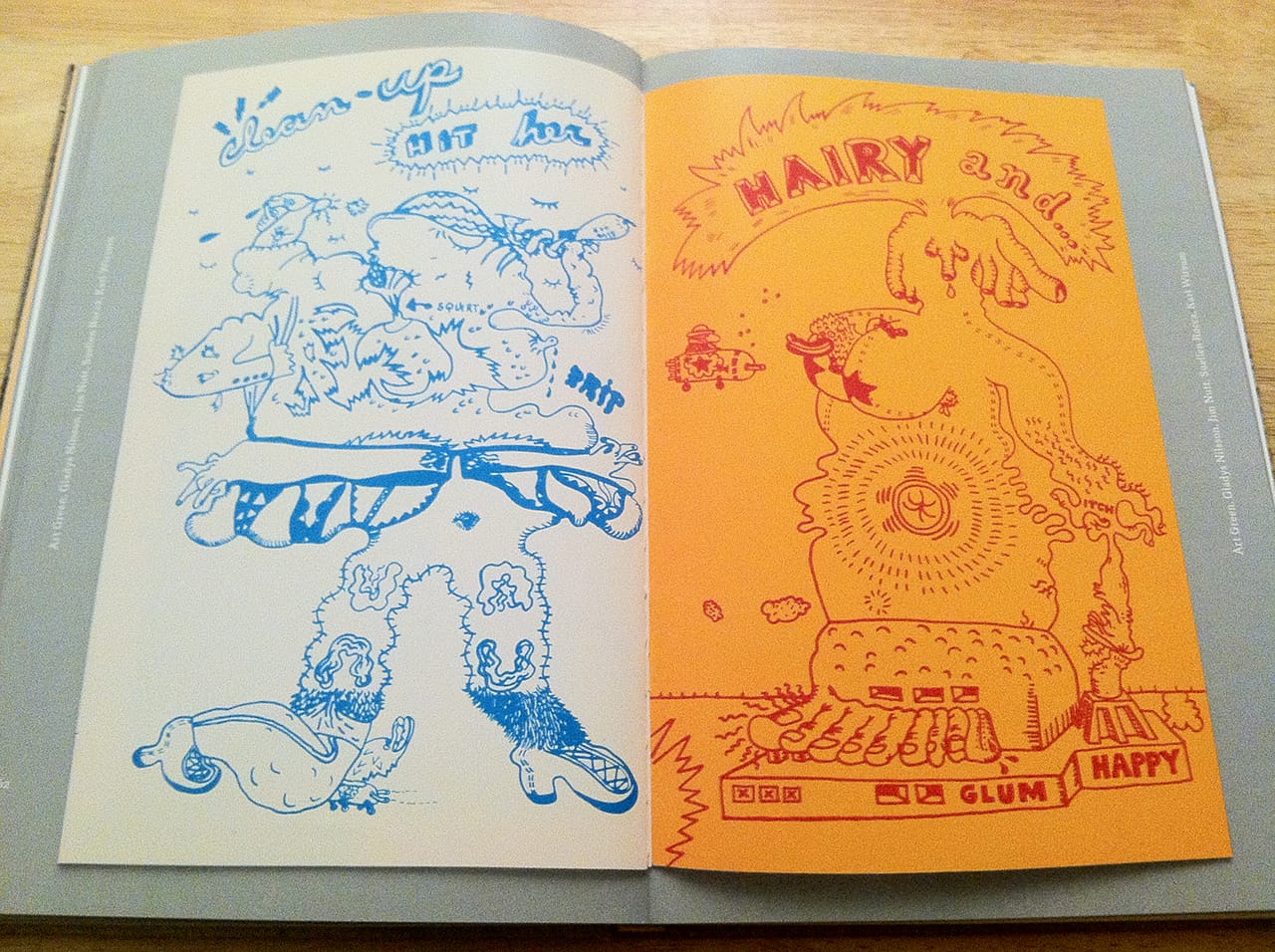
The spread presents the monochrome outlines of two full-page figures. The blue figure on the left has legs that include images of women’s hair, similar to Rocca’s iconography in “Chocolate Chip Cookie,” and a top half that looks to be chunks of molded clay similar to the styles of Nilsson and Nutt. The composition of the yellow and red figure on the right is similarly murky, combining bold lettering, big breasts, and a small flying spaceship. There’s no way to be sure who authored which lines — and that is in fact the fun of the exquisite corpse: there’s no telling what creature will be born or which artist will be the dominant parent. Although the book smartly indicates authorship by listing the artists in the margins alongside each spread, when it comes to the collaborations, they are truly group efforts.
In addition to the concept of the books, their limited color palette, one of the more beautiful and unifying elements, was also determined by financial necessity. At the beginning of each new comic, Nadel includes a paragraph of context by Nutt: “The second year we began using a coated paper stock rather than newsprint. We also increased the amount of interior pages […] but didn’t use as many color plates to compensate for the cost of the added paper.” The limited colors work especially well in shared spreads like one by Nilsson and Wirsum in pink and blue. Wirsum’s right-panel portrait of a broad-shouldered man in a floral-patterned pink shirt is immediately the more eye-catching. Almost the entire page is dominated by the pink shirt and background, with only the skin of the man in blue. In the top right corner a message is scrawled in cursive: “Best Wishes Hairy Who your pal Slitzy.” This touch of the handwritten recurs on Nilsson’s opposite page, which nicely balances Wirsum’s overly saturated one by staying mostly white with blue outlines. Two figures stand with their fingertips touching near the top of page, forming a heart-like shape that’s echoed by the heart tattooed on the left figure’s chest and the hearts on the letter in the right figure’s hand. Linked initially by shared colors, these two pages play off each other with nods to kitschy flowers and hearts and sentimental, jocular notes.
Although it seems that these books were birthed merely by a series of difficult circumstances, it’s worth noting that rather than use the pages to sketch out ideas to display in their larger (and presumably more expensive and financially lucrative) works, the artists drew inspiration from their finished paintings to incorporate into the books. The latter are purposeful works of art that privilege line, drawing and collaboration — themes present in many of the works on display in the Matthew Marks show. The narrative of What Nerve! is not just one of alternative figuration, but of alternative thinking, evidenced by the genre-bending use of drawing and zines, toys, furniture, and clothing.
What Nerve! Alternative Figures in American Art, 1960 to the Present continues at Matthew Marks Gallery (502, 522, and 526 W 22nd Street, Chelsea, Manhattan) through August 14. The Collected Hairy Who Publications 1966–1969 is available for pre-order from Matthew Marks.


