A 100-Day Advent Calendar for Design Devotees, in Honor of Herb Lubalin's 100th Birthday
The renowned font designer will be remembered in an online project created Cooper Union, his alma mater, highlighting various objects for a 100-day run.

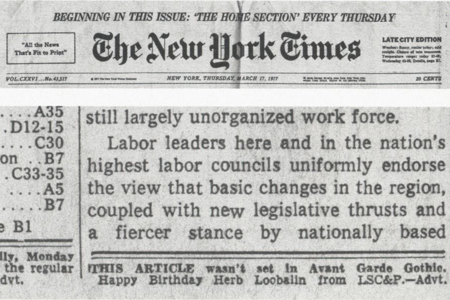
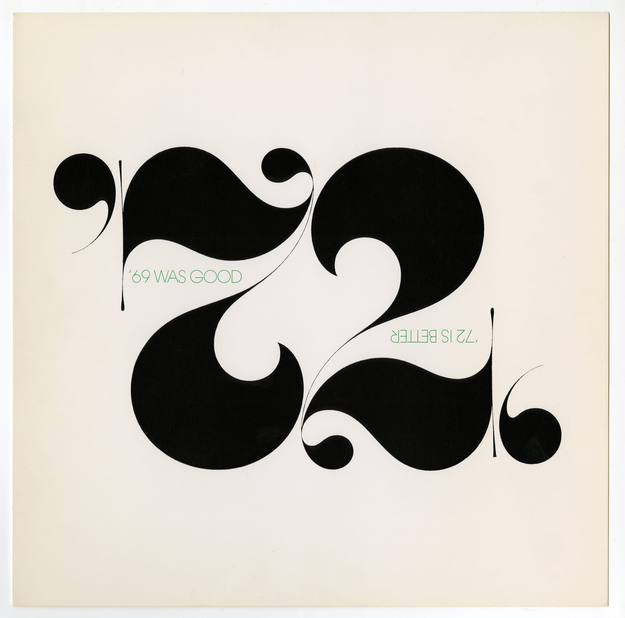
In 1977, when the pioneering graphic designer Herb Lubalin turned 59, his firm announced his birthday in a very public, endearing, and totally nerdy way that could only be for a devotee of type. It bought ad space on the front page of the New York Times and printed one short line: “This article wasn’t set in Avant Garde Gothic. Happy Birthday Herb Loobalin from LSC&P.” The Avant Garde Gothic typeface, then just a few years old, represents just one of Lubalin’s lasting and most famous contributions to design; it’s been been used for innumerable texts, from Twin Peaks‘s opening credits to Wienerschnitzel’s logo.
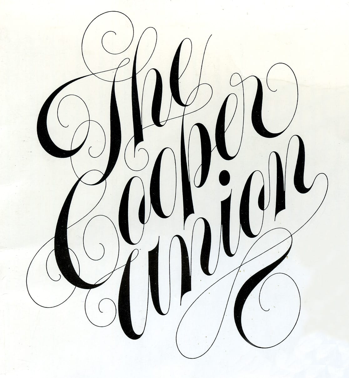
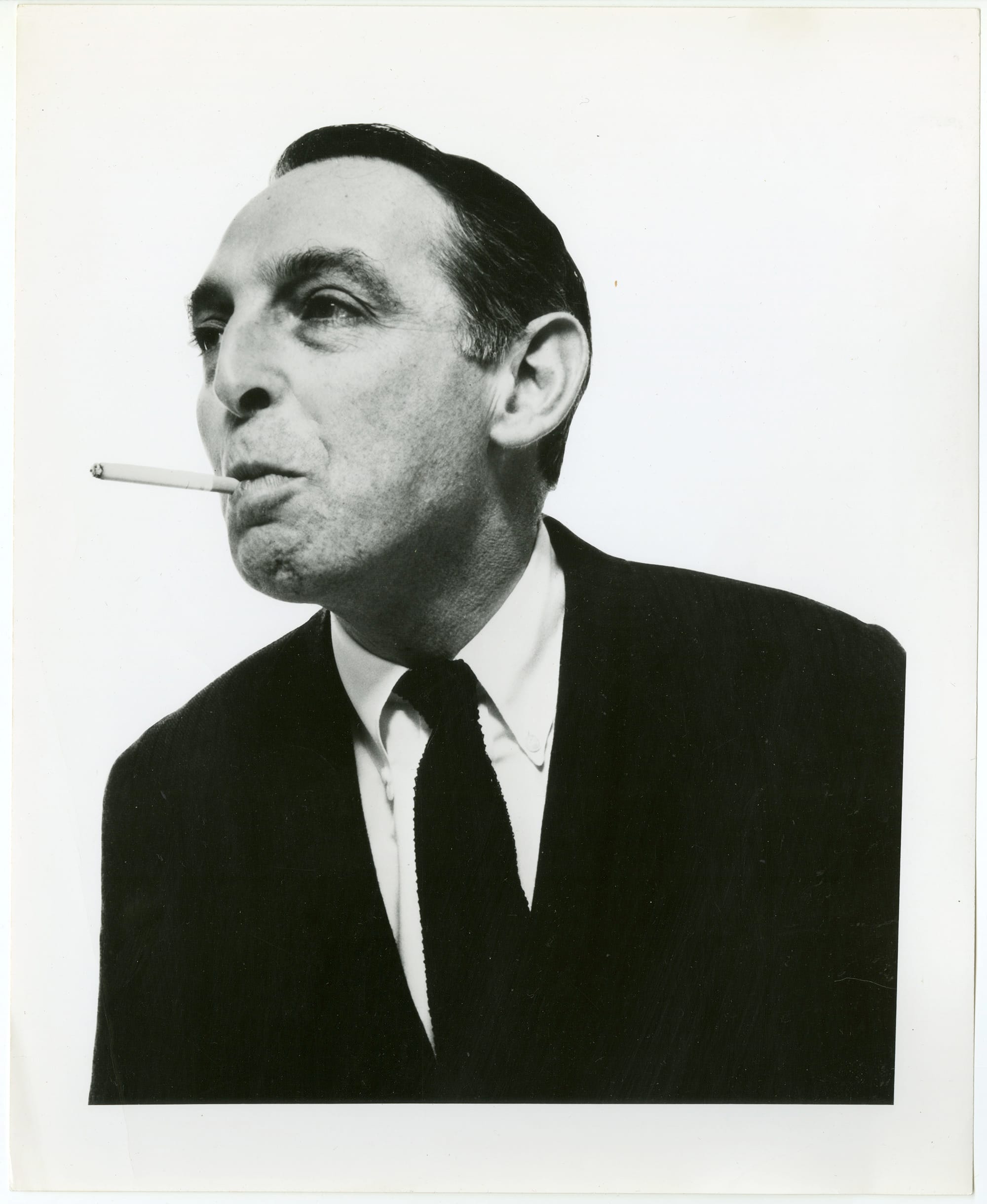
This year, Lubalin is receiving another apt and design-savvy tribute. He would have turned 100 on March 17th, and to commemorate the centenary of his birth, his alma mater Cooper Union has launched an online project that reexamines his career. Adopting the form of an advent calendar, Lubalin 100 will highlight various objects over 100 days, through June 24, and provide context for each. The posters, magazines, and other material are all drawn from the institution’s Herb Lubalin Study Center of Design and Typography, which has housed the designer’s entire archive since 1985. Lubalin died in 1981 at the age of 63.
“The driving force of this project is to allow the more general public, as well as designers, to understand Lubalin’s work in a more nuanced way,” the Center’s curator Alexander Tochilovsky told Hyperallergic. “Which means trying to highlight some of the anecdotes behind the work, so people have a better sense of how the work operates and what made it significant.”
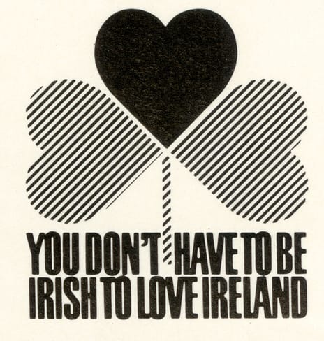
The website’s early entries offer some examples of Lubalin’s visions, from an eye-catching ad he designed for Ireland’s tourism board to a cheeky holiday card he produced with his partner Thomas Paul Carnase. There’s also a condensed but thorough biography, which follows the trajectory of his career from letterer for a sign company to creative director of an advertising agency to head of his own design firm. Further “days” of Lubalin 100 will explore more of Lubalin’s seminal and lesser-known designs in more detail, including works his clients rejected.
The Center chose the calendar format to tell Lubalin’s story because it is “so complex,” Tochilovsky said. “By parsing it over 100 days, it gives us an opportunity to be thoughtful and not overwhelm with every piece. We can cover a lot of territory but also be brief, [and] hit all the important points.”
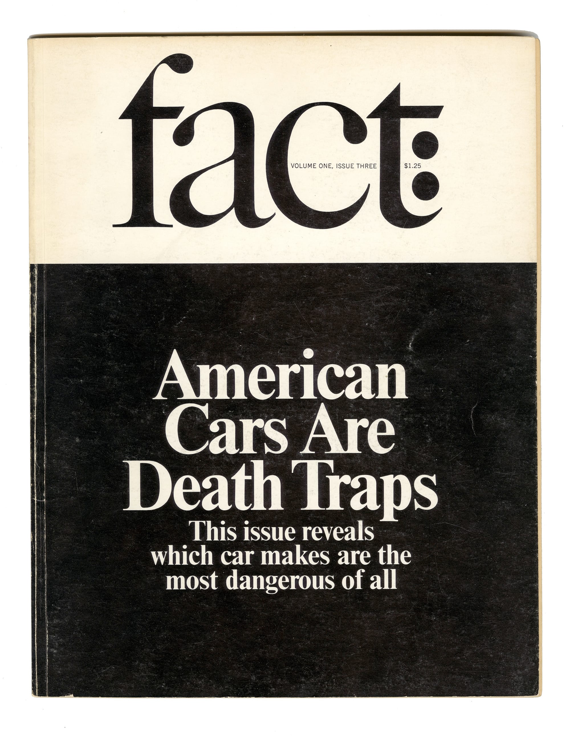
Among his major works are designs executed for a series of magazines published by Ralph Ginzburg: Eros, Fact, and Avant Garde, for which Lubalin conceived the Avant Garde Gothic typeface. The visuals of each, Tochilovsky said, were “absolutely perfect” for their respective material, which ranged from erotica to satirical commentary on current affairs. Lubalin 100 will spotlight this design work but also the editorial content that demanded it, much of which is not widely known about today.
“Most people experience graphic design in its final form, and I think the work gets flattened into just its aesthetics,” Tochilovsky said. “I think Lubalin’s work suffers the most from that issue because it’s so graphic, it just becomes like eye candy. But here’s all this other stuff that makes it even more interesting, important, and timeless.”
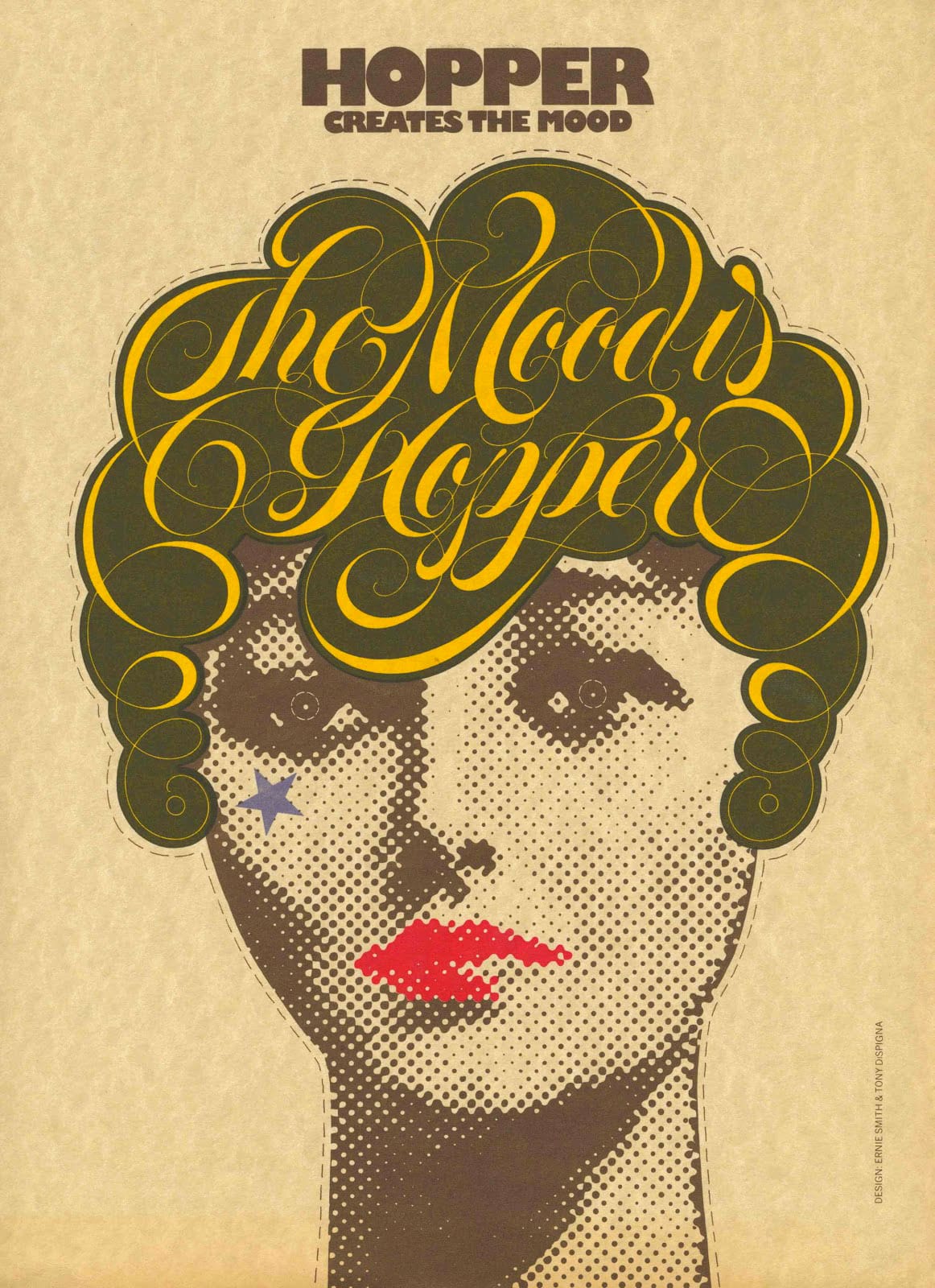
Online visitors will also learn about the evolution of individual designs. Lubalin rarely worked alone, relying on collaborators to execute his designs with specific skills, and the Center will present mini profiles of some of these individuals, from Carnase to Tony DiSpigna, a master of drawn lettering.
Part of this online tribute will also explore the uncommon choices Lubalin made as a graphic designer, beyond his creative output. His studio culture stood out for its time for some of these decisions: Lubalin hired quite a few women as designers and often took on lesser-known clients, at times working for free when people couldn’t afford his services.
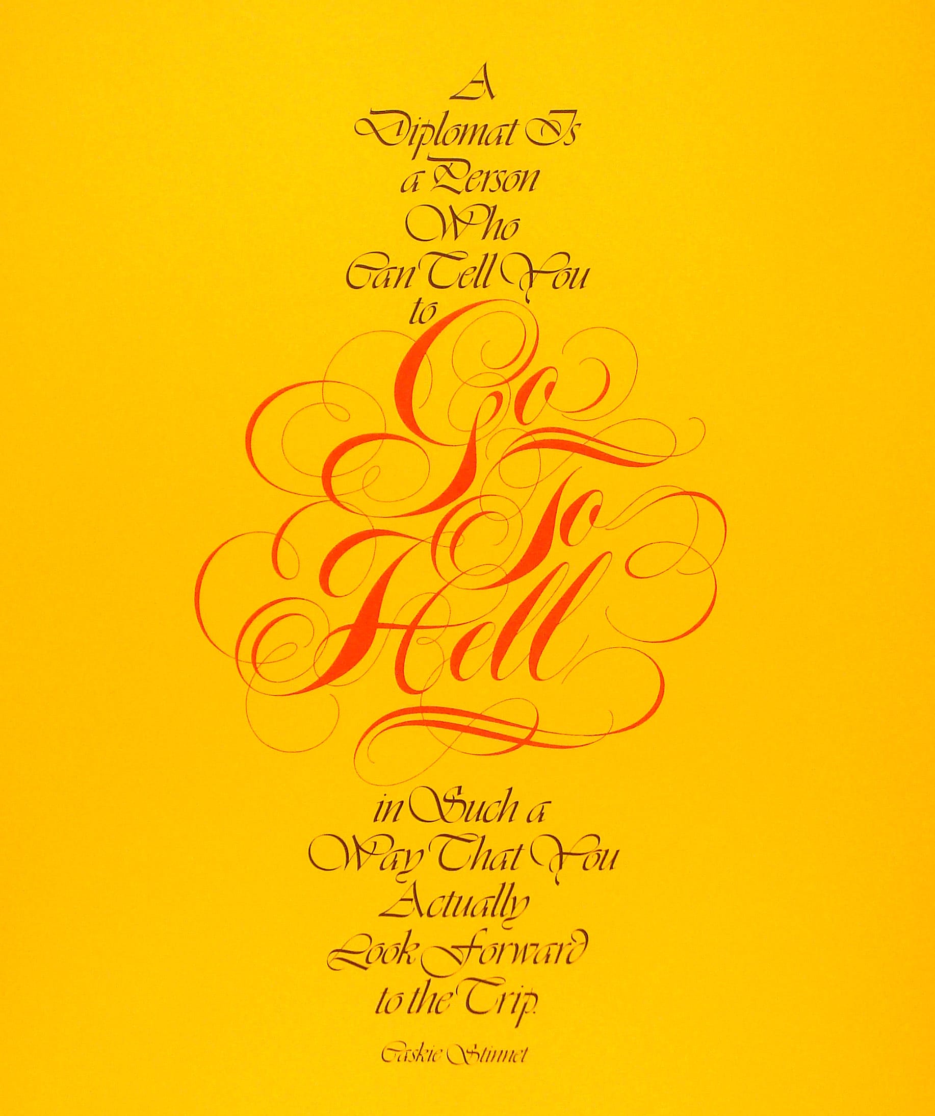
Reacting to the status quo of graphic design at the time, Lubalin’s work was expressive, visualizing language so messages were not just relayed to people, but truly seen. His designs collapsed the borders between text and image. Although some of his calligraphy can appear dated to contemporary eyes, revisiting them is a reminder of a time when typography was slowly evolving, and visually stimulating imagery — now an everyday experience — was not especially common.
“Lubalin understood design as an experience, and he understood that there are ways, through good, thoughtful design, you can make someone take notice,” Tochilovsky said. “What he did was make the formal qualities of language come through and engage the viewer on a subtle level. You’re going to remember those types of images much more, especially in the context of 1950s. It’s profound how different that approach was at the time.”