What We Loved (And Didn’t) in “Greater New York”
Plus, the works we’re on the fence about in the massive MoMA PS1 survey.


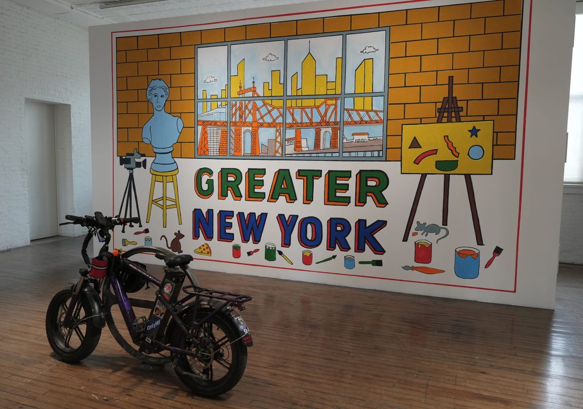
A survey of New York is an impossible premise. It’s simply too big, too unwieldy — but that’s also what makes it so relentlessly, aggravatingly, and beautifully itself. MoMA PS1’s Greater New York tries its hand at the tall task of capturing the city’s art world — and it is a world unto itself — exhibiting more than 150 works by more than 50 artists.
Below, we’ve selected around 20 artists whose work we feel strongly about, whether because we loved it, because we didn’t, or because we’re still puzzling through it. There’s some disagreement between us here. Of course there is — this is New York, home of eight million stubbornly held opinions. What fun would it be otherwise?
Check out our list below, or dive into our general thoughts and first impressions here. And of course, tell us what you think. —Lisa Yin Zhang, associate editor
What We Liked
Dean Millien
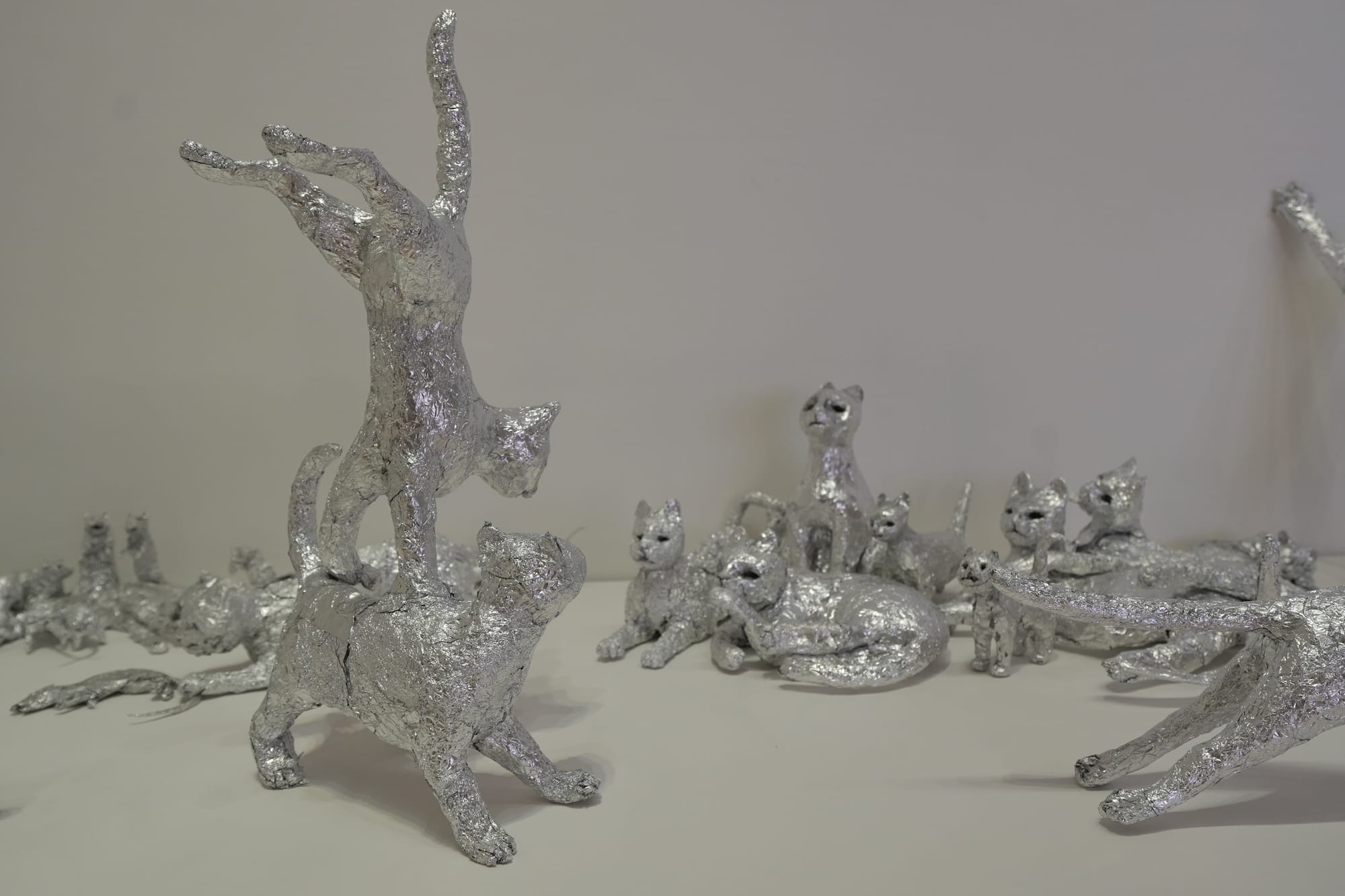
Lisa Yin Zhang: This one was an office favorite — I immediately slacked our resident cat-lover, Senior Editor Valentina Di Liscia, a photo of it, to which she responded: “Ok yes. very good.”
It feels like a love letter to the city — these are the organisms we share it with, for better or worse (speaking as someone who lived through a rat infestation). But these are also allegories for us — cats and rats playing, listening, fighting. It’s really easy to hate people these days, but these softened me. We are poor, sweet, vicious animals.
Hrag Vartanian: This is so sweet and emotional. Knowing that he started making aluminum sculptures at age four — after his toys were taken away by his father — melted my heart. They're cinematic and personal while also speaking a universal language that makes them immediately accessible. Aluminum foil is one of those ubiquitous materials we all encounter at delis and use at home, and that familiarity gives the work a tactile quality; I used all my willpower to stop myself from touching it.
Hakim Bishara: I’d go as far as suggesting that this is the best piece in the show. How charming. How authentic, surprising, and beautiful.
Red Canary Song
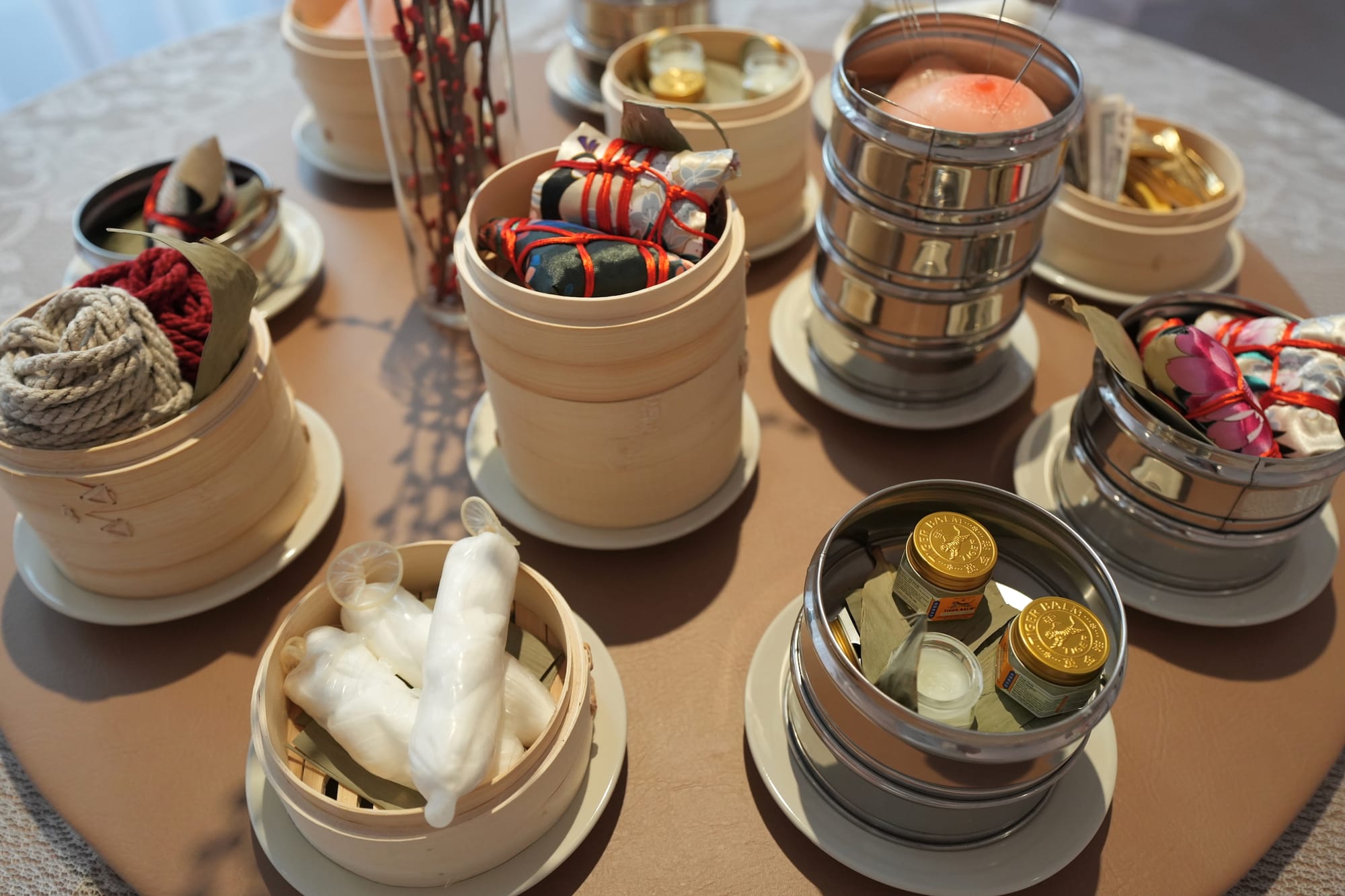
Rhea Nayyar: An immersive, liminal installation that cracks the door open to the sorely misunderstood realities and fatal misrepresentations of migrant massage work, sex work, and other forms of unprotected intimate labor in New York. It’s both smart and effective for this grassroots collective to utilize various forms of art — including sculpture, audio interviews, mock posters, and data visualization — in its activism, archiving, and advocacy work. And I think the environmental curation makes the subject matter far more accessible to visitors with limited to no information about this marginalized demographic and the dangers of their stigmatization.
Hrag Vartanian: What a great use of cultural familiarity to gesture toward something so much greater. It also captures the intimacy of how we are presented to the world, and on whose terms. I might have suggested editing certain elements, but I suspect that with more time the installation's underlying logic and distinct chapters would become clearer. This is a work I hope an institution will acquire and preserve — it raises important questions through powerful imagery.
Rhea Nayyar: I just think the resources and literature table could have benefited from some more streamlining, as the overall display might be a lot for a first-time visitor to take in and process.
Kameron Neal
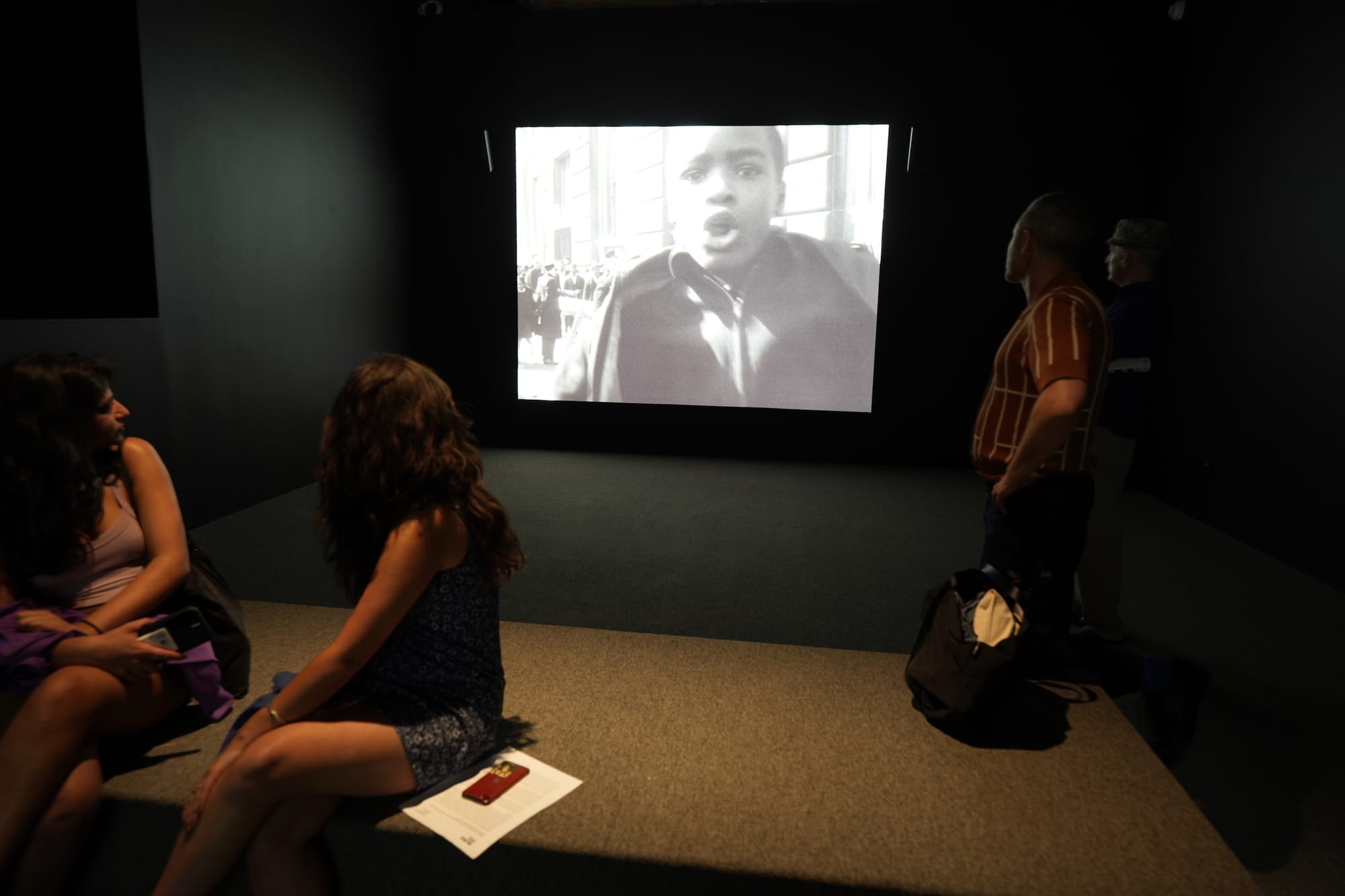
Hrag Vartanian: A slow drip … this was a deeply unnerving, roughly 25-minute work that Kameron Neal created during a 2021–22 Public Artist in Residence at the NYC Department of Records and Information Services. The artist made it after reviewing over 3,600 minutes of NYPD surveillance footage captured by plainclothes officers between 1960 and 1980, one of the most active periods of protest in the city's history. The two screens play off the dynamics of seeing and being seen. We encounter images from Vietnam War demonstrations, Black Panthers protests, Young Lords events, labor strikes, and other actions that record the city at its most passionate. Some moments are funny, others disturbing — one image shows a man bandaged with something protruding from his torso, holding a sign that reads something like "I took an integrated subway train."
As someone who has covered protests extensively, as we all have at Hyperallergic, this hit home: I've encountered people I suspected were plainclothes officers, talked them up, and sometimes fed them disinformation just to see how they'd react. Neal's installation focuses on what the police saw and recorded, but it's worth remembering that the protesters had agency too, and based on the images Neal includes, he's fully aware of that. Their presence is part of what makes “Down the Barrel (of a Lens)” (2023) so powerful.
Hakim Bishara: The sad part is that the viewer quickly arrives at the inevitable conclusion that nothing’s ever changed.
Win McCarthy
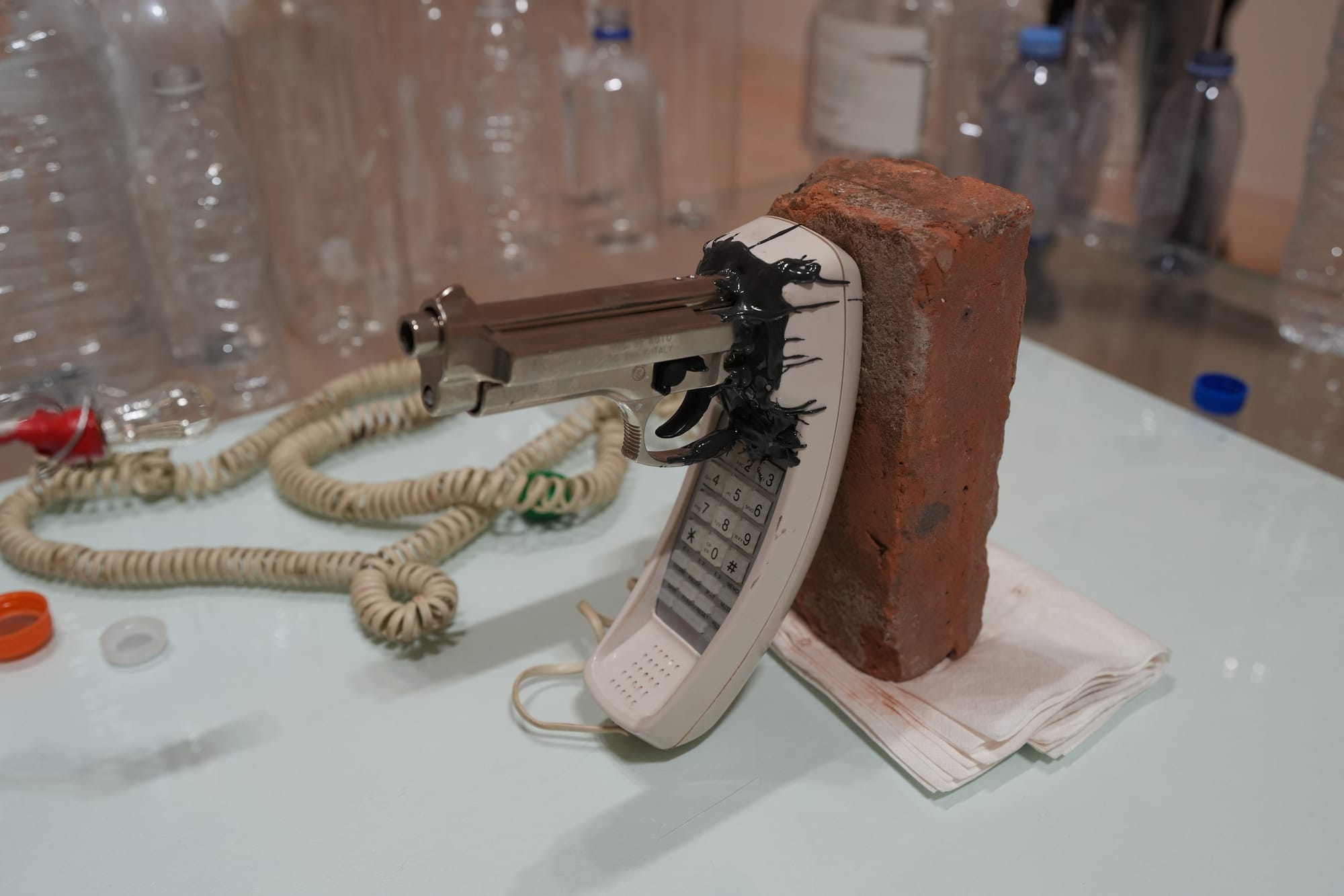
Hrag Vartanian: A sharp sensibility for objects is at the heart of McCarthy's chimerical visions, and “Angelus Novus” (2026) was a favorite — its mashup of a landline handset with a telephoto lens is hard to forget. I also admire parts of “The Id Rider at the Dawn of History” (2026), including the landline handset inset with a pistol — what's his thing with landlines? Throughout this show, he bestows his objects with what feel like emotional undertows, as strange as they are illuminating.
Hakim Bishara: That second maximalist installation literalizes the neural and psychological damage we’re causing to our brains by being tethered to our phones. It sends a clear visual message: You might as well shoot yourself in the head (please don’t).
Piero Penizzotto
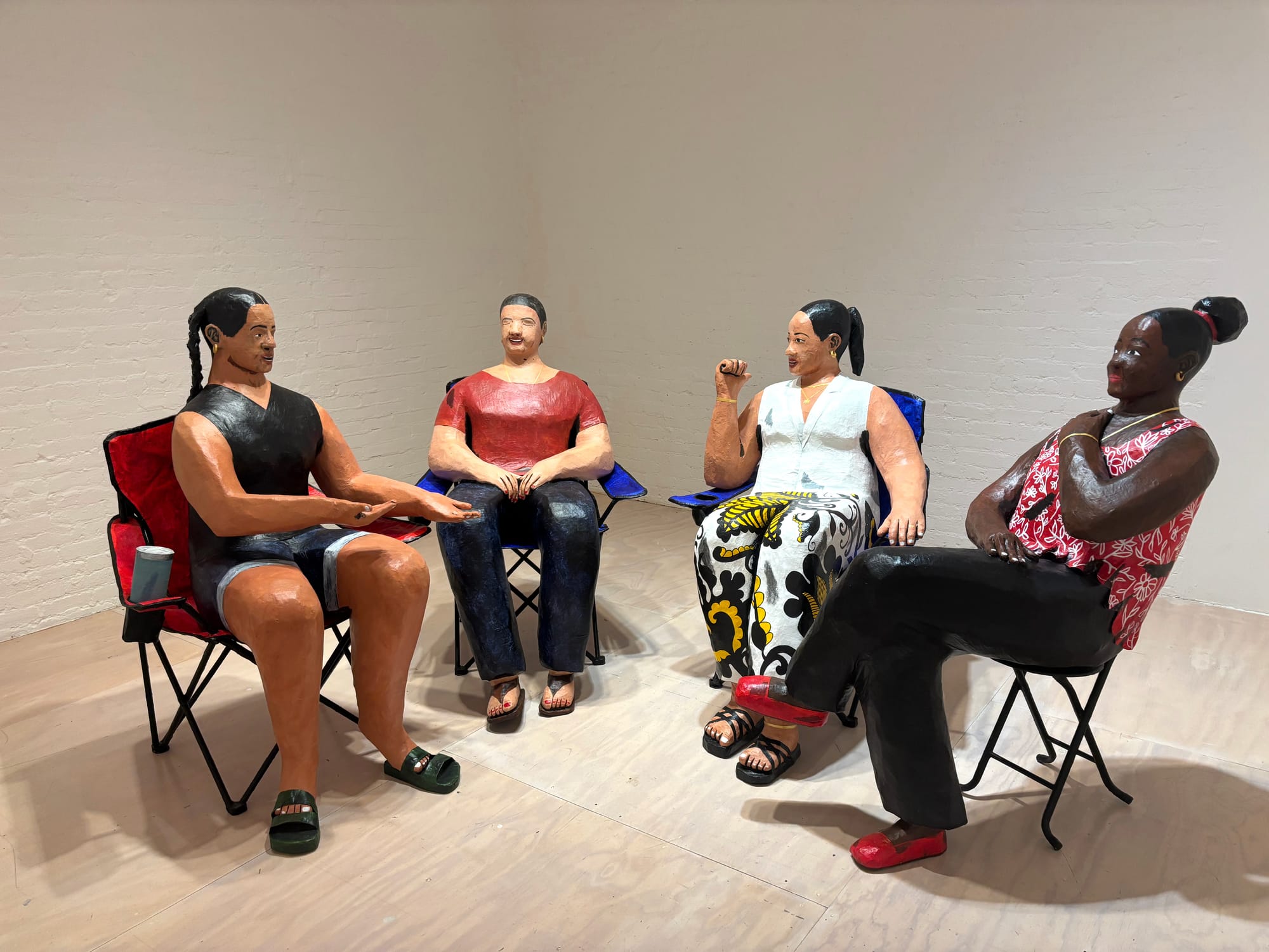
Rhea Nayyar: An endearing, pure-of-heart salve treating those of us with permanent frown lines in our foreheads. I loved that these are life-sized but not life-like, since these experiences are not necessarily mine to reminisce on, but rather appreciate. The figures are stuck between the second and third dimension, as if Penizzotto conjured them from a comic series or a sketchbook.
Lisa Yin Zhang: I actually felt ambivalent about these, but I’m outnumbered. I love the impulse behind them — sculptures of the artist’s friends, family, communities commemorating “fragile moments of togetherness,” in his words. But there’s something deeply uncanny about them, which creates a friction with his intentions that is sort of generative, mostly a little confusing.
Hakim Bishara: They’re not “documentary," that’s for sure. But they do capture a very New York moment — the moment preceding full and utter gentrification.
Kenneth Tam
Lisa Yin Zhang: This is one of those works that didn’t just capture the texture of New York but played with it — those seat covers-as-carpet trigger visceral memories for anyone who’s been in a cab. But Tam doesn’t merely recreate or represent that experience, those lives; he is plucking on the metaphor, plumbing it. The taxi cab medallion, once a path to the American dream, a way to “own a piece of New York,” in former Mayor Bloomberg’s words, is now sunk cost, dreams drowned.
Hakim Bishara: Funny you mention Bloomberg because this installation is more up Mayor Mamdani’s alley. He fought for the rights of cab drivers before running for office. Through his practice, Tam has become an expert on deconstructing masculinity. Can’t tell you how much I enjoyed seeing these hard-day taxi drivers perform delicate, convincing pieces of modern dance.
Vijay Masharani
Lisa Yin Zhang: Vijay Masharani’s are some of the few artworks I’ve encountered that capture what it’s like to think, remember, mull — let the mind be without its consciousness, its need for words. Virginia Woolf’s To the Lighthouse jumps to mind. In one of his works, kaleidoscopic bursts of color fracture a video of the view from and of a car, accompanied by the sung refrain “baby, I’ll be here” — associative, playful, a little sad, and moving.
Rhea Nayyar: I’m not even gonna hold you, I really couldn’t tell you what these drawings are about other than “Big Thinking Happened Here.” I’m honestly fine with that though, because they’re gesturally and technically exciting enough to hold their own. Masharani’s video work was even more engrossing, reactivating a 2016-era New Media optimism that extracts moments of humor, curiosity, acceptance, and contemplation from the sensory onslaught of the world’s quotidian terrors and uncertainties. Come for the tangibility of the mind’s eye and ear, and stay for the absurd profundity of the handheld burbling crab.
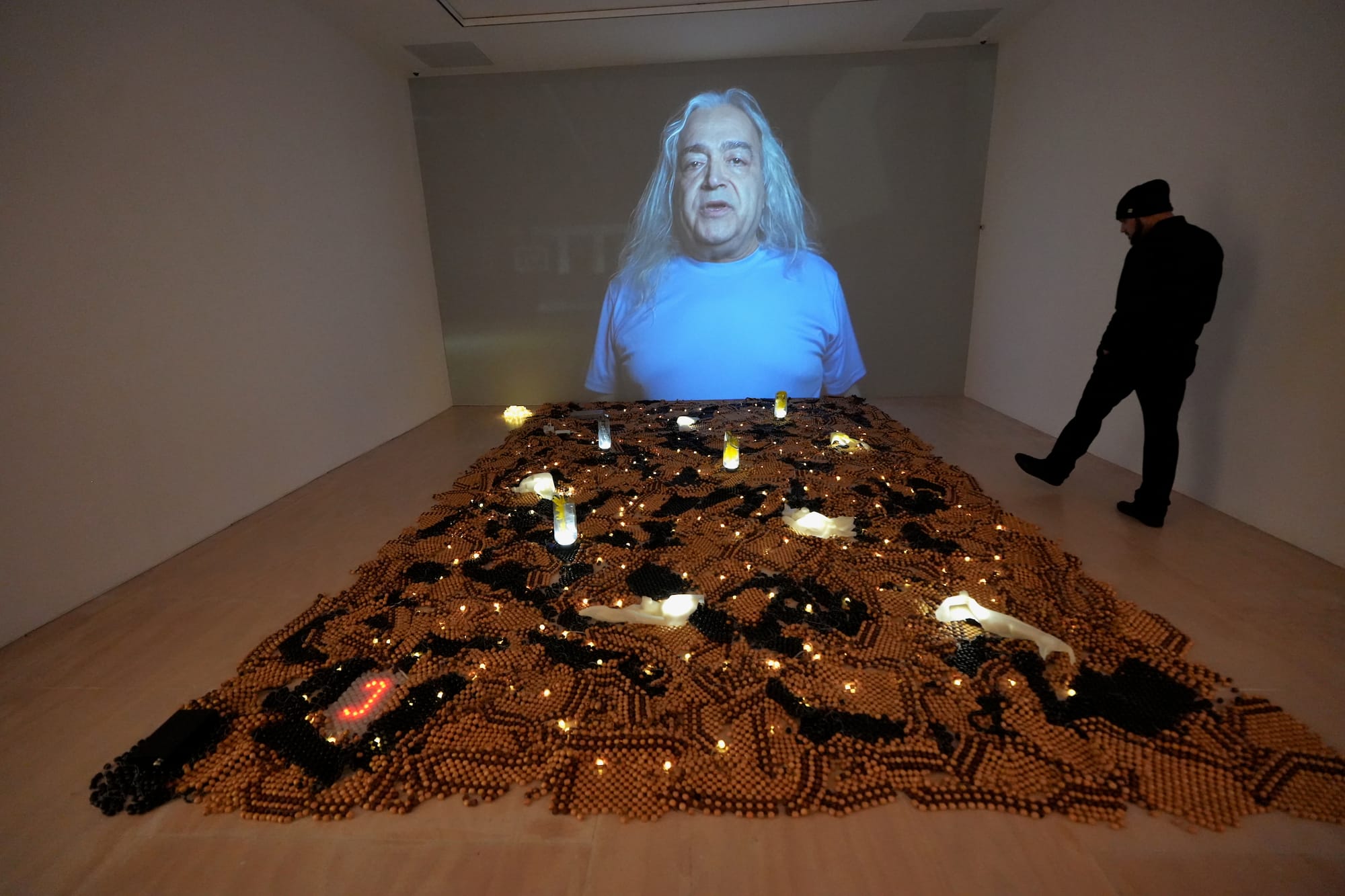
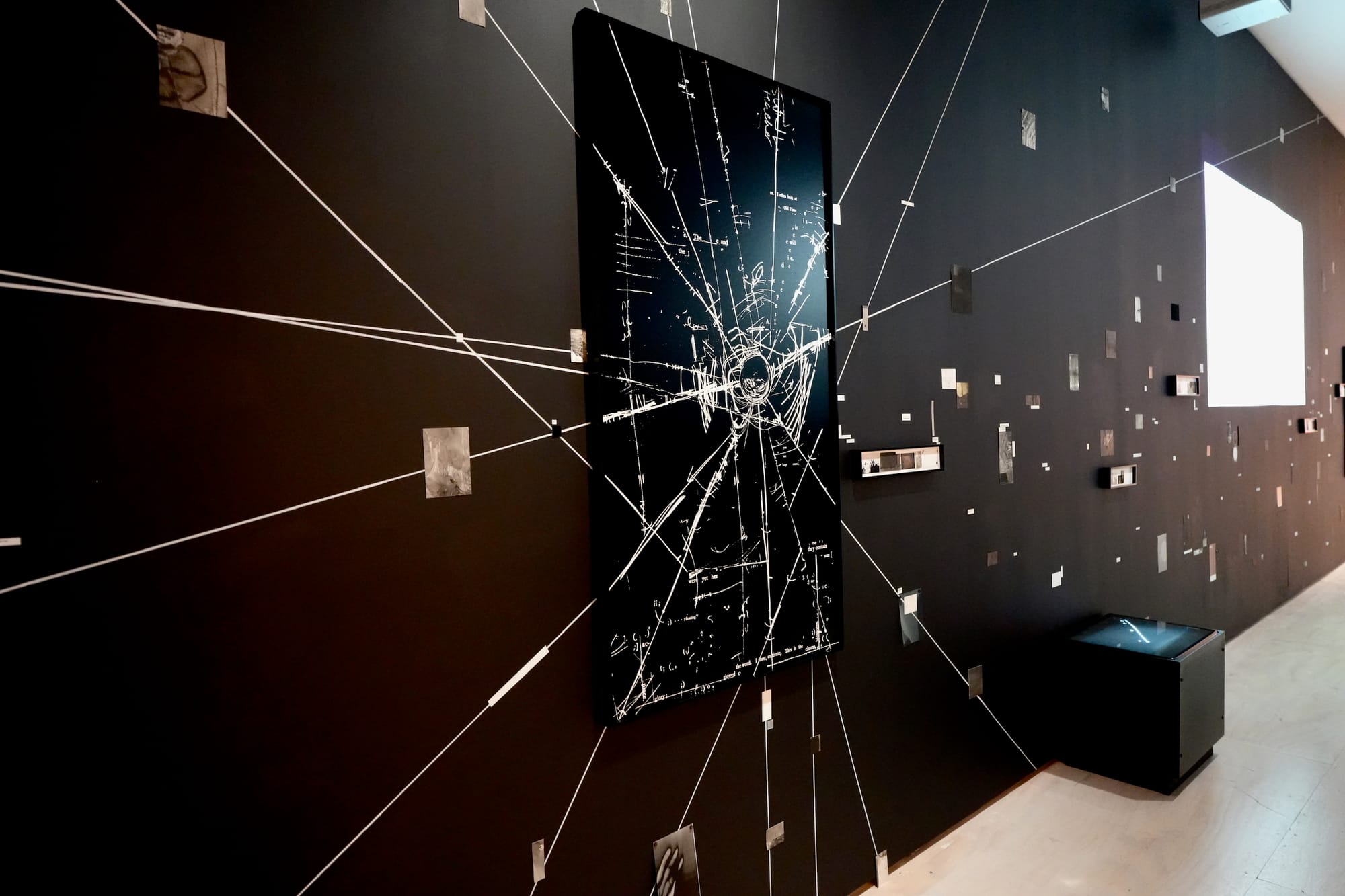
Kite

Hrag Vartanian: These moody works look straight at the theater of the mind. Using the frame of technology and the worlds — perhaps dystopias — it envisions, they act like black holes that defy geometry, convention, and notions of value, while remaining fully conscious and conversant with all three. They stuck with me.
Dean Majd
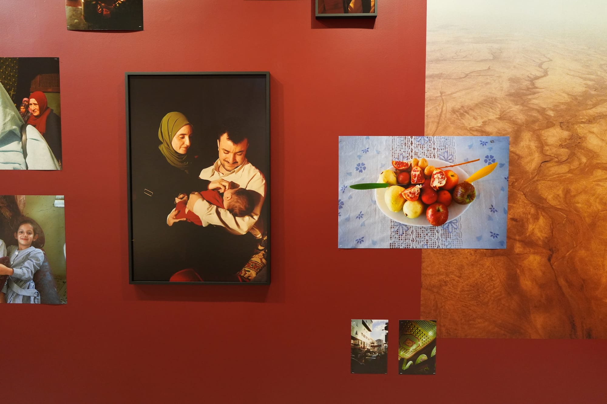
Hrag Vartanian: Deeply humanizing images of people and places that feel almost close enough to touch. The installation enhances the work by suggesting a dreamlike world drifting past — like images dissolving across a screen.
Rhea Nayyar: Very dignified and surreal display, and the blood red walls felt both lively and comforting. But placing the wall-text at the threshold of the space was a poor/ impractical choice based on what I experienced and observed. After scanning the room about five times to figure out where the caption was, I had to nose past a couple of people who inadvertently congregated in front of it.
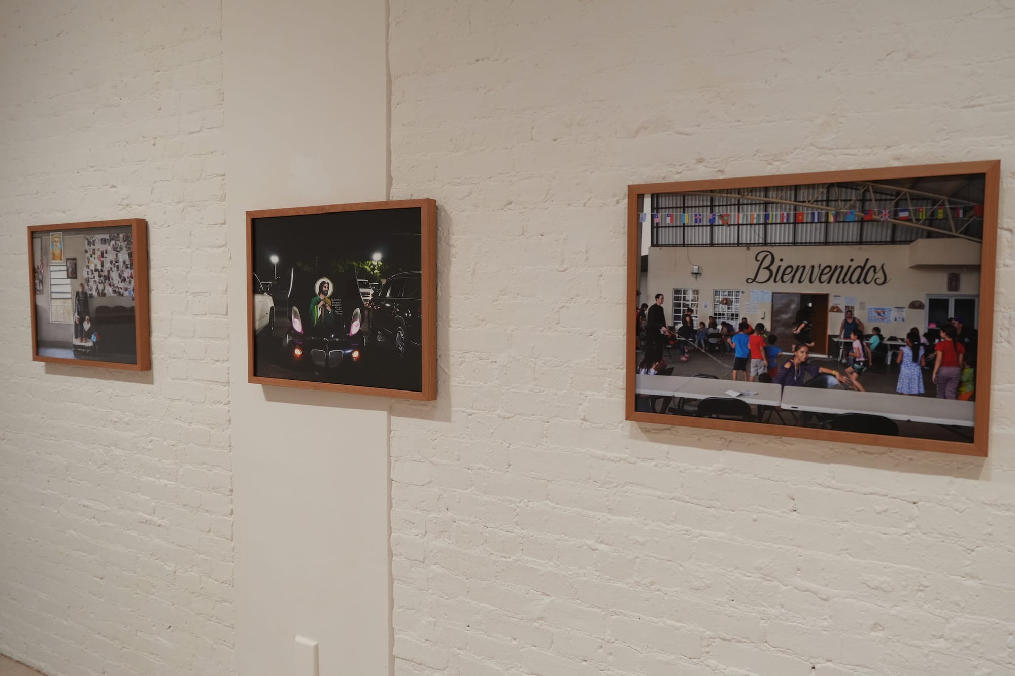
Farah Al Qasimi
Hrag Vartanian: Great eye, and images, with a solid sense of geometry in the compositions. And I loved the little detail of an internet message at the edge of one wall asking if earplugs were required because of a local mosque’s loudspeaker. A sense of humor is always welcome, as these photographs can be heartbreaking and melancholic. They are rendered so starkly and with harsh angles — both things I often associate with diasporic aesthetics.
Rhea Nayyar: These images walked the line between vernacular photography and choreographed composition, and that tension was exaggerated by their high contrast and contemplative stillness.
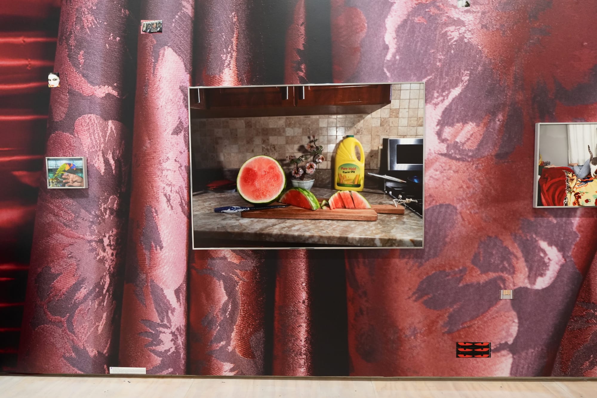
Cinthya Santos-Briones
Hrag Vartanian: These are my favorite photographs in the exhibition, distinguished by their clarity of vision and careful attention to composition. The way the images are printed gives the forms a sculptural quality, and each scene is arranged to convey a sense of three-dimensionality — winking at the illusory nature of reality in various ways. Each of these works gives me insight without making me feel I know the place completely, a curious threshold that stops short of rendering the images intrusive or even invasive.
Cevallos Brothers
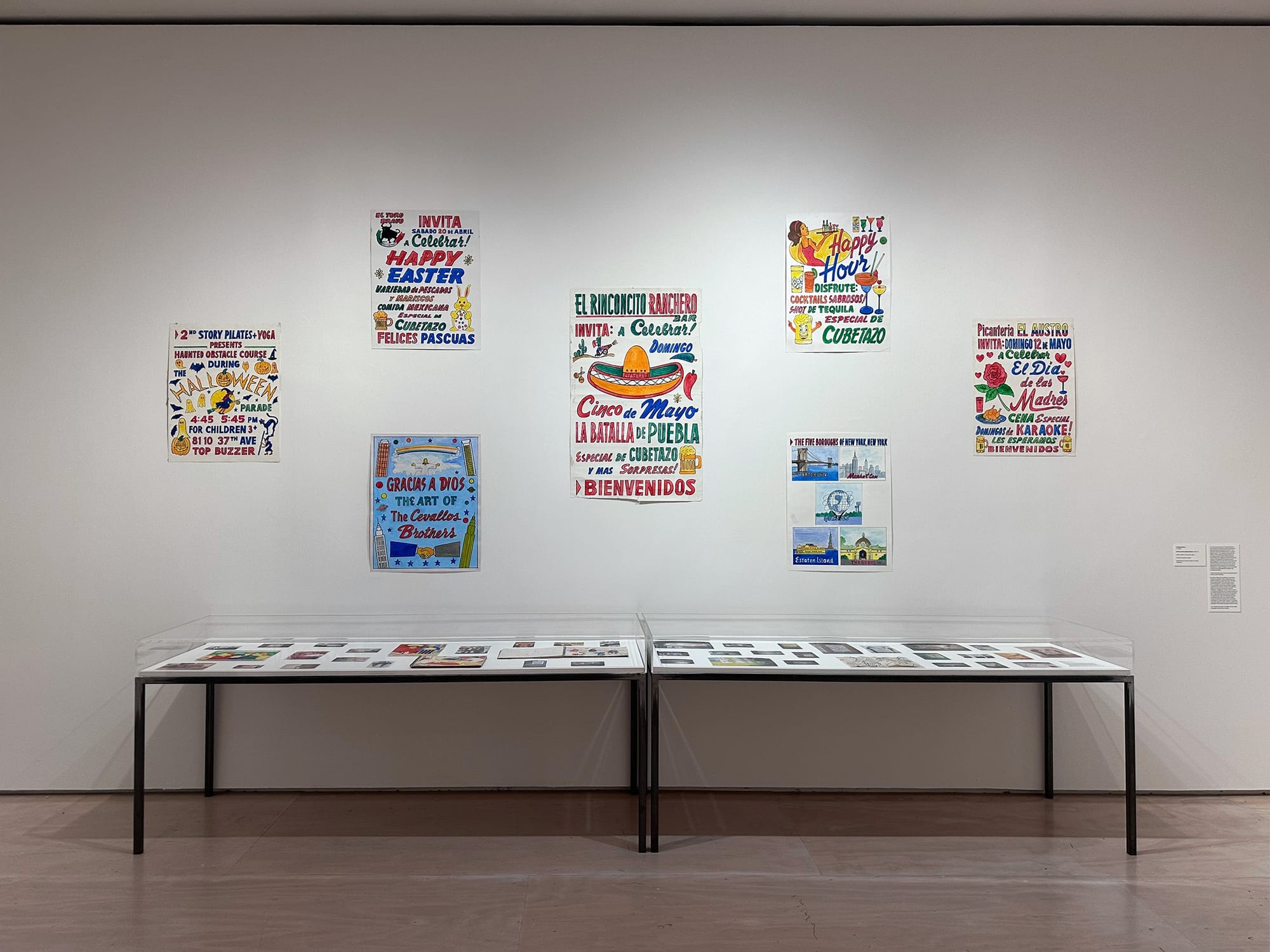
Lisa Yin Zhang: Yes! Yes!! At risk of being corny, living here, I feel like I encounter art in so many beautiful and rapturously interesting forms — the scraped surfaces of ads pasted over each other, the specific visual vernacular of distinct ethnic enclaves, the scribbles and graffiti and help-wanted and room-for-rent signs on lamp posts and in shop windows. I do love art that draws upon this urban or even specifically New York aesthetic — and there’s quite a bit of it here — but why not bring in the source material? If this is a survey of art in New York, then these hand-painted signs belong here, and then some.
RN: High-vibrational 🤝 Historical. Yerp.
What We Were Ambivalent About
Kameelah Janan Rasheed
Hrag Vartanian: She's at her best when sprawling, associative, and jumping between contrasts that can feel jarring at first. The screens, words, and spliced sentences were a delight to explore, and her black-and-white aesthetic felt beautifully cleansing amid the large show. Her drawings, photograph choices, and navigation of the hallway-like space were bursting with energy. I love this installation — I'm not ambivalent — and will probably return a few times, since it's nearly impossible to take it all in at once.
Lisa Yin Zhang: I am ambivalent. On the one hand, I liked the installation — words on scraps of paper pinned to the walls, photos on strings, a screen that flashed more associative images and texts. But the wall text tells me that this work is meant to map the threads of a story about a woman attempting to understand her encounters with aliens, an “agentive photocopier,” and a “quiet magician.” Maybe it was just the raucousness of a survey environment, but I did not get that. I think this is a hard piece for a first-time viewer of her work to jump into.
Rhea Nayyar: This is a piece I wish I had had the bandwidth to devote more time to, but its location felt like a cramped pinch-point for foot traffic between two larger galleries. The lack of physical space within the display made it harder to mentally access the work.
Esteban Jefferson
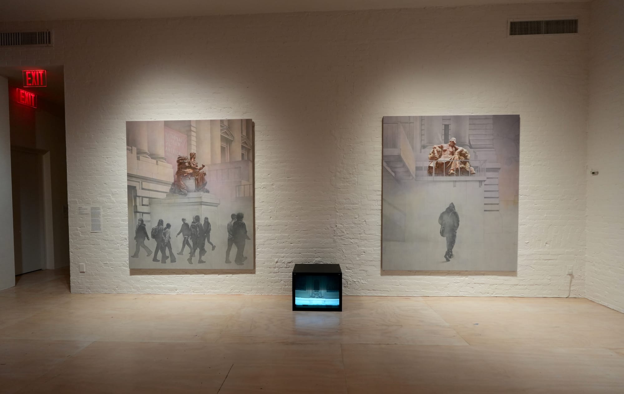
Hrag Vartanian: I really wanted to like these, but I’m not sure they add much to the original sculptures and, in some ways, I think he made the sculptures look more regal. I like his painting style but felt the content fell somewhat short conceptually.
Lisa Yin Zhang: On the one hand, I liked that they’re commandeering an overlooked perspective within our physical environment — New York is studded with these public sculptures that we’ve all walked past without noticing at some point or another. They’re meant to draw attention to how colonial legacies, represented by these classical sculptures, rule public space, but I think there might’ve been a more effective way to convey that idea. These felt eerie, washed-out — in a strange way, the people in them seem to exert more power than the sculptures themselves. I think I like these, I’m just not sure they’re doing what the artist intended them to.
Chang Yuchen
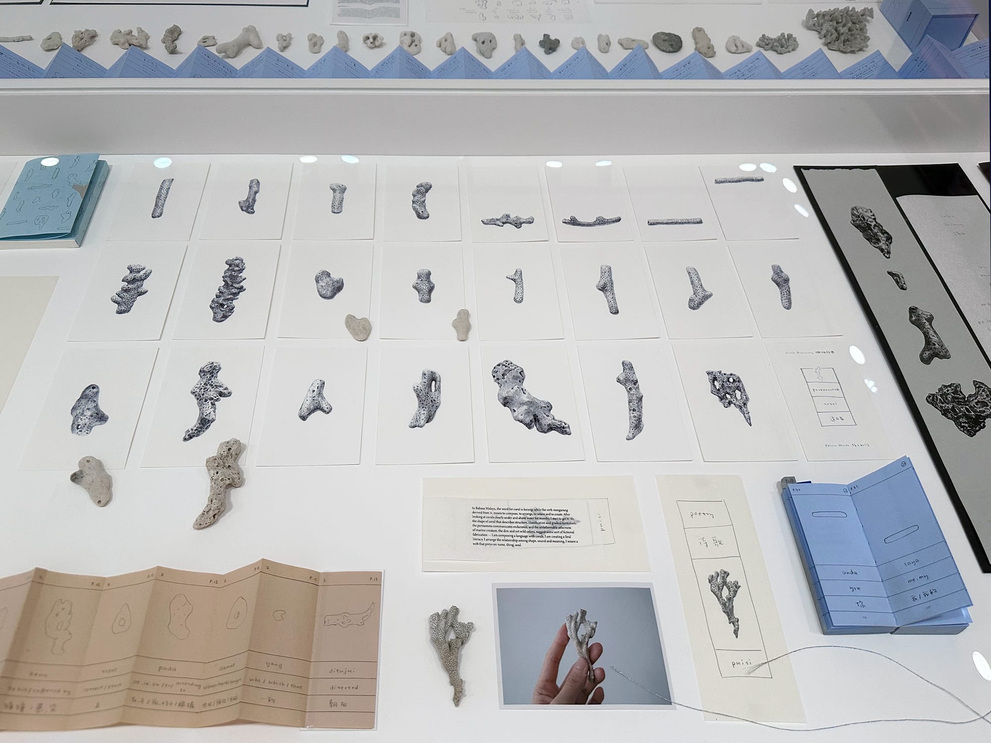
Lisa Yin Zhang: This work kind of encapsulates one gripe I also had with the Whitney Biennial, which is that it is rife with these tender, deeply feeling pieces that clearly hold a lot of meaning for the artist but are somewhat inert for a viewer. For the series Coral Dictionary (2019–ongoing), Chang collected coral fragments that washed up on the shores of Dinawan Island, Malaysia, and created graphite drawings of them alongside meanings she assigned to them, translated into English, Mandarin, and Malay, displayed in vitrines.
I do believe in the meaningfulness of that gesture, that process — for Chang. For the viewer, there’s little to hold onto. I really, really wanted to care.
Rhea Nayyar: Very delicately rendered and thoughtfully displayed, but ultimately too cerebral for and removed from the context it was curated in, and flattened by the explosion of color in Farah Al Qasimi’s corner section.
Louis Osmosis
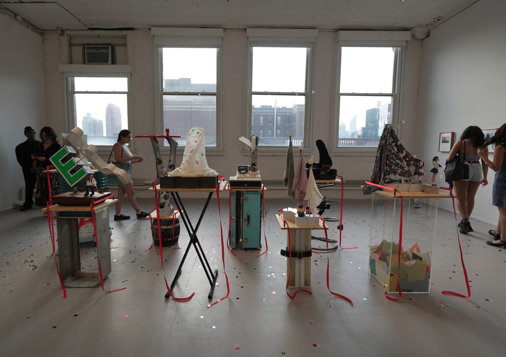
Lisa Yin Zhang: I mostly quite liked these works — I am obsessed with and will be stealing Osmosis’s coinage of those completely bloodless corporate sculptures all around New York as “the NPCs of modernism.” I buy these as a kind of anti-monument.
I see this work in conversation with a couple of other pieces on view that draw upon subculture aesthetics — some anime figurines here, gaming in Ian Miyamura’s “bearers of standards” (2025–26), and niche aesthetics like the femme goblin of Taína Cruz’s “Uptown Twilight Sauté” (2025).
I love that freedom and I don’t want to punish it, but I do think it can be uneven in its results. And I think I see an anxiety in these artists to be taken seriously despite their unconventional subjects — perhaps relatedly, many of them are young — and the result is that they sometimes overcompensate with impenetrable artspeak. One of Osmosis’s titles is “Variations on Public Affairs & Their Subsequent Invigilators: Hitchhiker with Perec’s E” (2026), and Miyamura’s work is described in the wall text as “conceptual playmaking from a postdigital painterly perspective.” Man, what?
Hakim Bishara: Because it skews young (many of the artists are born in the 1990s), this exhibition feels like an MFA show at times. This room gave that feeling. It’s not just the works. It’s also the way it’s installed.
Cici Wu
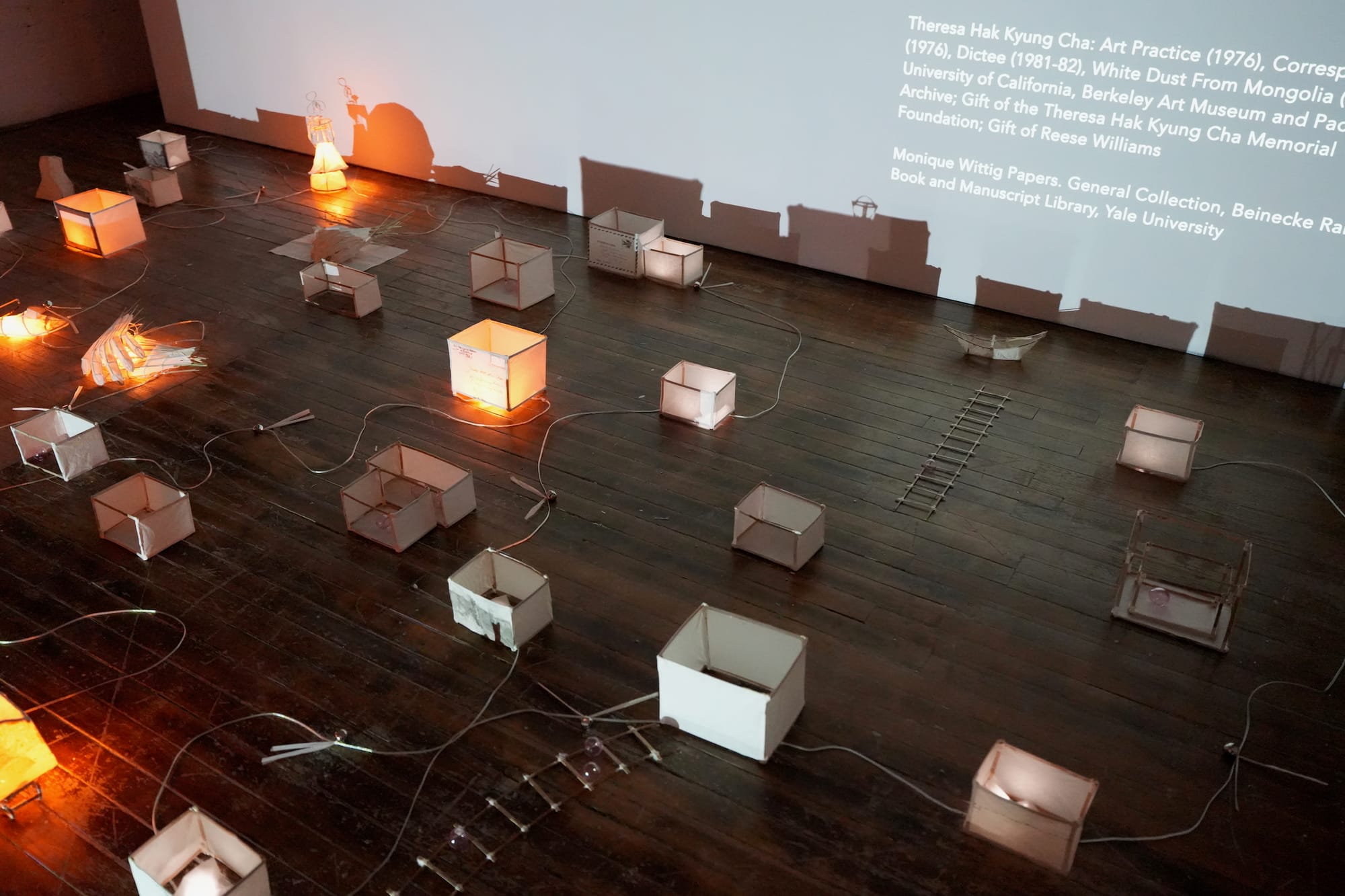
Lisa Yin Zhang: We all love Theresa Hak Kyung Cha, but as (East) Asian Americans, is that, like, all we love? Don’t get me wrong — with its softly glowing handcrafted paper lamps, this work is tender, moving, even beautiful. But this survey is about New York now. There’s got to be a way to pay respect to the ones who got us here, without forgetting about the “here” of it all.
Jay Carrier
Hrag Vartanian: There's something very familiar about his large painting “Niagara Its Great to Be Here” (2024) — partly because I think I remember seeing the very sign it references, but also because so much of that region between London, Ontario and Buffalo, New York, where the Six Nations reservation and Niagara Falls exist, has always felt strangely unattractive due to environmental degradation and neglect. I like how Carrier takes what look like crude marks and turns them into something quite stunning. That said, I didn't feel the mural-sized painting was well situated among so many quieter works; that juxtaposition made it feel more jarring than it perhaps should be.
Lisa Yin Zhang: I was not formally drawn to this painting, so I moved on pretty quick — one sad thing about surveys of this scale. But I like it better in reproduction, so perhaps it was the install, or maybe I’ve just got to give it another go.
What We Didn't Like
Women’s History Museum
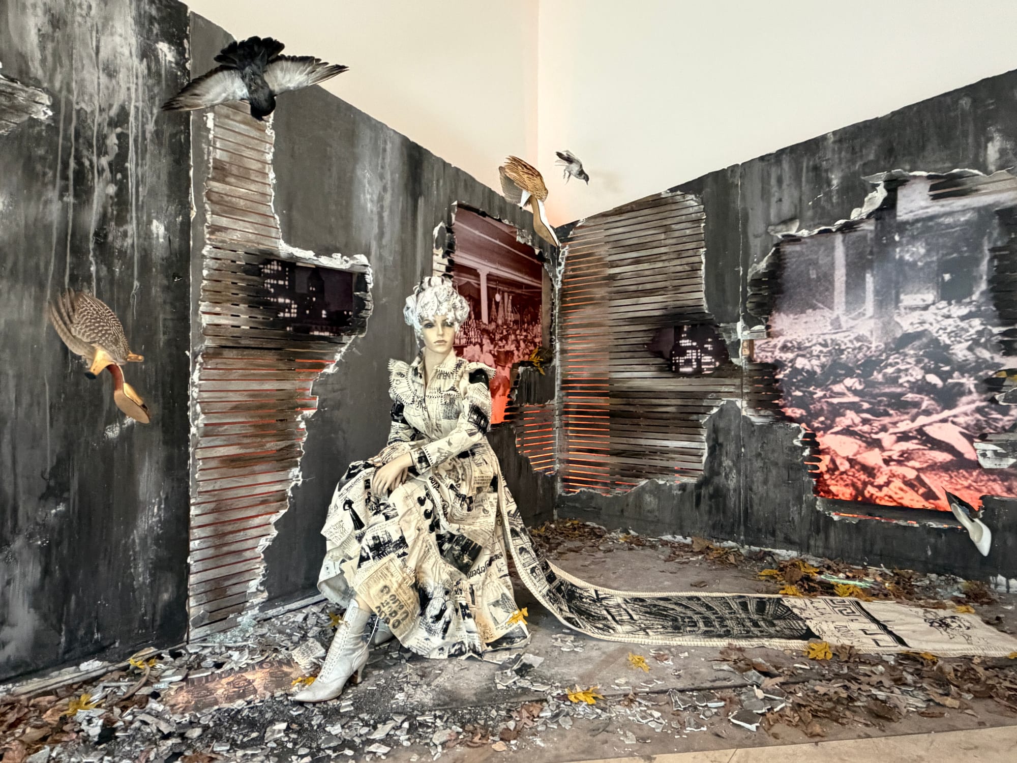
Lisa Yin Zhang: The wall text is your only way into this piece, because it’s really hard to visually parse — not a great start for a work of art. It’s about the Triangle Shirtwaist Factory fire of 1911, an iconic Christian Dior dress popularized by Sex and the City, and protest smocks designed by 19th-century suffragists and workers. Even knowing all that, it’s kind of impossible to piece together in the work itself, and I didn’t walk away with any kind of new insight, just a few interesting facts.
Hrag Vartanian: I liked the shoe pigeons, but that’s about it. It came across as the backdrop of a community theater play.
Rhea Nayyar: Overworked, over-complicated, and over-saturated. Less is more… NEXT.
Hakim Bishara: Come on, give them a break. It's a well-meaning work that is trying to say something important.
Kristin Walsh

Lisa Yin Zhang: I came across "Engine no. 14" (2026) on the third floor, and thought it was some kind of sterling silver foot-washing fountain, which I didn’t hate, but was certainly confused by, especially as there was no wall text nearby to explain. On the second floor, there was some explanatory wall text, but it explained very little …. What does the fact that the structure is an elevator have to do with the fact that the value of copper exceeds the value of a penny, so we can’t melt them down? A bunch of said pennies dance around in one portion, and a silver rod dances and bangs around what looks like an ashtray in another. It’s sort of mesmerizing, like something trying to find its place but unable to, which feels like a metaphor for the work writ large.
Marc Kokopeli
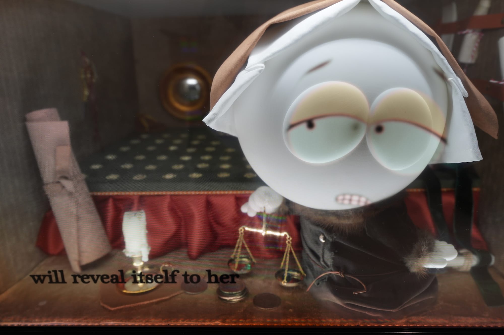
Hrag Vartanian: These are undercooked works that needed more time in the studio. I liked the underlying idea and the focus on booms and busts, but the pieces weren't sufficiently interesting, and leaning so heavily on one TV program gave them an obsessive quality I found alienating … particularly since I don't think South Park is all that compelling as a cultural artifact.
Rhea Nayyar: I got sucked in because these were just so weird, but I think the tech and diorama elements mask that this is just the conceptual inversion of TikTokers making salacious SpongeBob edits with the power of AI voice filters and found footage. Put it back in the oven, it’s not done baking yet.
Coumba Samba
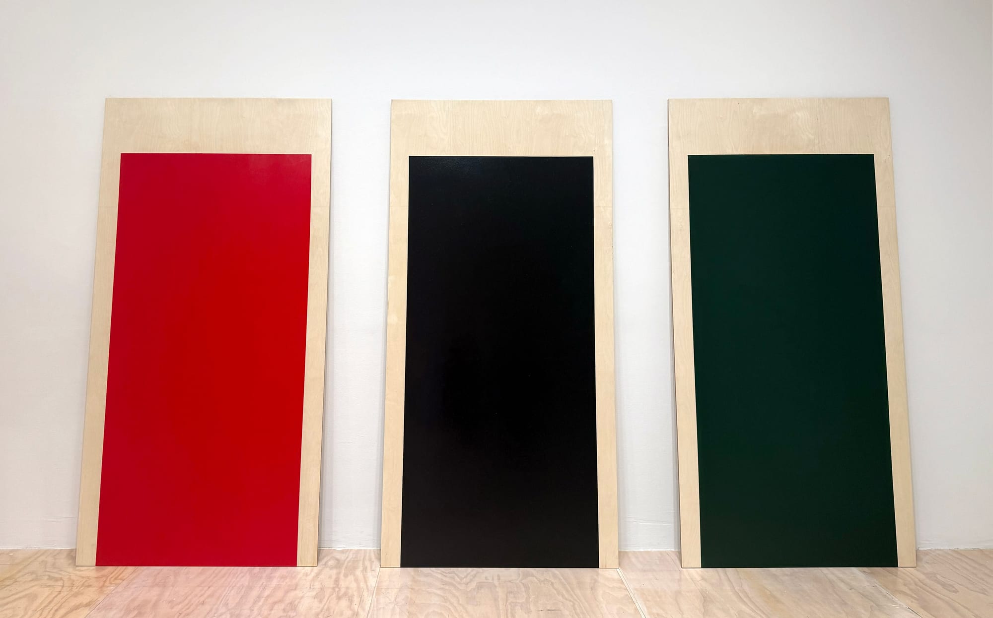
Rhea Nayyar: Not trying to hate or oversimplify, but distilling colonial and broader global histories and dialogues into their representative colors feels a bit like reversing a car in circles here. I’ve seen other works by Samba that do and say more than this, and the inclusion of this particular piece comes across as hastily ticking the check-box of representing complex, cross-continental conflicts. That’s puzzling to me considering the head-on confrontations staged by Dean Majd, Taína Cruz, and Farah Al Qasimi, among several others.
Lisa Yin Zhang: I don’t think you’re oversimplifying. These are oversimplified. Felix Gonzalez-Torres did it better 40 years ago.


