Feature
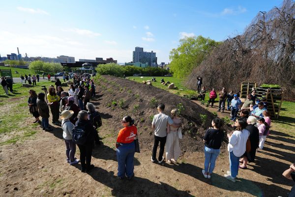
Jean Shin’s Living Memorial to the Trees of Green-Wood Cemetery
Inspired by Korean funerary practices, the artist's new works examine how ritual and reflection mark the cycles of time.
News
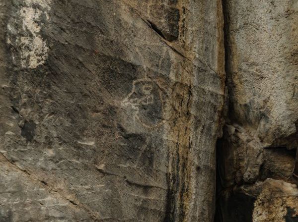
Archaeologists found 16 drawings and petroglyphs along the route of a forthcoming high-speed passenger train.
Art Review
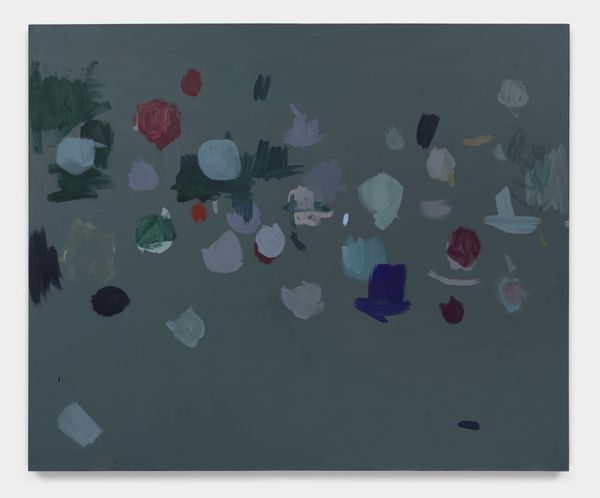
Her paintings compress Roman mythology, Italian Renaissance paintings, color relationships, and that moment before disappearance.

Art Review
His sculptures are a striking metaphor for the fragile equilibrium of American life.
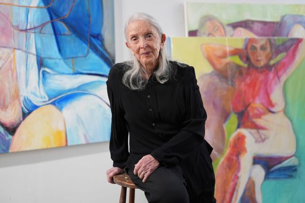
“You say, ‘Fuck you. I'm good and you're wrong,’” she told Hyperallergic. “This is who I am, this is what I do, and this is what I care about.”
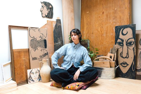
Surrounded by her drawings and ceramics, we discussed her evolving art practice and new life as NYC first lady.
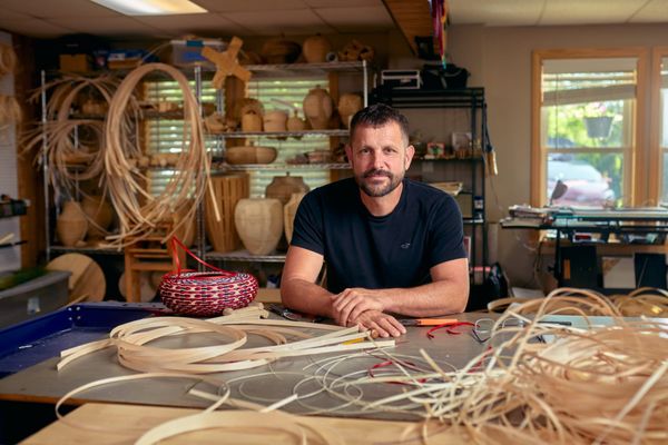
Join us on April 29 for a conversation with artist and recent MacArthur Fellowship winner Jeremy Frey and Hyperallergic Editor-at-Large Hrag Vartanian.

“On Censorship” offers timely reflections from the dissident artist, whose entire life and career have been marked by state persecution.
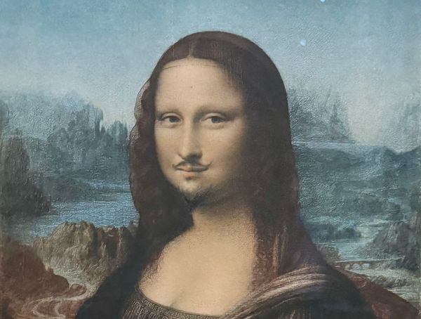
“The art world changed,” scholar Thierry de Duve told us on the occasion of MoMA’s new show. “Duchamp’s ‘Fountain’ is the message that brings us the news.”
Residencies, fellowships, grants, and open calls from Banff Centre, the Vilcek Foundation, and more in our monthly list of opportunities for artists, writers, and art workers.
Get the best of Hyperallergic sent straight to your inbox.
Books Newsletter
Plus, inside a Black Panther family album, predatory art-world relationships, and the unknown Qing Dynasty trade portraitists.
Art Review
His sculptures are a striking metaphor for the fragile equilibrium of American life.
News
The late artist’s submissions to General Idea in the 1970s are the subject of a focused exhibition at Art Metropole in Toronto.
Opinion
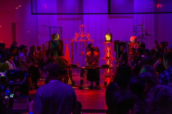
The rave offers a temporary homeland, a space where belonging is felt rather than declared.
Sponsored
Announcement
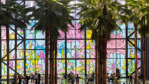
Bold and vibrant large-scale installations featuring blossoming flowers celebrate the natural world and bring the outside indoors.
Daily Newsletter
An intimate profile of the body painter, Hungary's art world post-Orbán, and Lebanese artist Tania El Khoury's life amid war.
Weekly Newsletter
The artist and NYC first lady in an exclusive interview, LACMA's stunning new building, Trump plays Christ, and much more.
Interview
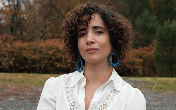
The Lebanese artist and Bard College professor spoke with Hyperallergic about her recent projects and precarious life under bombardment in Beirut.
Opinion
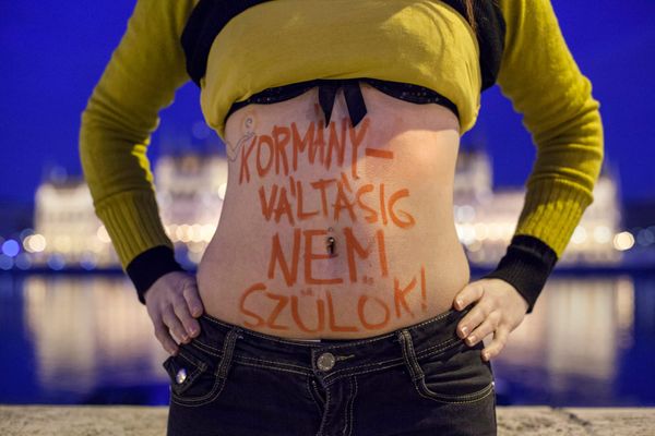
As a Hungarian curator living in the United States, I cannot help but see my country as both a cautionary tale and a source of hope for artistic freedom.
Interview
“You say, ‘Fuck you. I'm good and you're wrong,’” she told Hyperallergic. “This is who I am, this is what I do, and this is what I care about.”
News
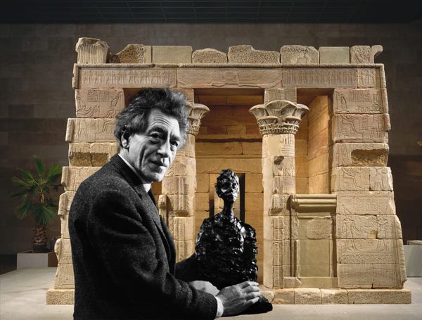
The museum and the artist’s foundation are collaborating on a surprising exhibition opening this June.
Feature
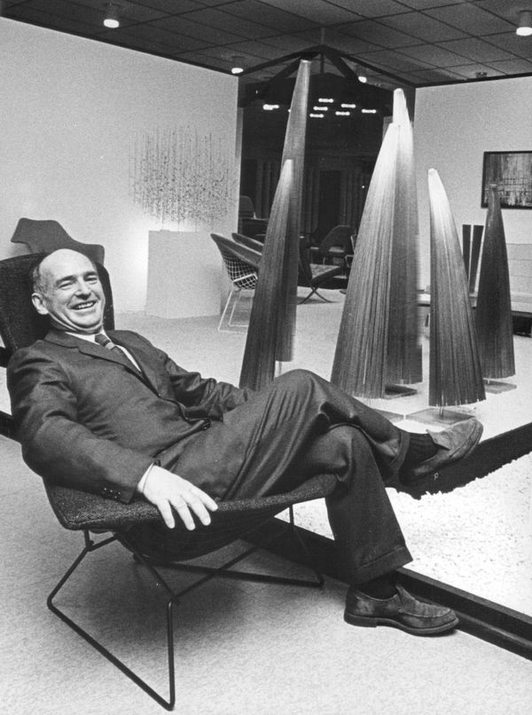
As a sculpture long thought lost resurfaces in Detroit, the artist and designer’s alma mater sets its sights on a major retrospective.